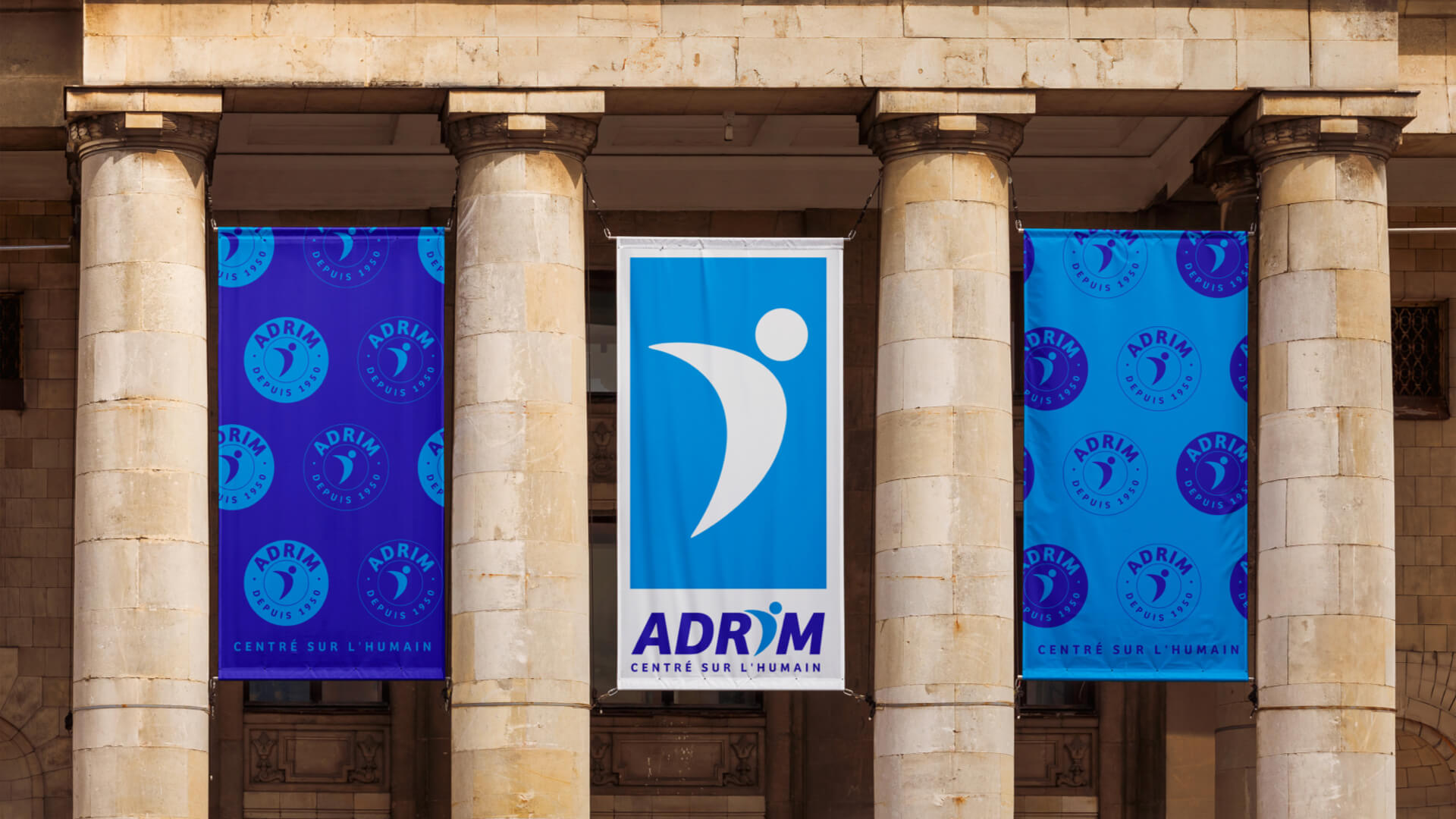
ADRIM
Art direction, logotype, webdesign, communication
SECTOR
Social integration
LOCATION
Paris
2025
For an institution that has been rooted in human values for over 70 years, the challenge was to modernize without distorting. This global overhaul has breathed new life and coherence into ADRIM's image, preserving its roots while giving it a new graphic energy: contemporary typography, a revisited color code, and a strong symbol centered on people. The aim: to transform a historic identity into a clear, modern and enduring communication.
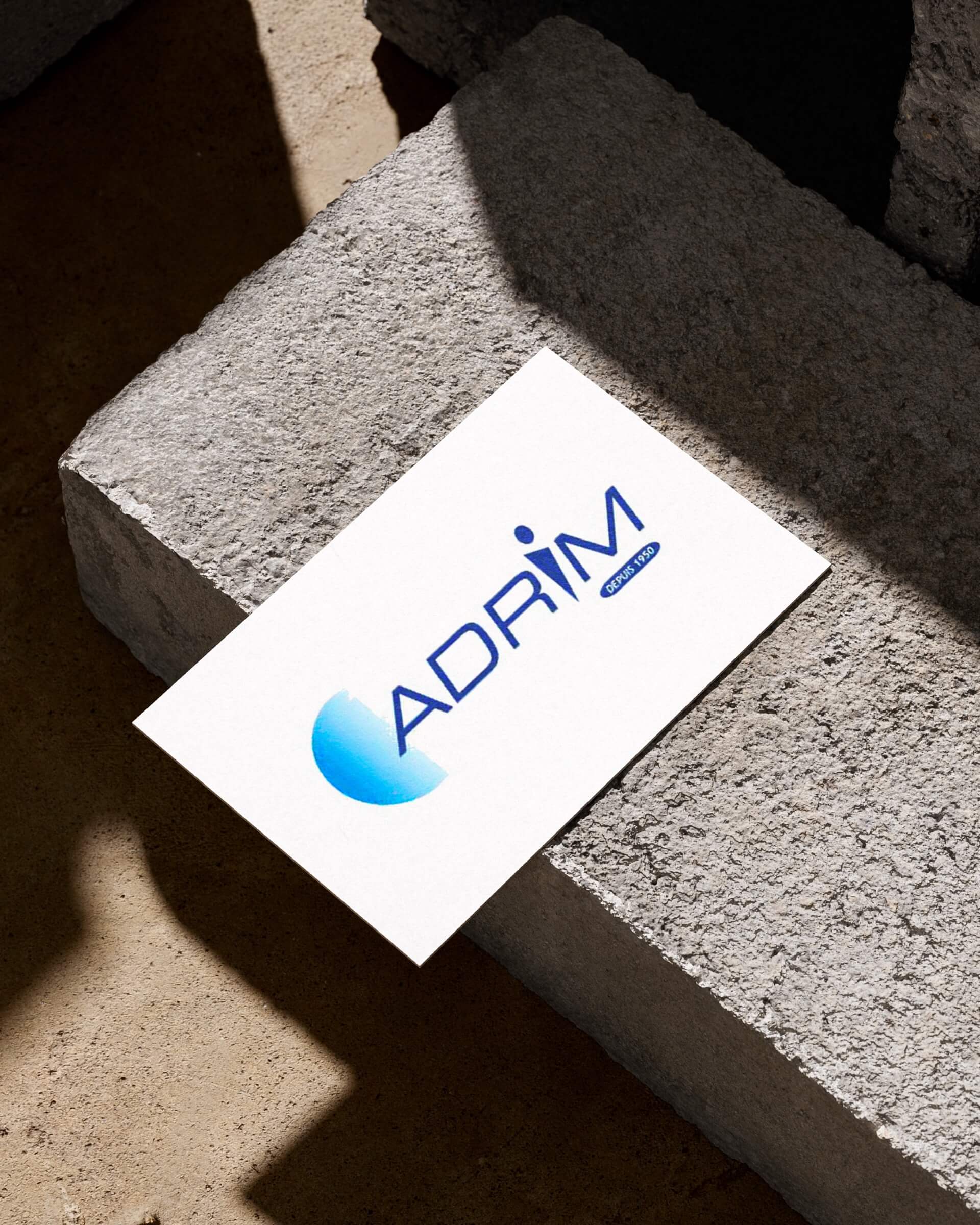
Before
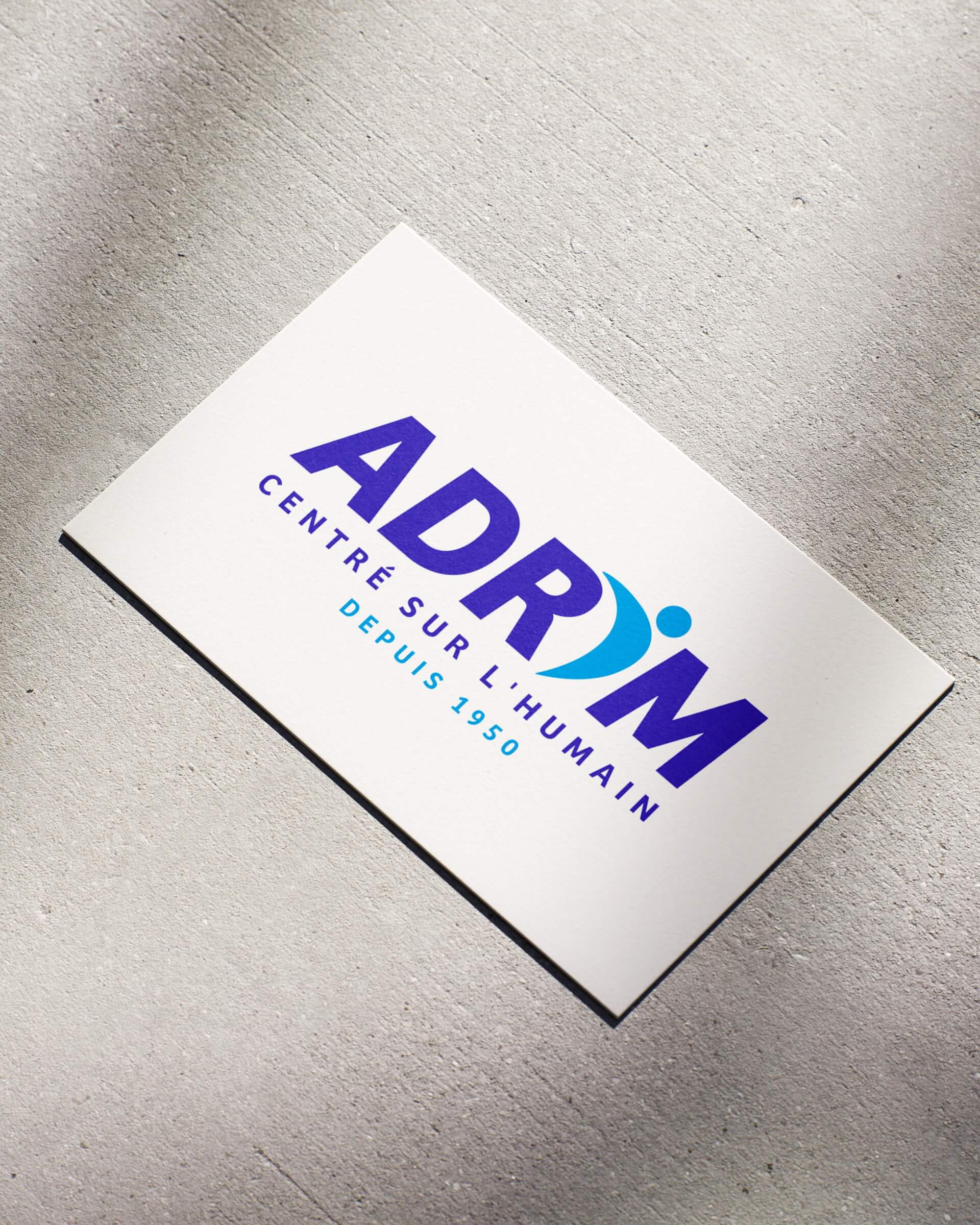
After
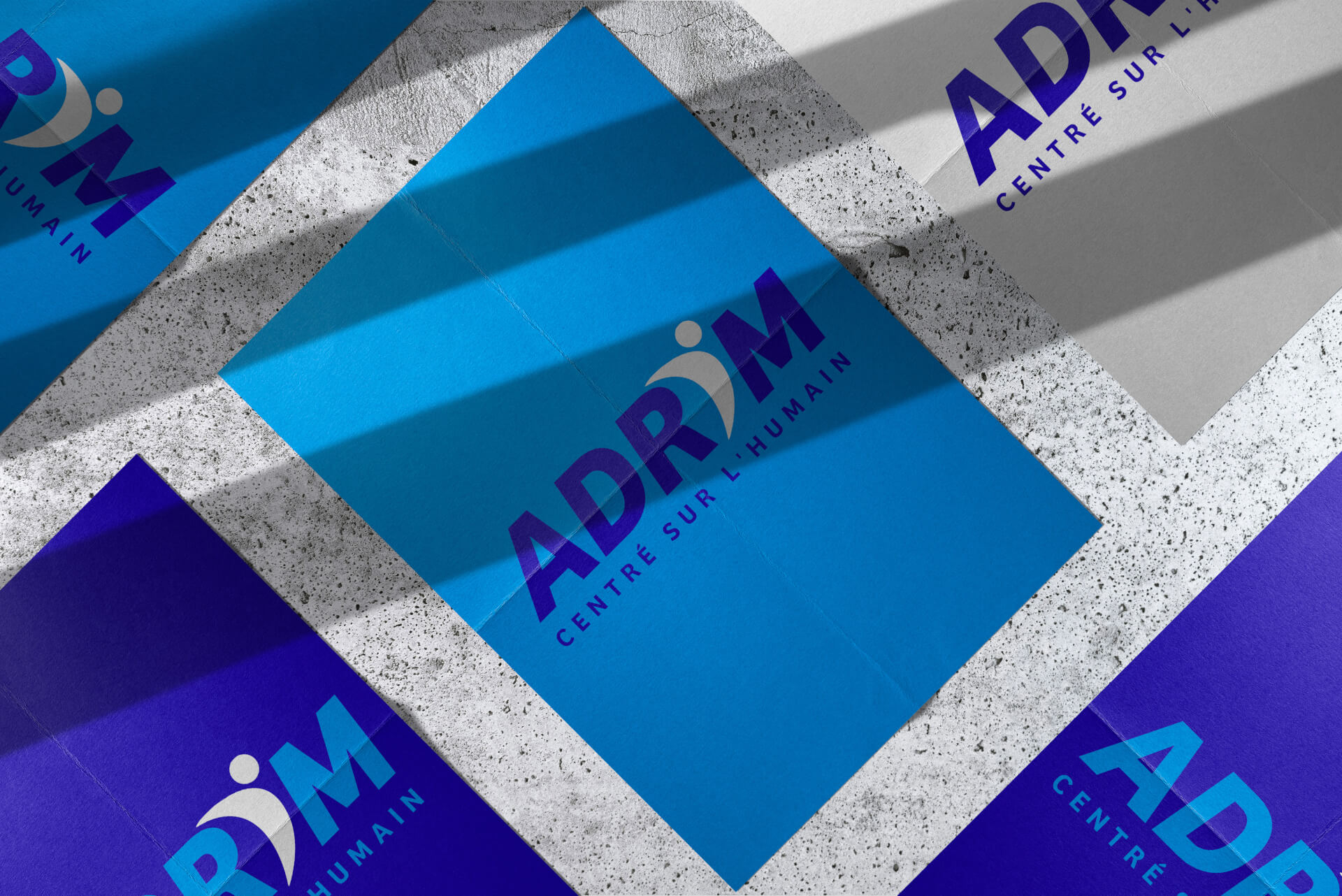
CONTEMPORARY COLORS ROOTED IN HISTORY
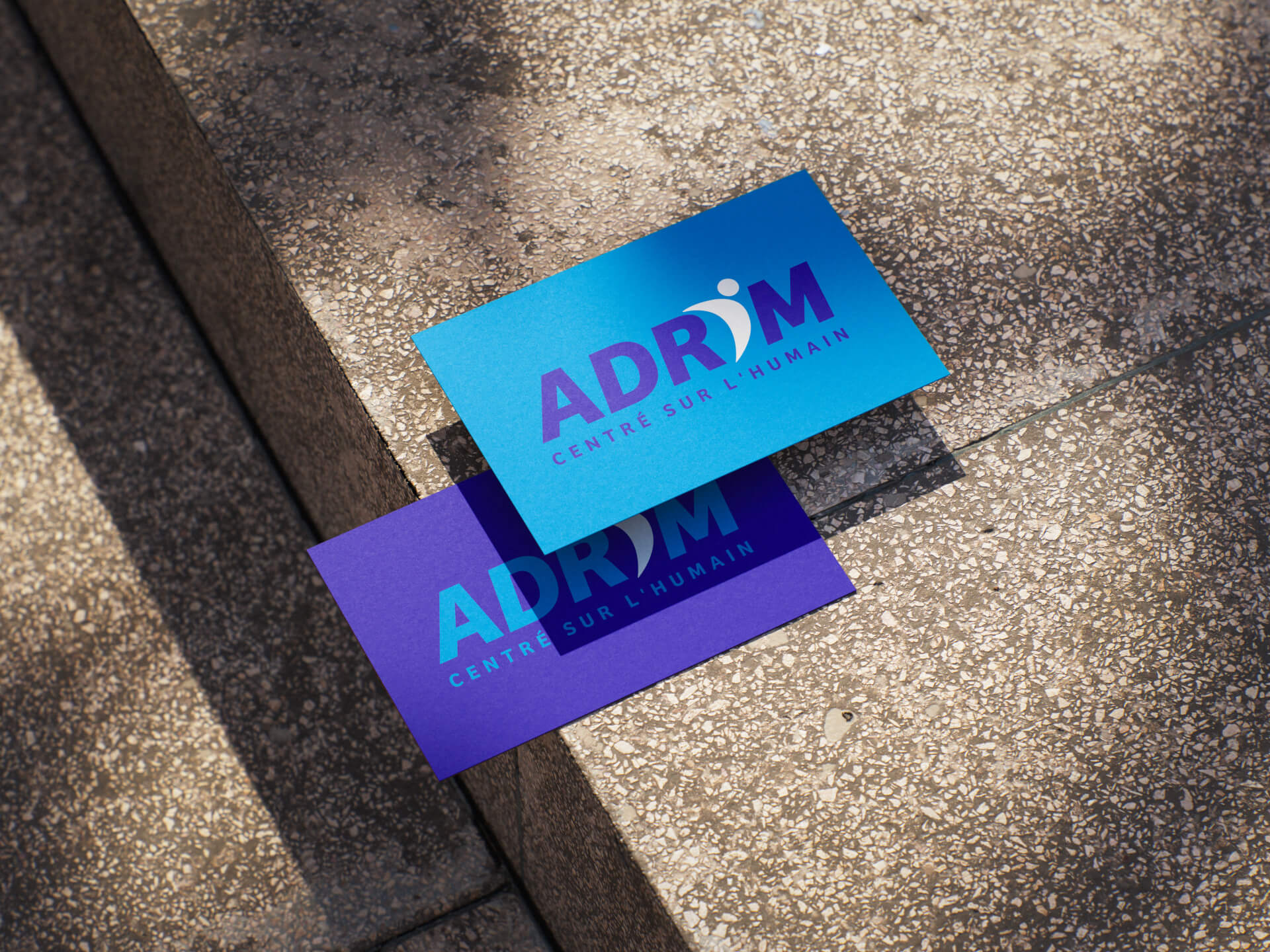
ADRIM's identity remains true to its origins, retaining its characteristic blue tones. Two more contemporary shades reinterpret them: a light blue for openness and serenity, and a revisited dark blue for depth and modernity. White balances the overall effect and reinforces the clarity of the message.

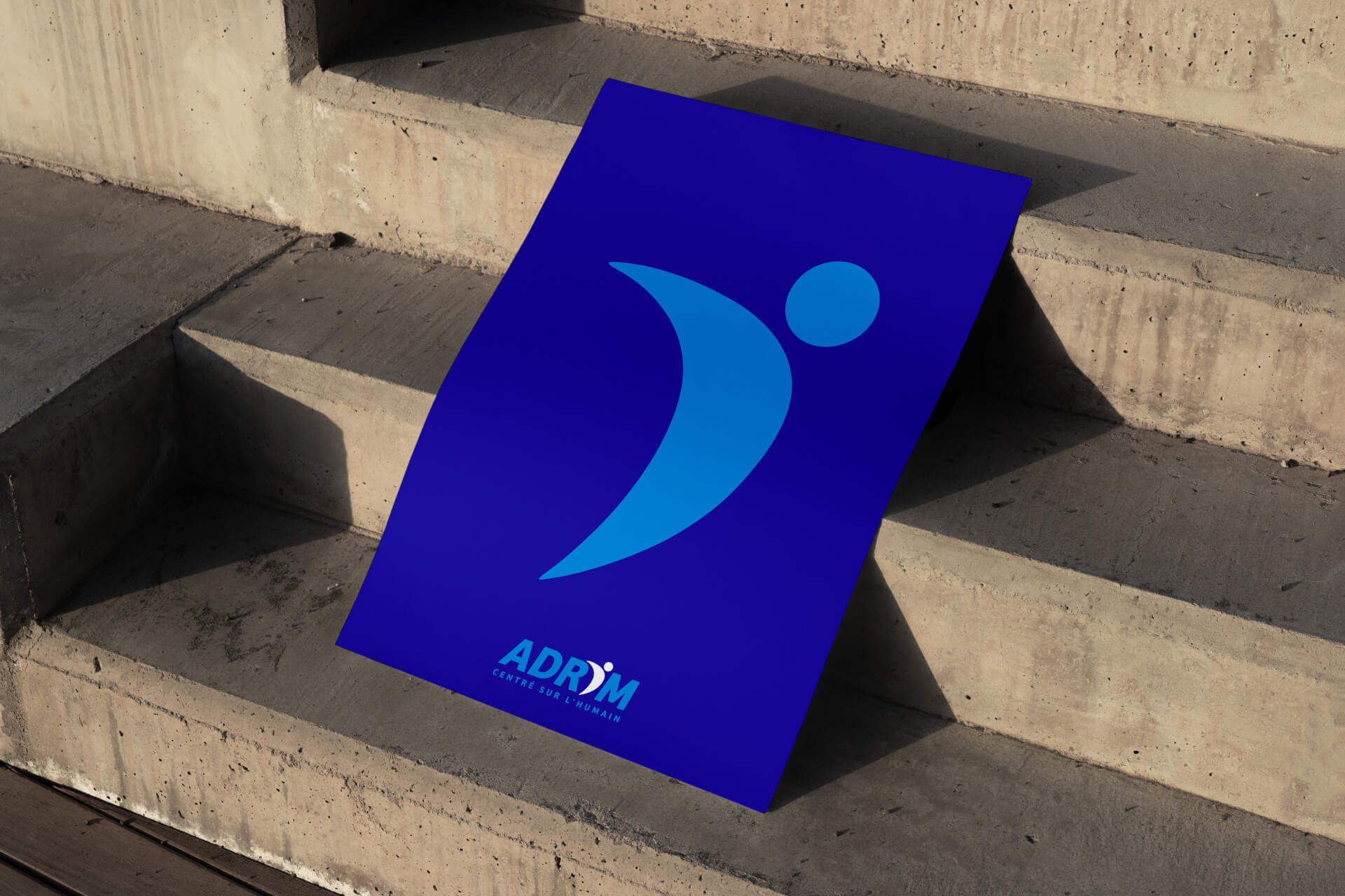
A HUMAN-CENTRED LOGO
Bree typography brings a bold, dynamic presence, in perfect harmony with the logo's symbolism. The "i" becomes a stylized human figure, symbolizing elevation and movement. This strong pictogram is ADRIM's new emblem, reflecting a modern, coherent and profoundly human identity.
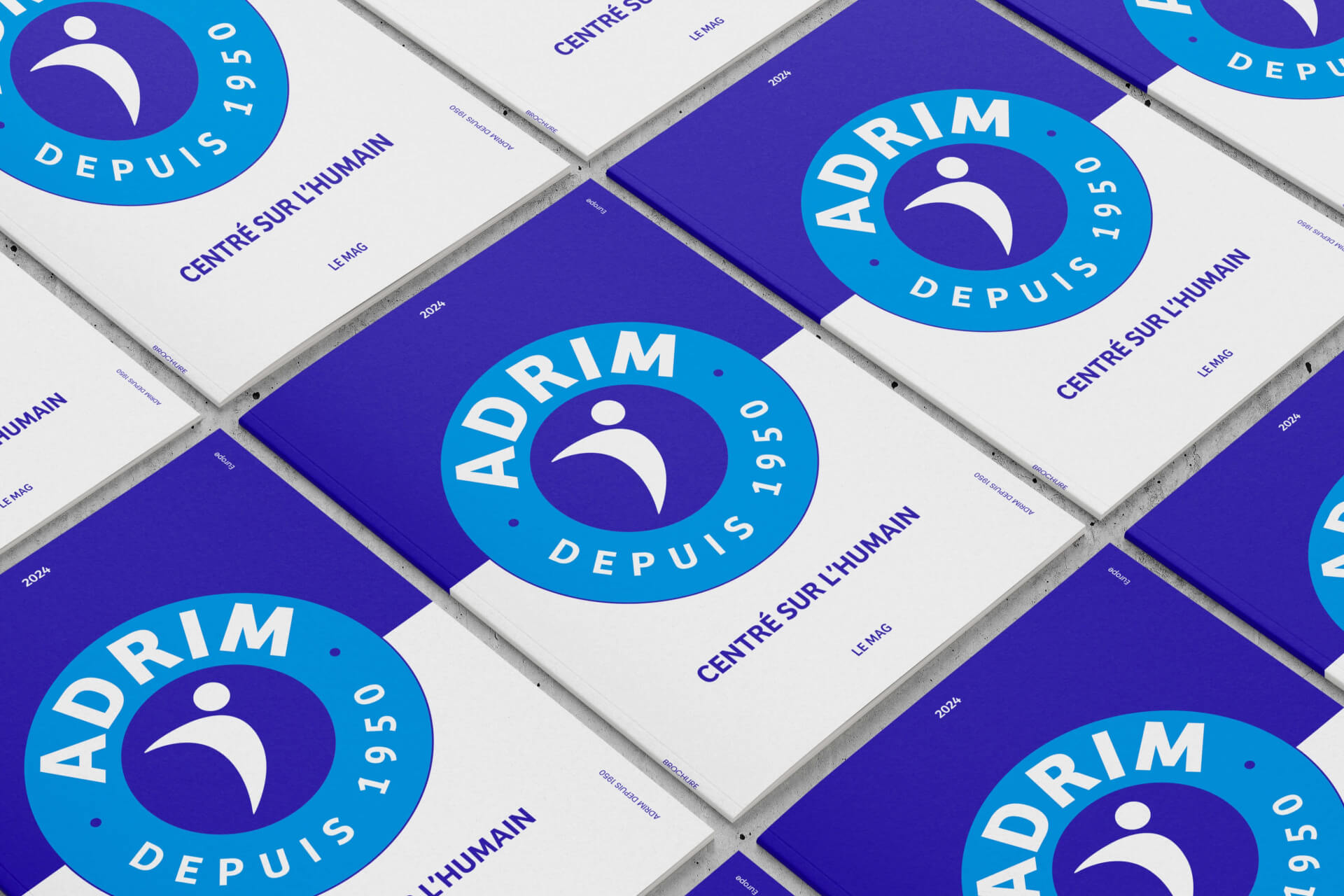
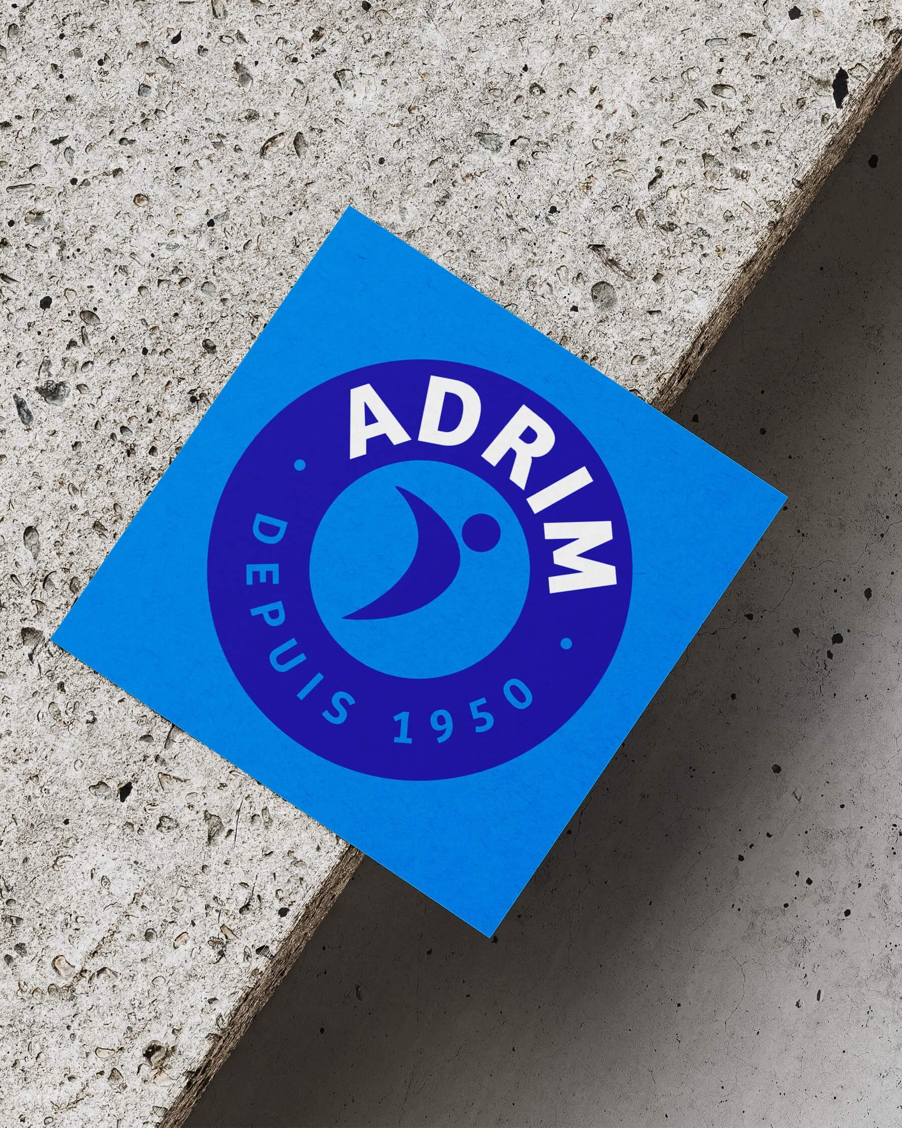
AN ADAPTABLE, RECOGNIZABLE IDENTITY
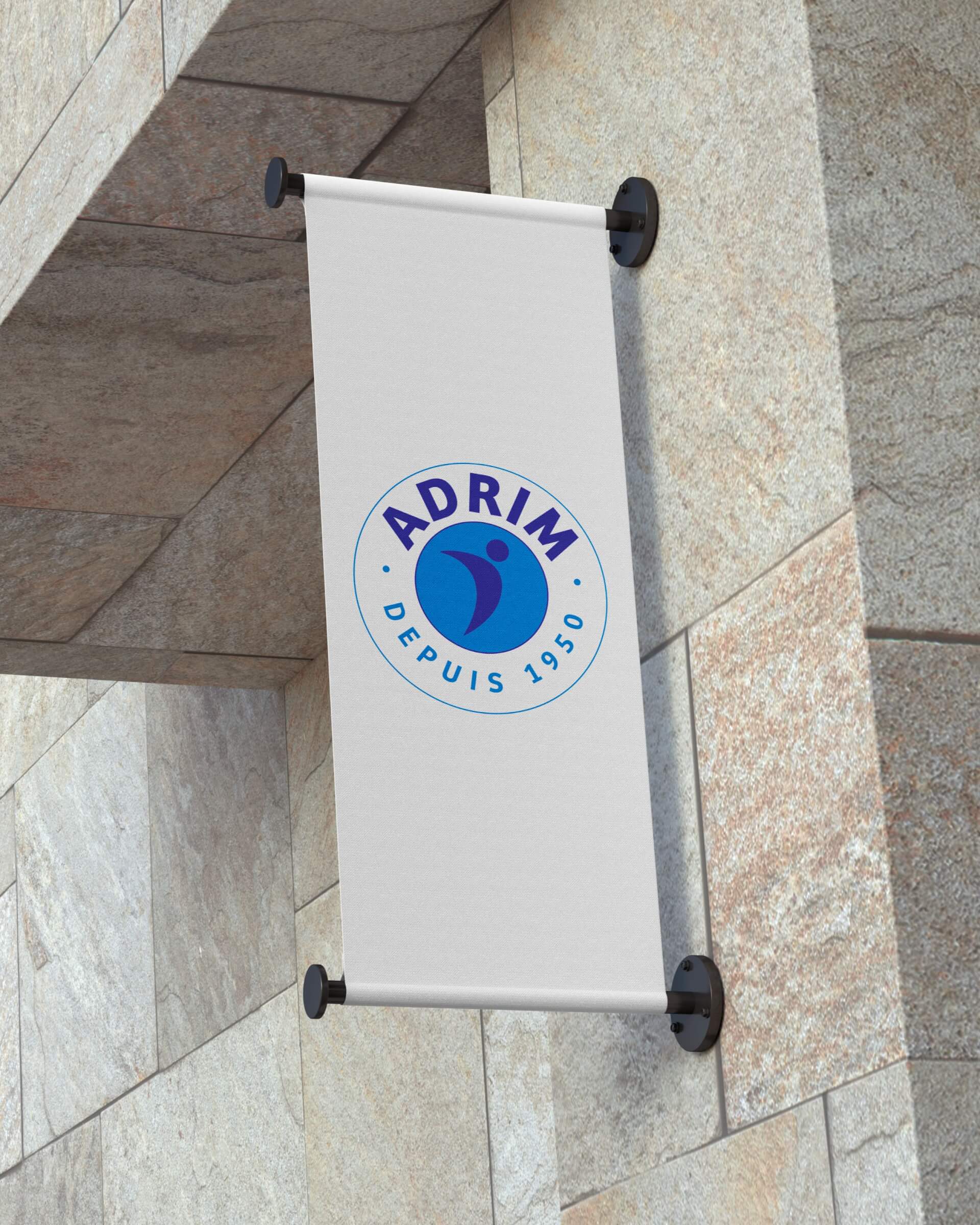
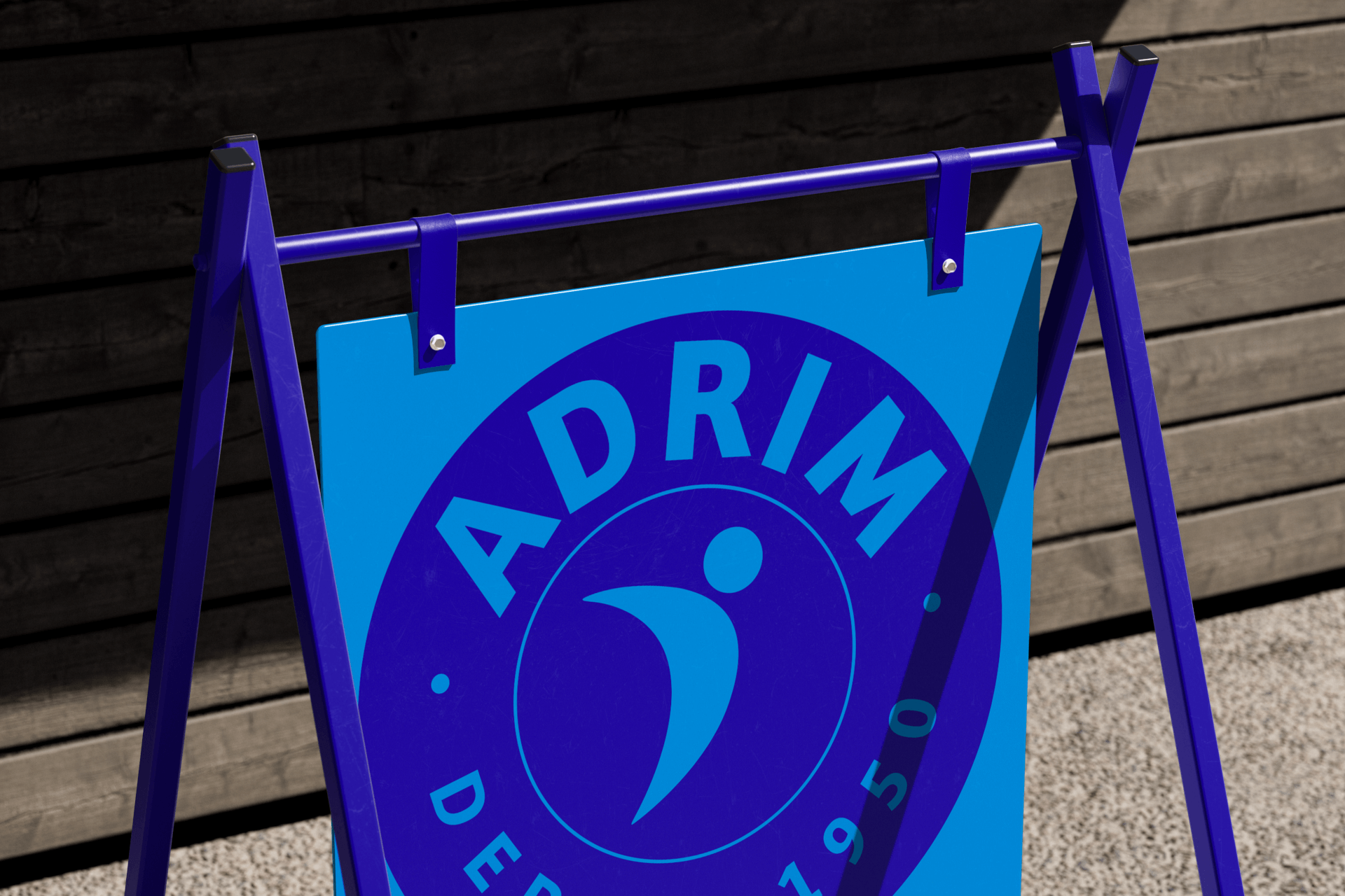
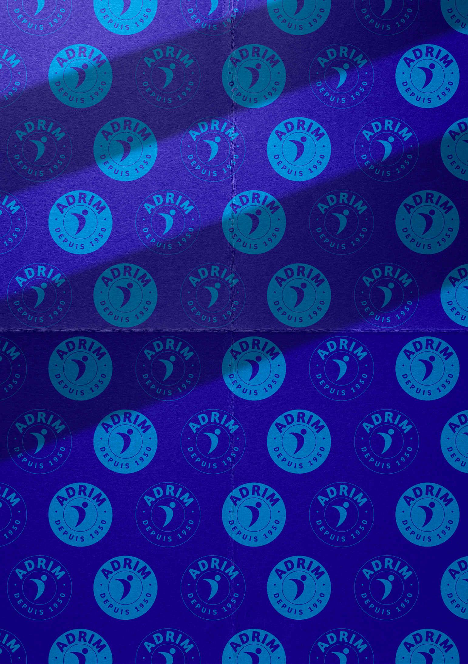
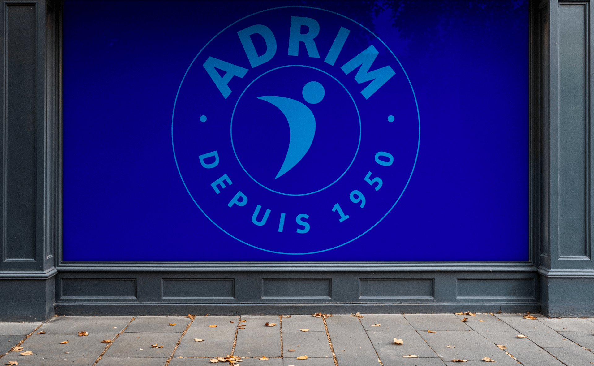
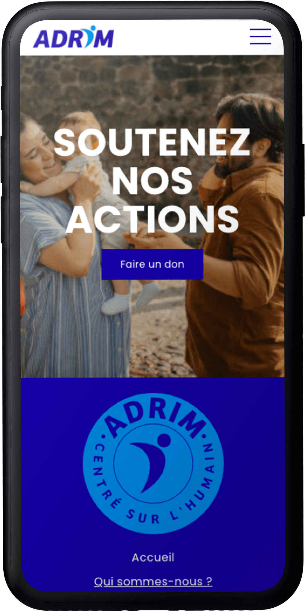
Available in a button version, the ADRIM logo adapts to all media - from digital to promotional items. This circular format highlights the central pictogram and the "People-focused" signature, while retaining the strength of the light/dark blue duo and the balance of the white.
PEOPLE AT THE HEART OF DIGITAL
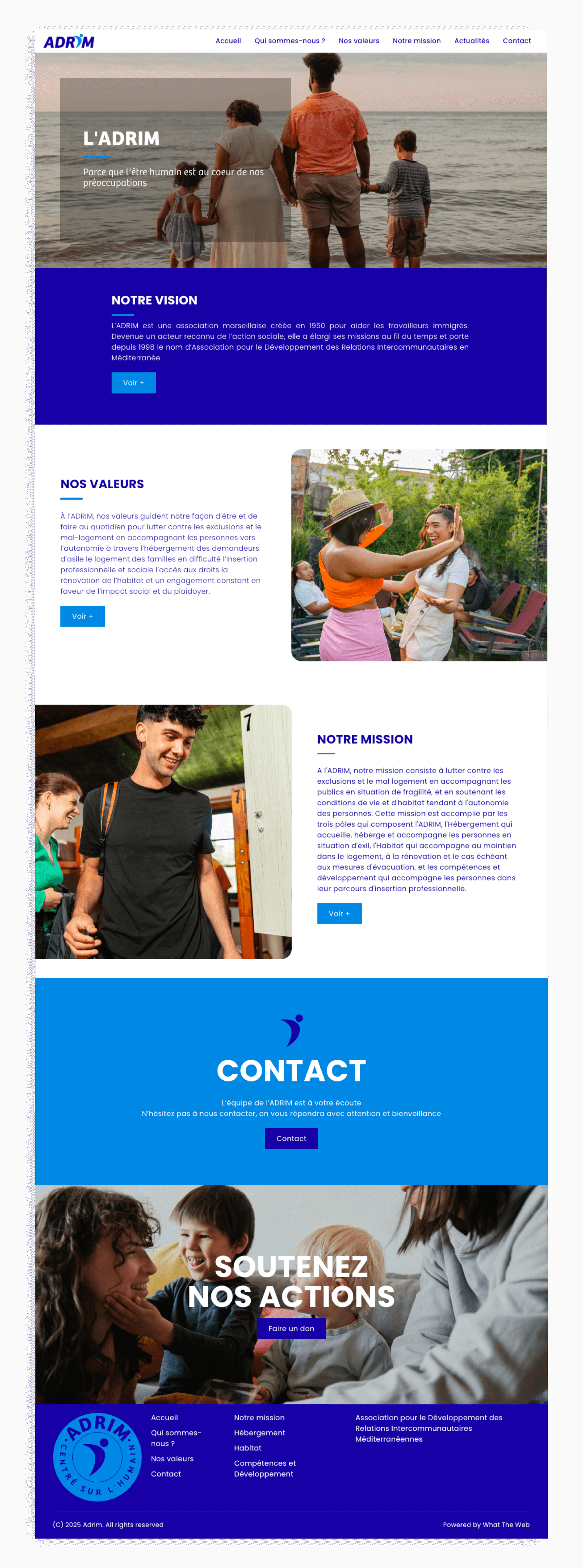
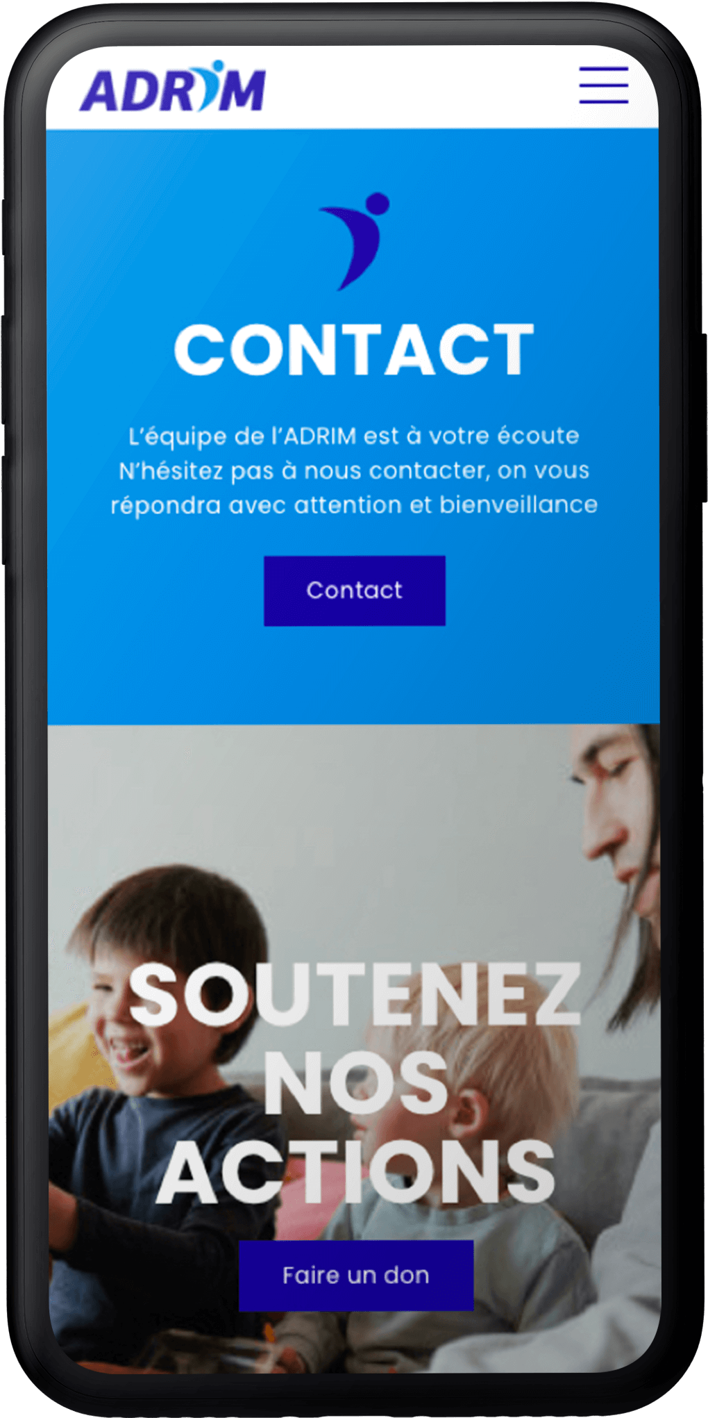
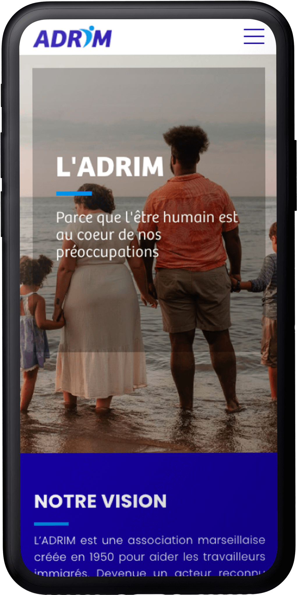
The ADRIM website translates the new identity into a clear, coherent digital universe. The colors, typography and pictograms adapt naturally to all formats, offering a fluid, legible and modern experience.
The ADRIM identity, always at hand
From web to mobile, every detail adapts naturally to ensure intuitive, accessible navigation. A flexible layout, controlled contrasts and a clear hierarchy ensure comfortable reading, whatever the screen.
+ creations + projects + identities + stories + colors
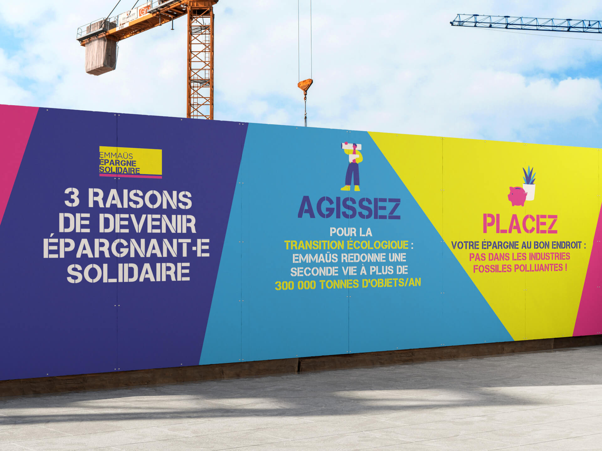
Solidarity savings
Emmaüs Epargne Solidaire
Festival
YO! Fest 2019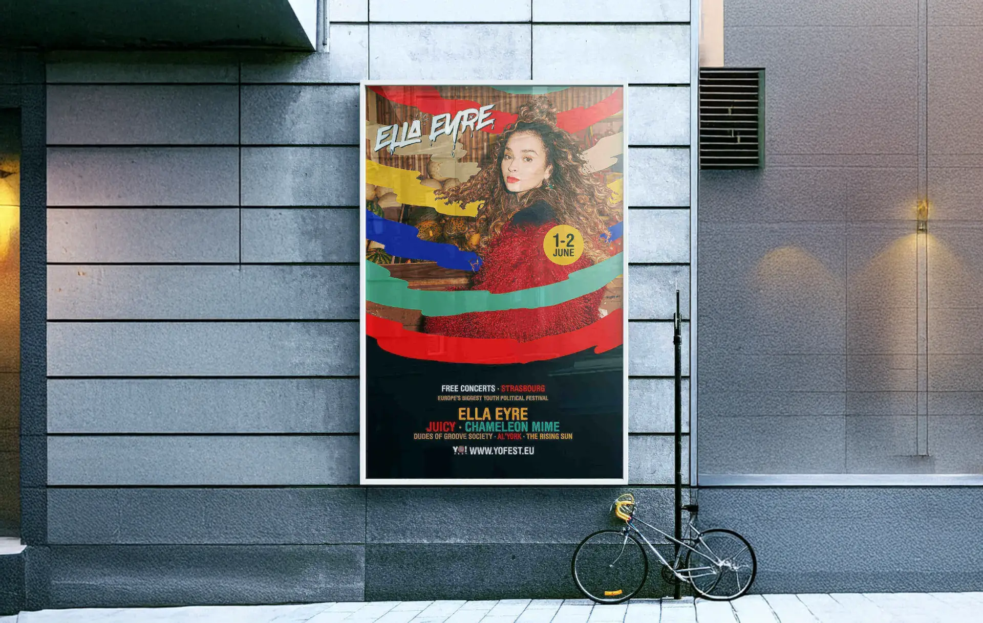
Festival
YO! Fest 2018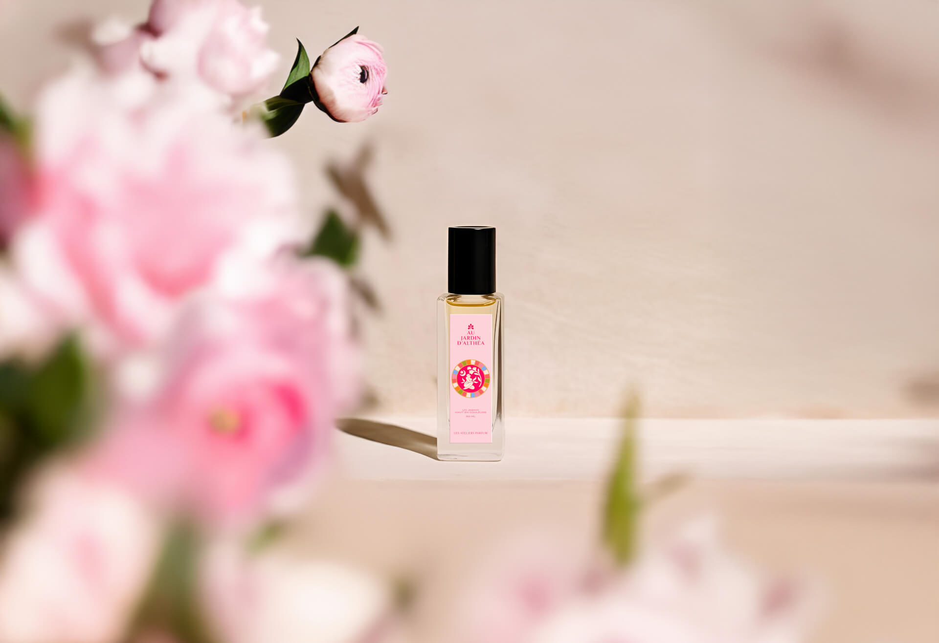
Natural fragrances
Au Jardin d'Althéa