L'OUTIL EN MAIN
Art direction, web design, communication
SECTOR
Crafts & Heritage
LOCATION
France
2023
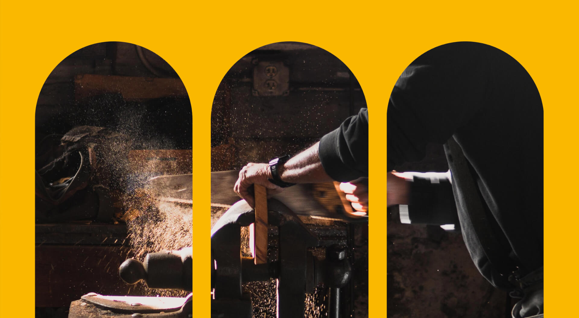
Gathering and exchange, transmission, humanism, elegance, passion... The artistic direction of L'Outil en Main brings together modernity and ancestral know-how. It proposes a positive representation of manual professions, deeply rooted in reality. A graphic design that draws its energy from connection, from the human bond, from highlighting know-how through movement and gesture.
COLOR CODE
Blue is a symbol of wisdom
Blue is an invitation to escape, to travel and to discover. A mineral and plant pigment, a reference to nature, to art, to the blue of work, this color is a timeless basic that is omnipresent in our lives. The logo's main color is declined and harmonized around seven different blues to give depth and rhythm to the graphic composition.
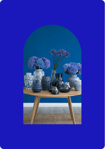
Cobalt blue
Neutrality . History . Intelligence . Seriousness
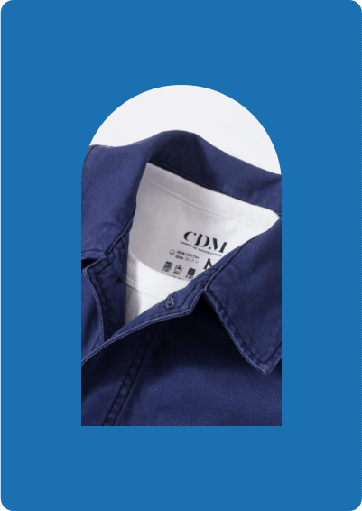
Work blue
Authenticity . Vigor . Solidarity . Youth
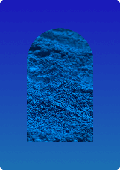
Gradient
Confidence . Serenity . Tenderness . Balance
Color for know-how
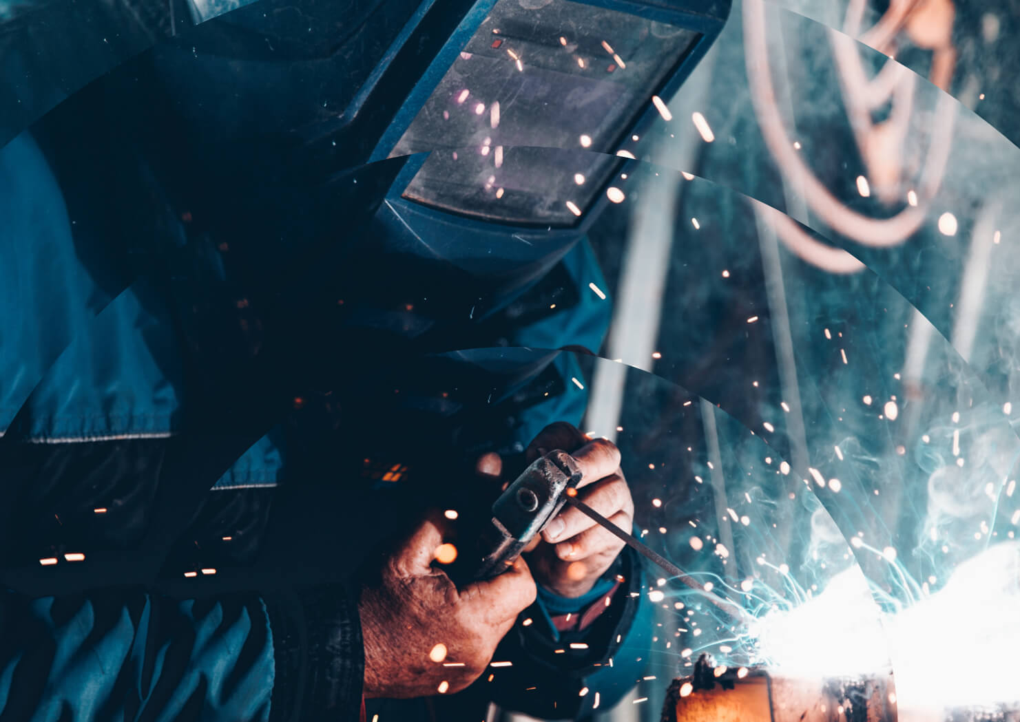
Highlighting this color tells a story and enriches the creative concept of savoir-faire. L'Outil en Main's main palette brings together the main blue and its shades. Seven colors emblematic of France are also presented, reflecting the energy of the various trades. It's a color palette designed to evolve over time.

Building
Hasmanien
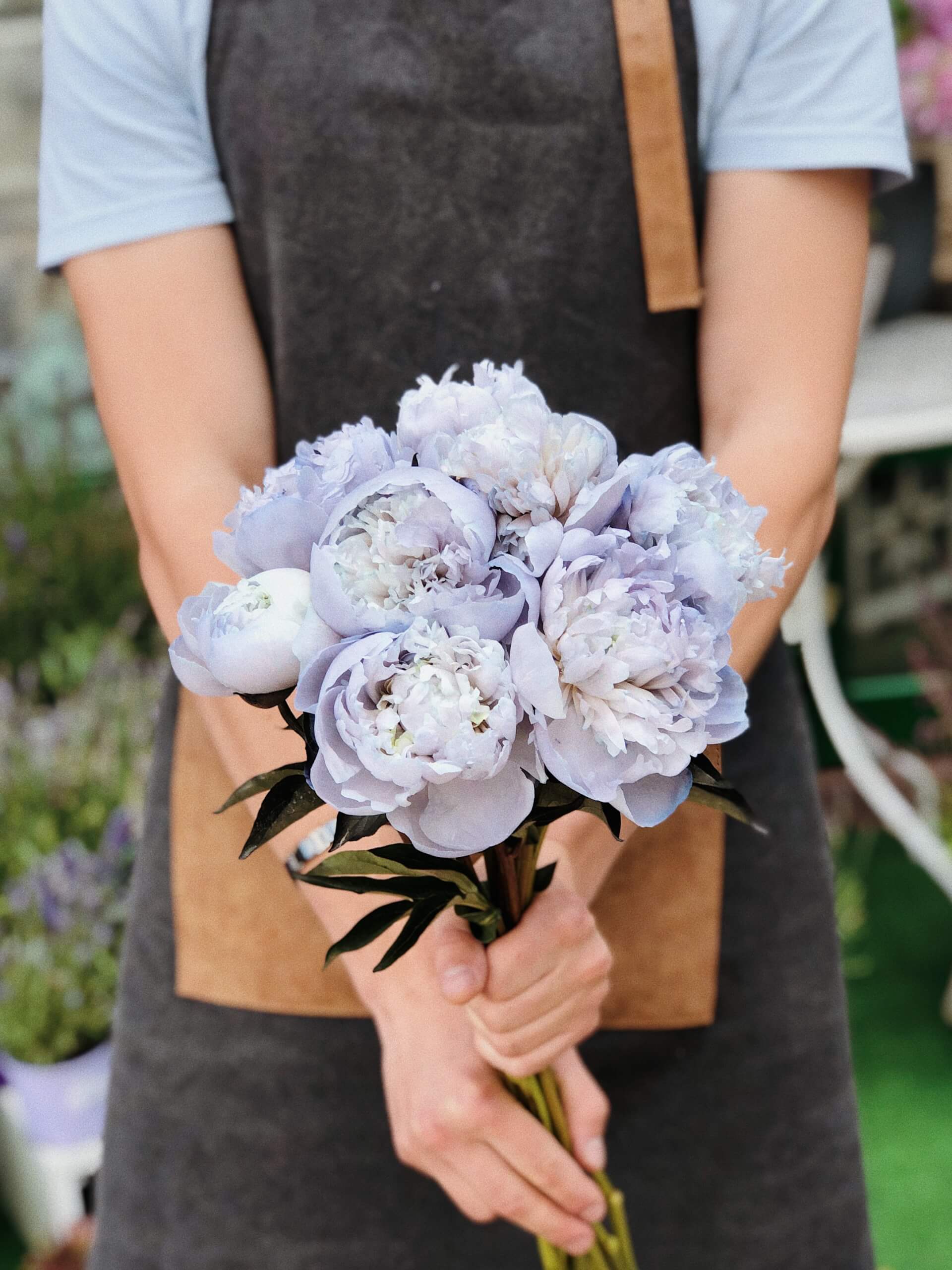
Environment
Oak leaf

Art
Lavender blue
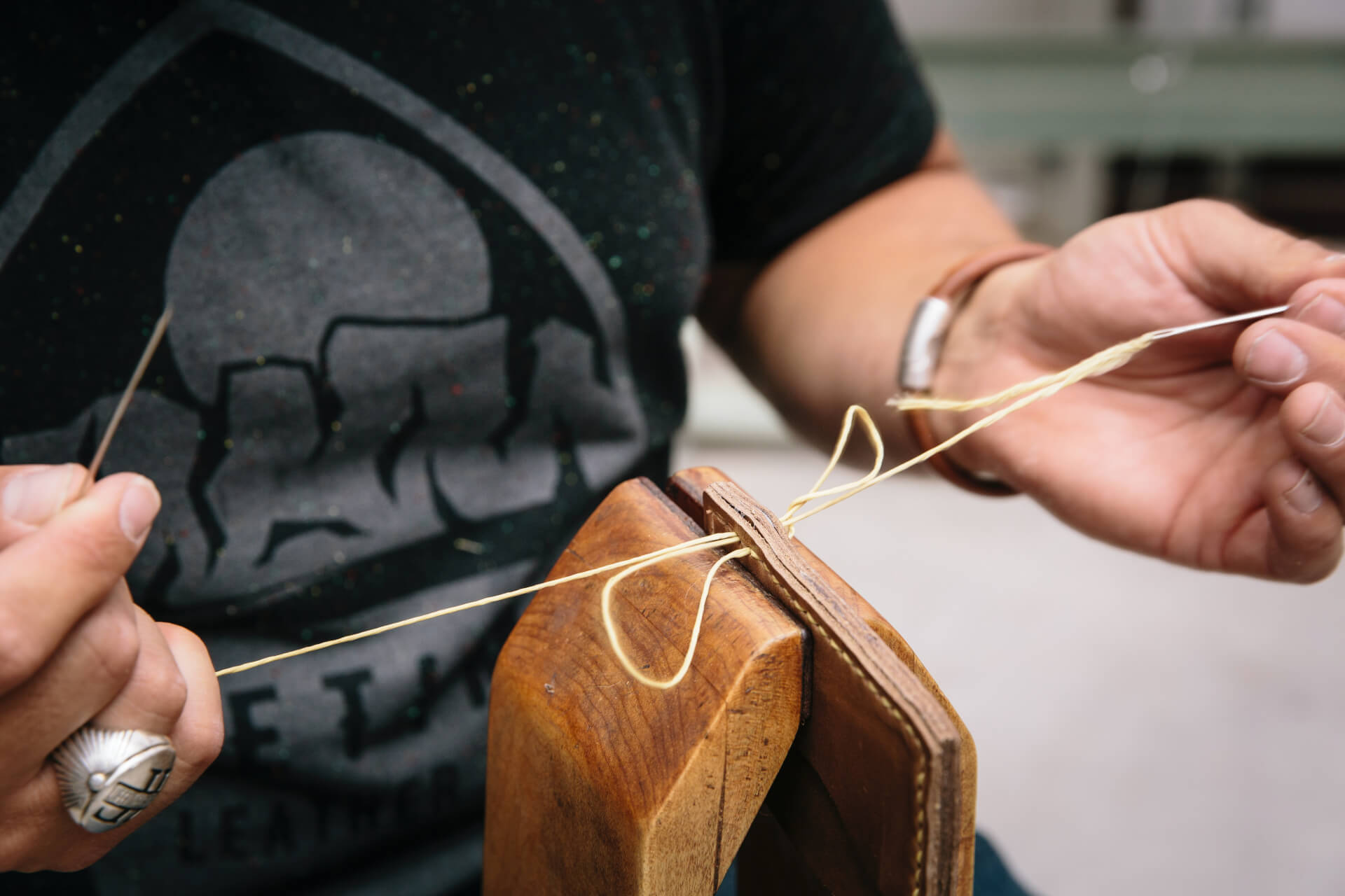
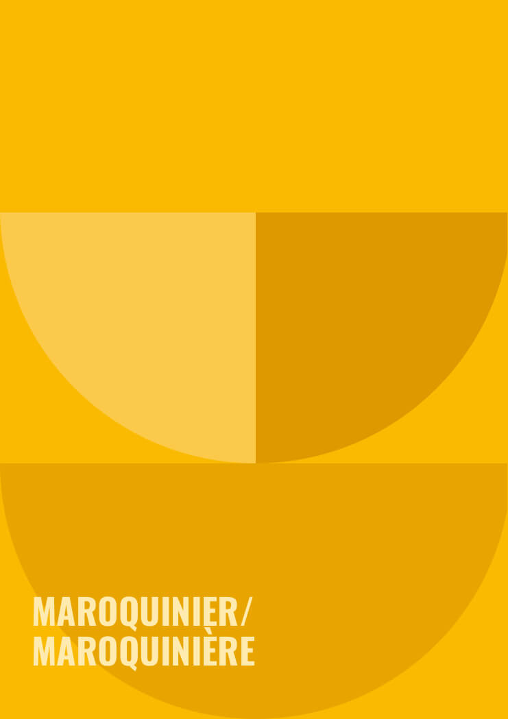
Textile & Leather
Matisse yellow

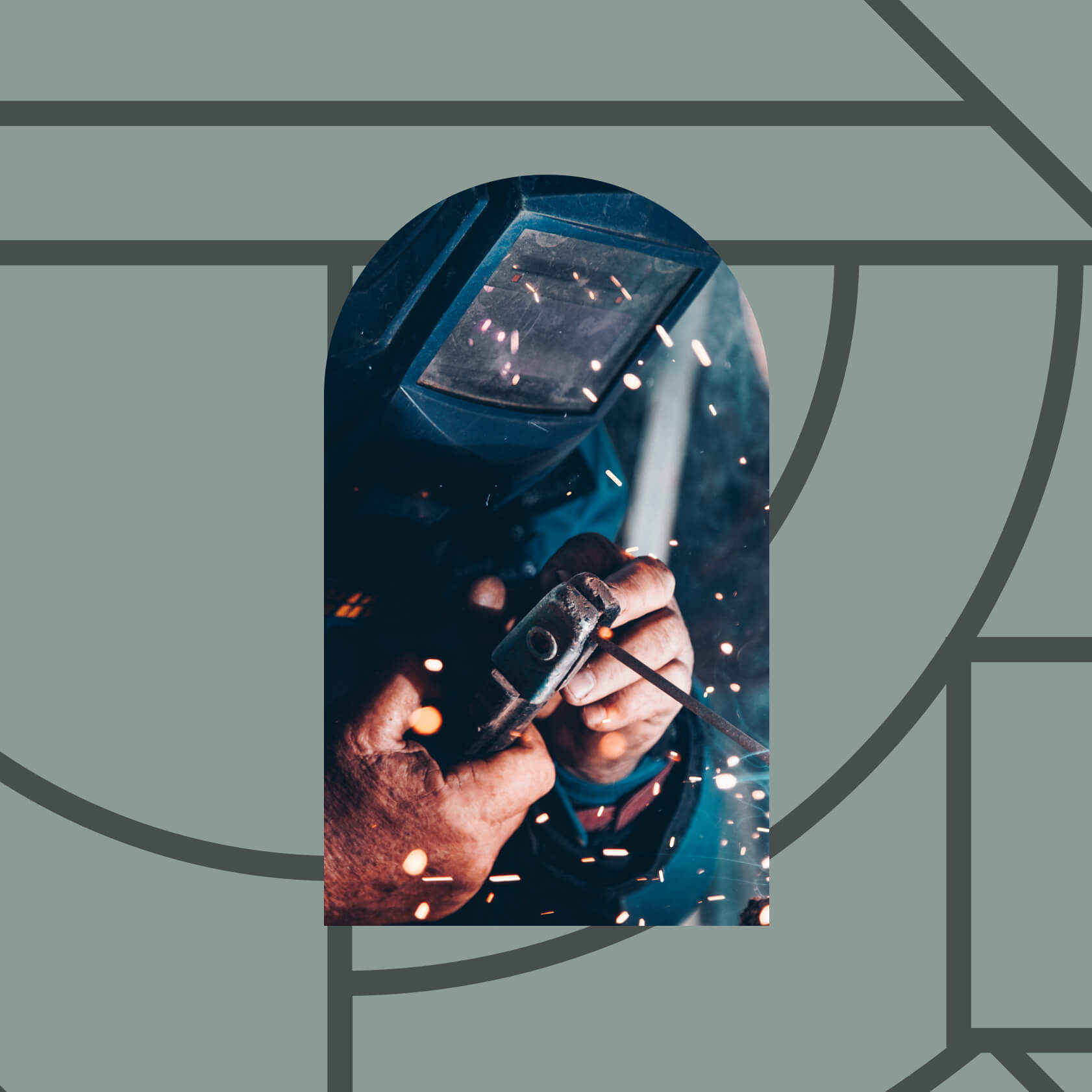
Industry & metal
Zinc gray
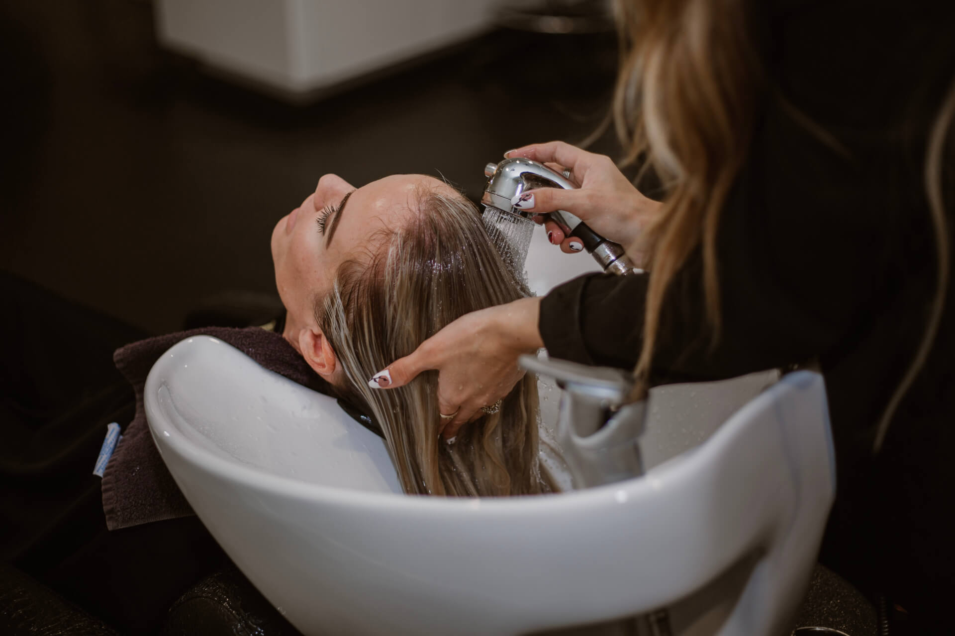
Aesthetics
Life in pink
Mouth
Rouge amour

Other
Bottle green
Graphic design
Two ingredients for one unit
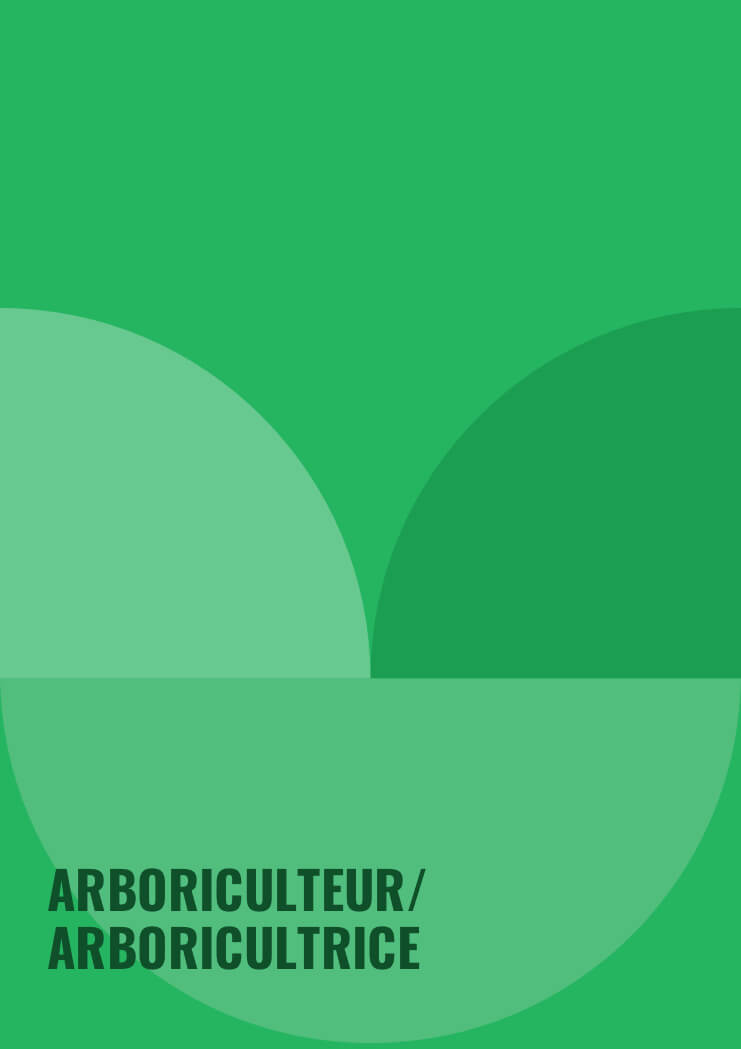
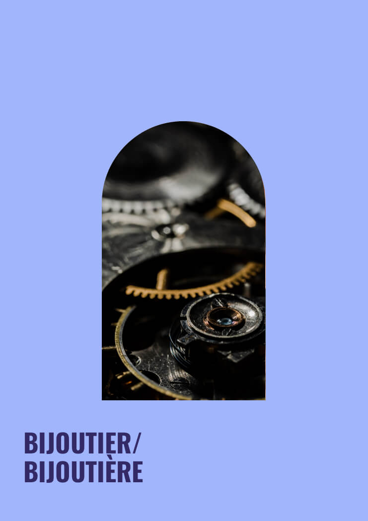
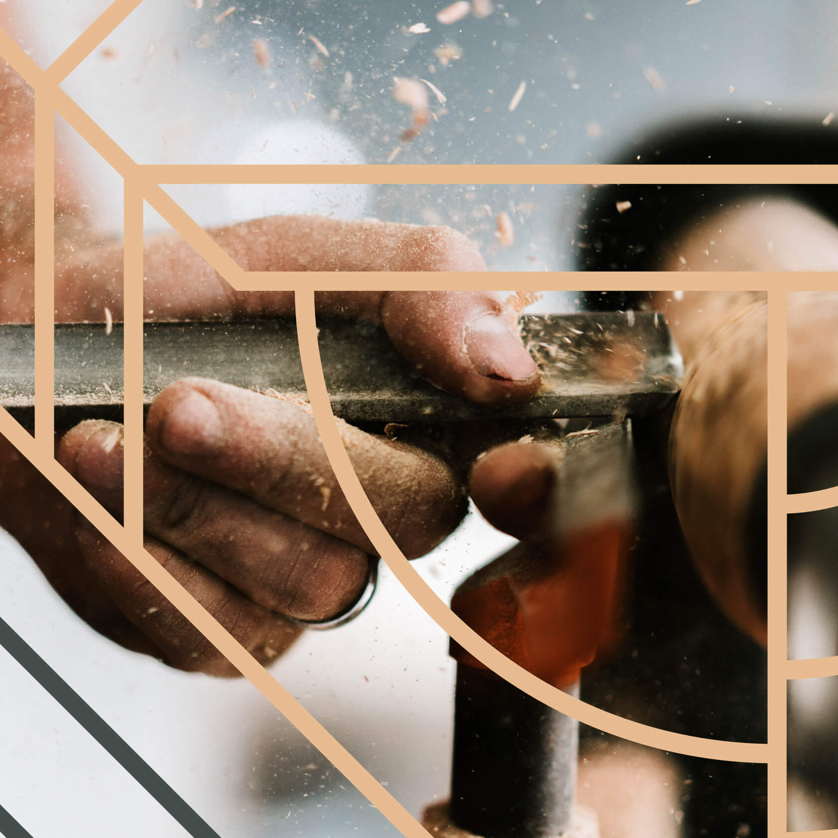
Art direction is made up of two ingredients. Working together and separately, they form the graphic universe of L'Outil en Main: - The graphic motif, which refers to technical aspects, plans, patterns, architecture and geometry. - The universal geometric symbol, such as the circle, semicircle and arc, which symbolizes the bridge, support, passage, door, craftwork.
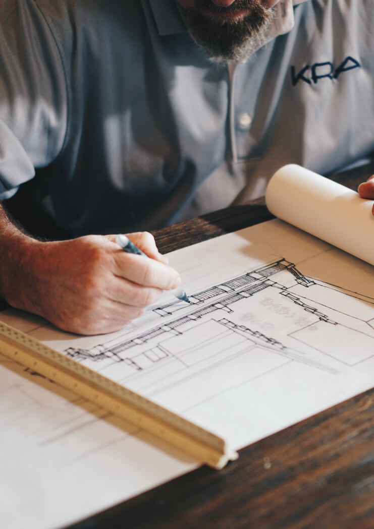
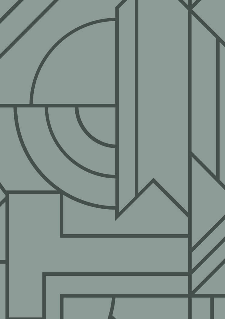
Creation . Know-how . Technique
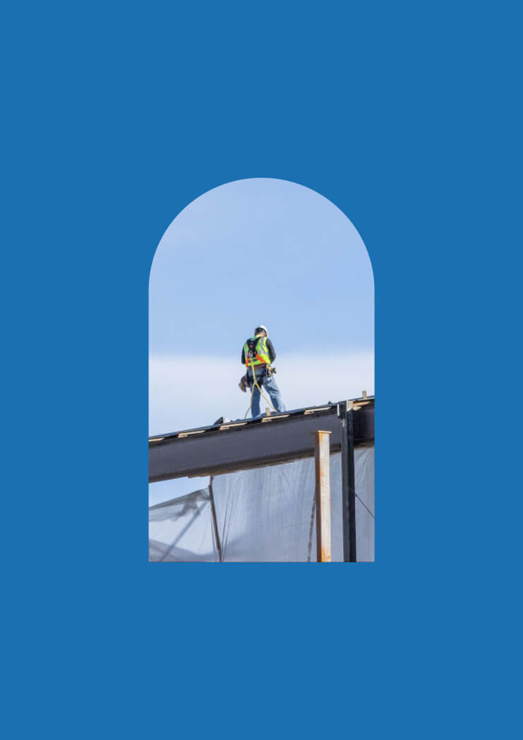
The link . The passion . The path
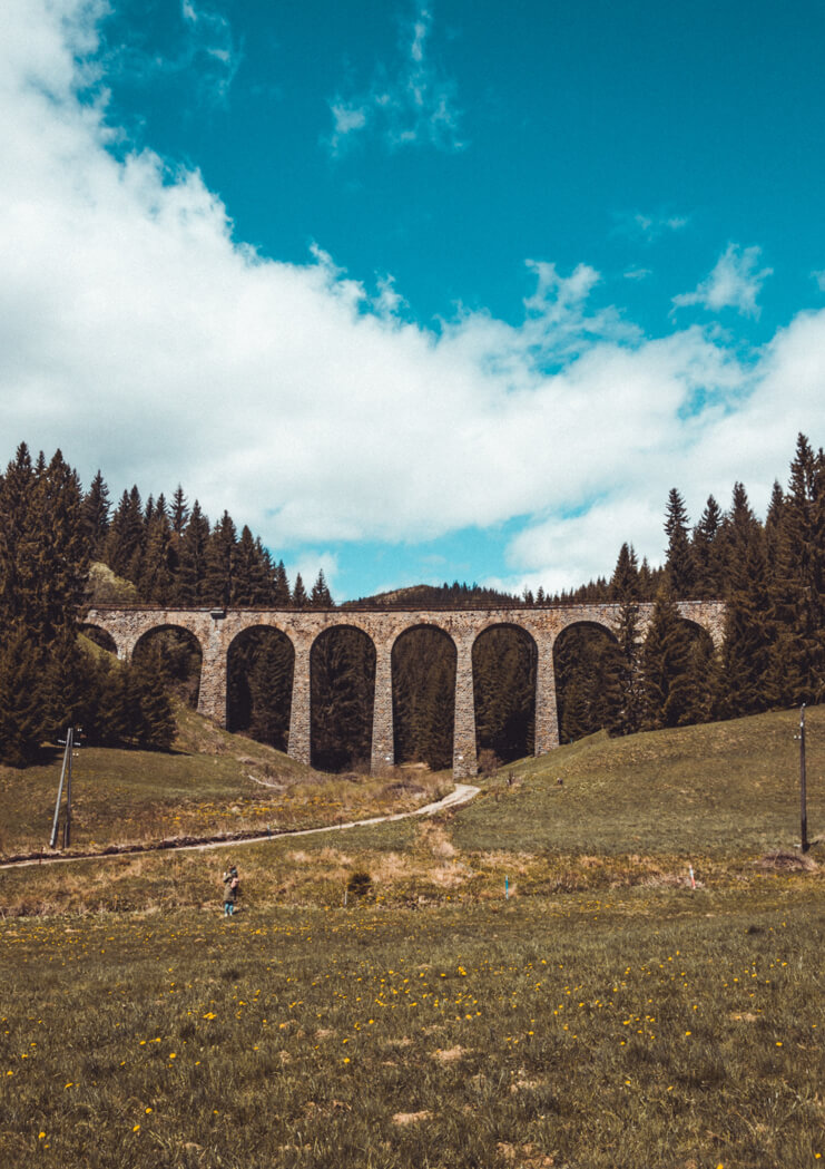
An open door to all possibilities
Whether it's a technical drawing, a decorative or geometric shape, it represents a gateway to design, art and craftsmanship. As a gateway to the world, it combines contemporaneity and elegance to capture attention and raise awareness of the world of craftsmanship.
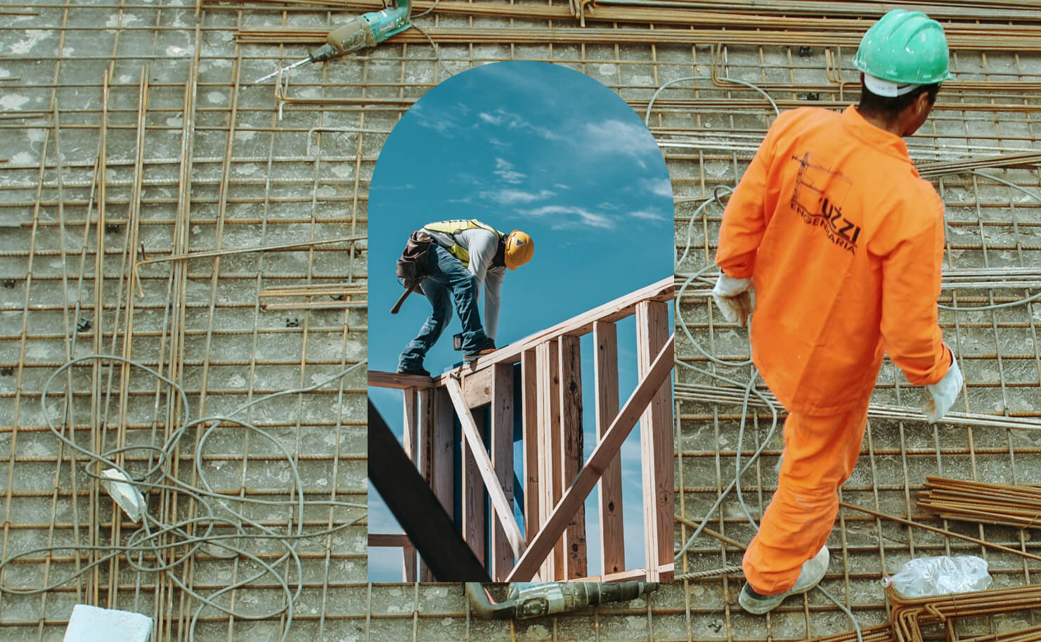

Iconography in motion
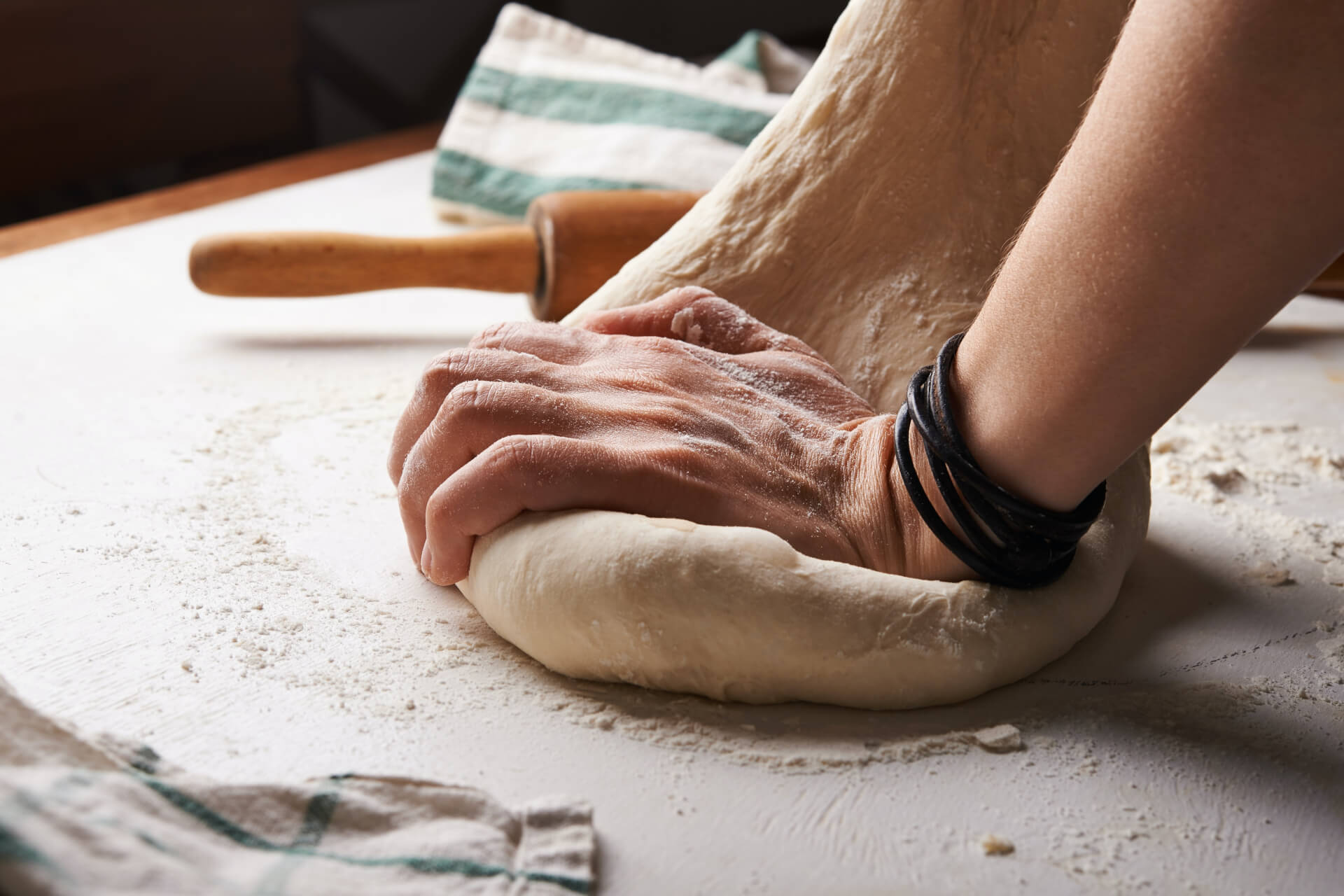
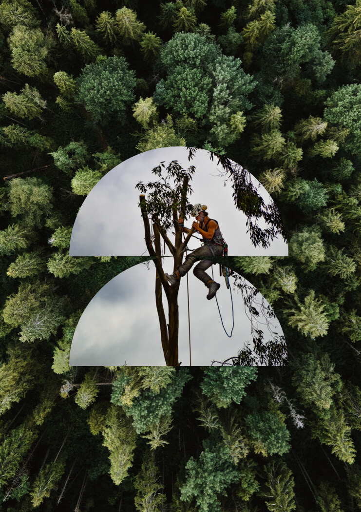
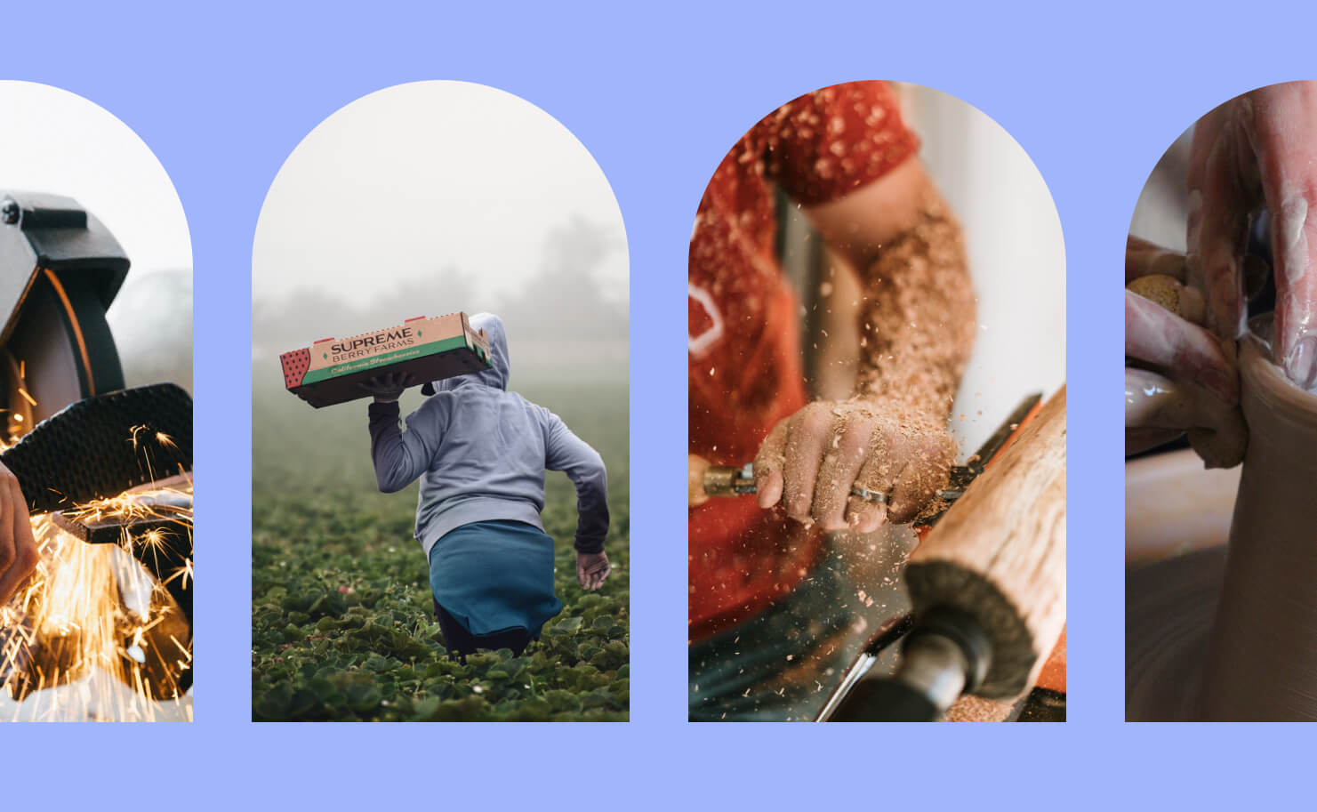
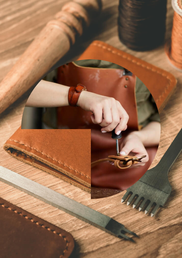
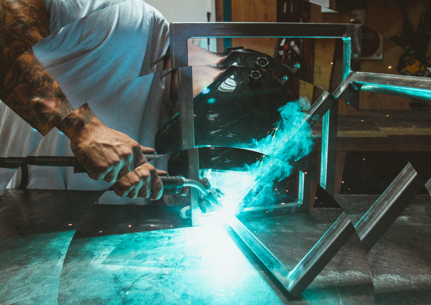
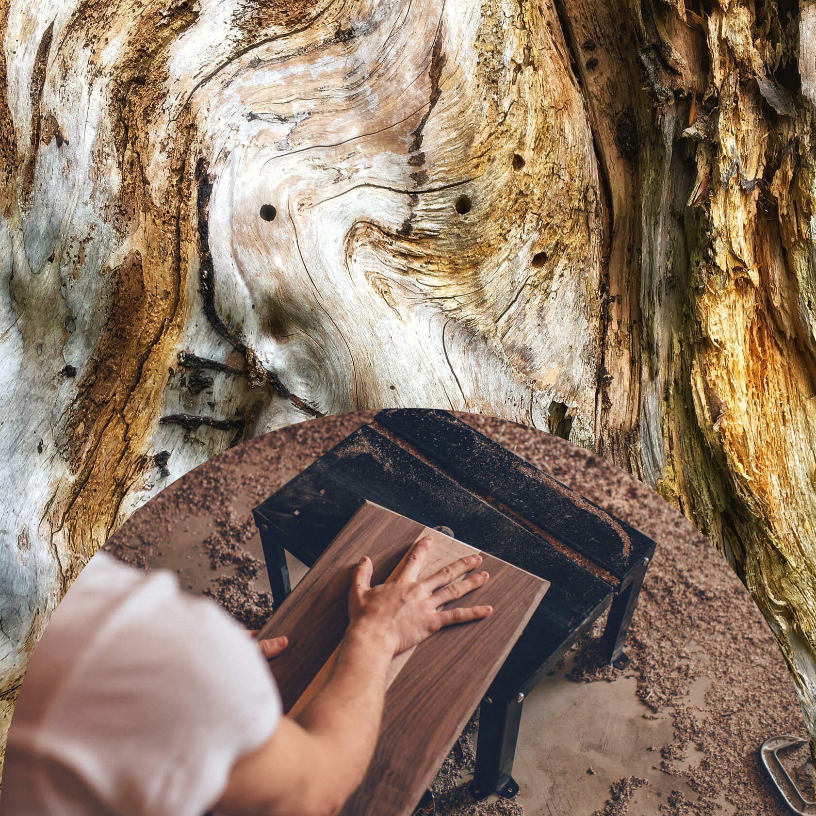
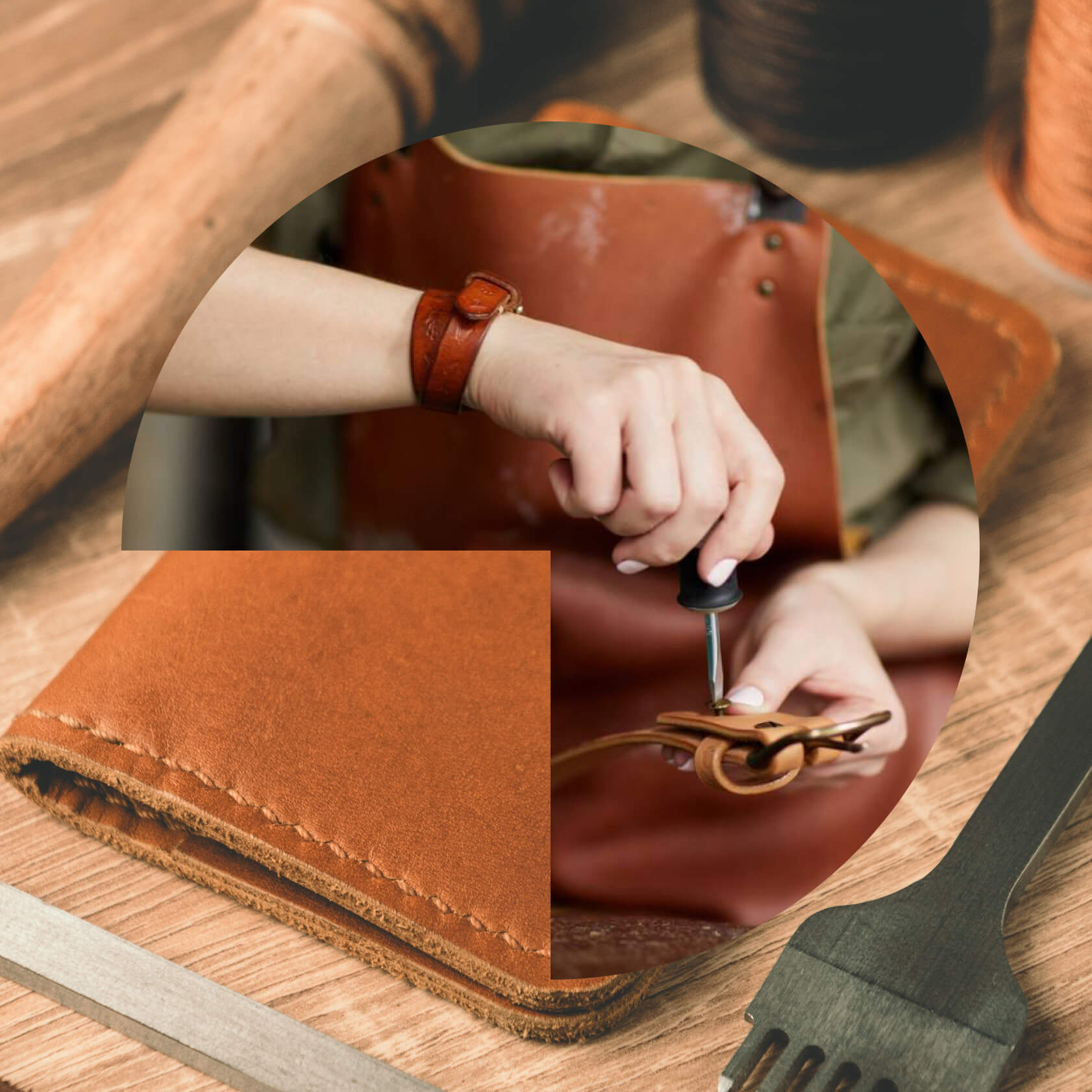
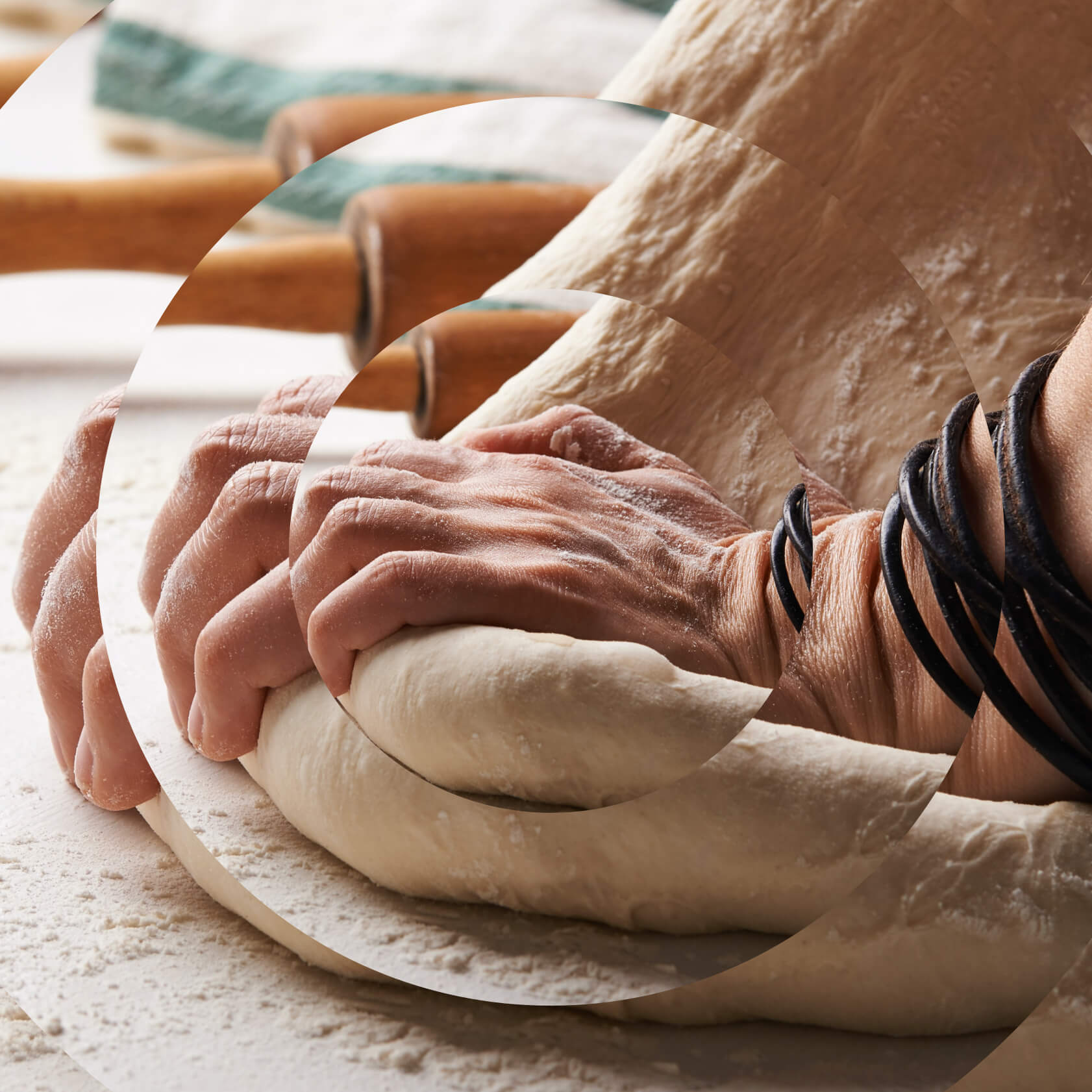
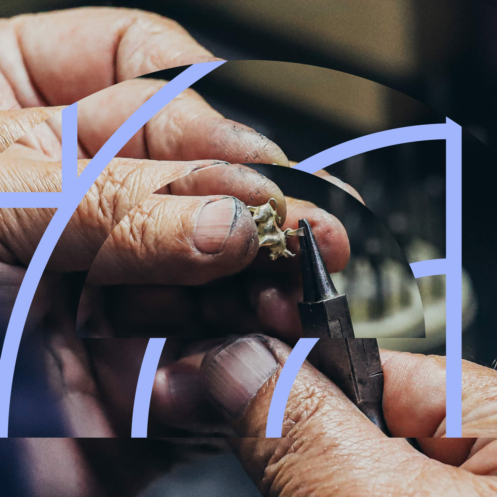
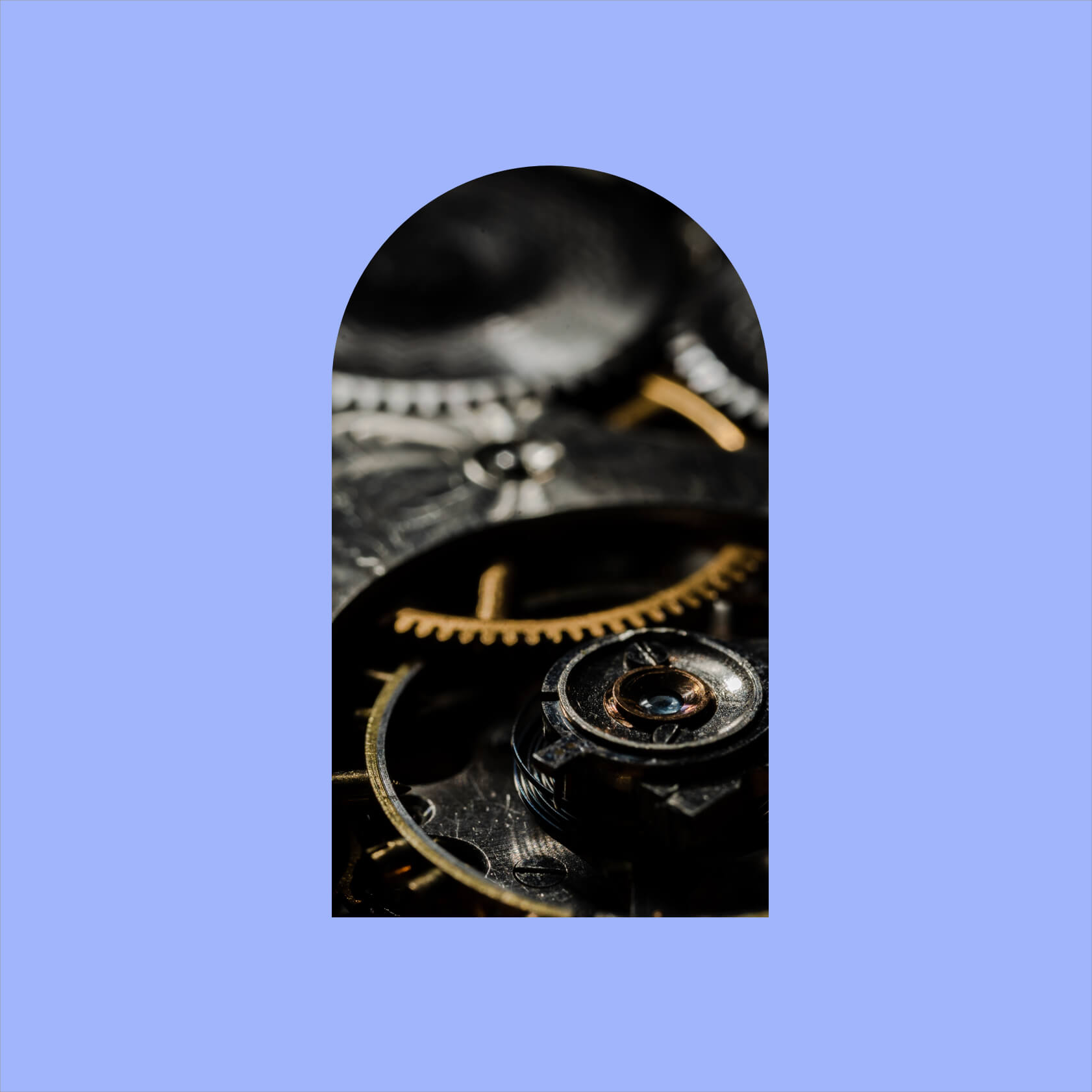
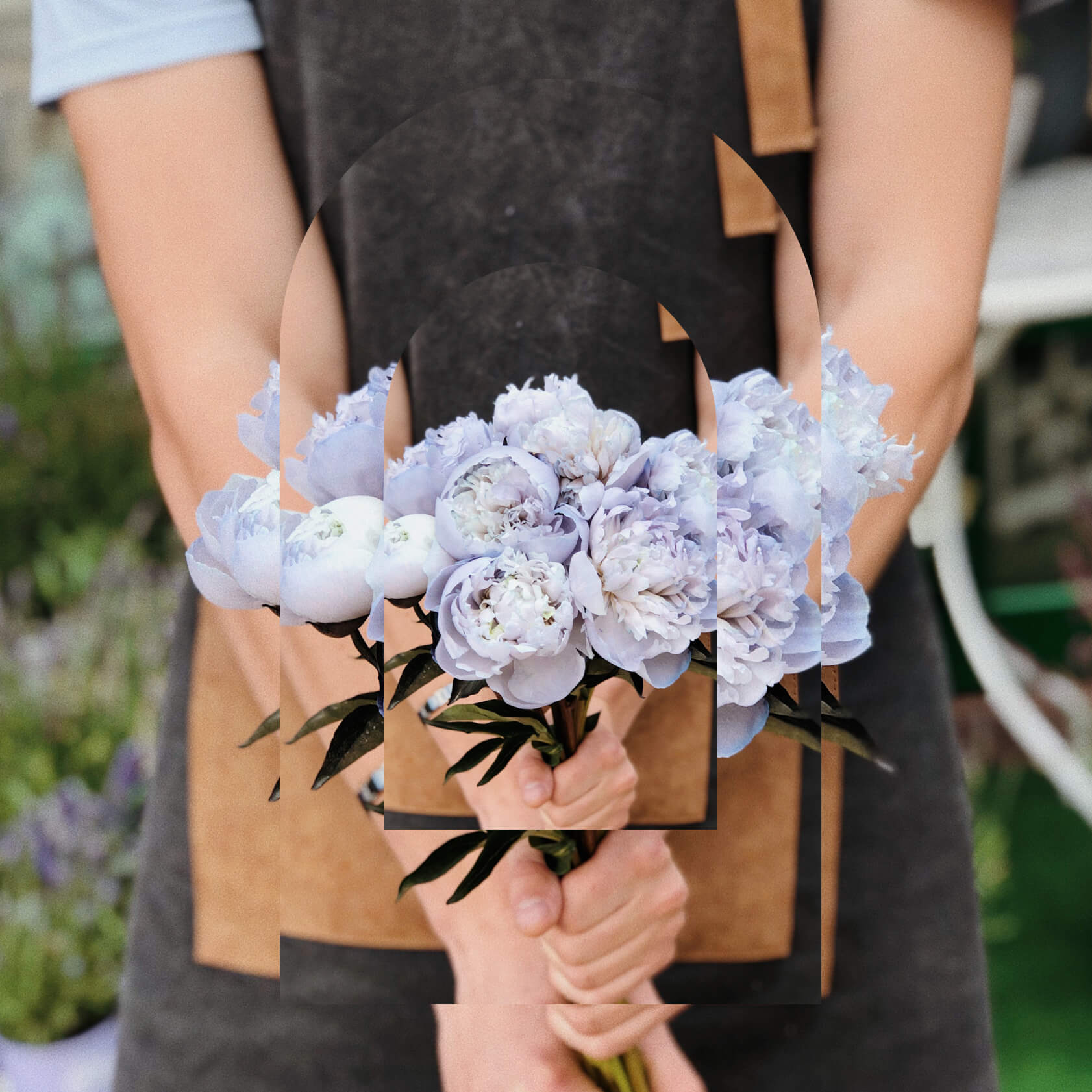
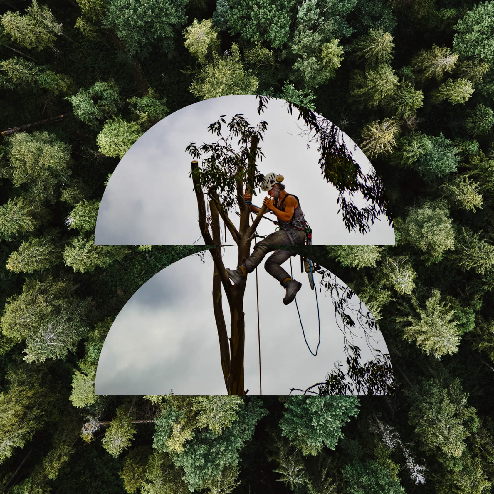
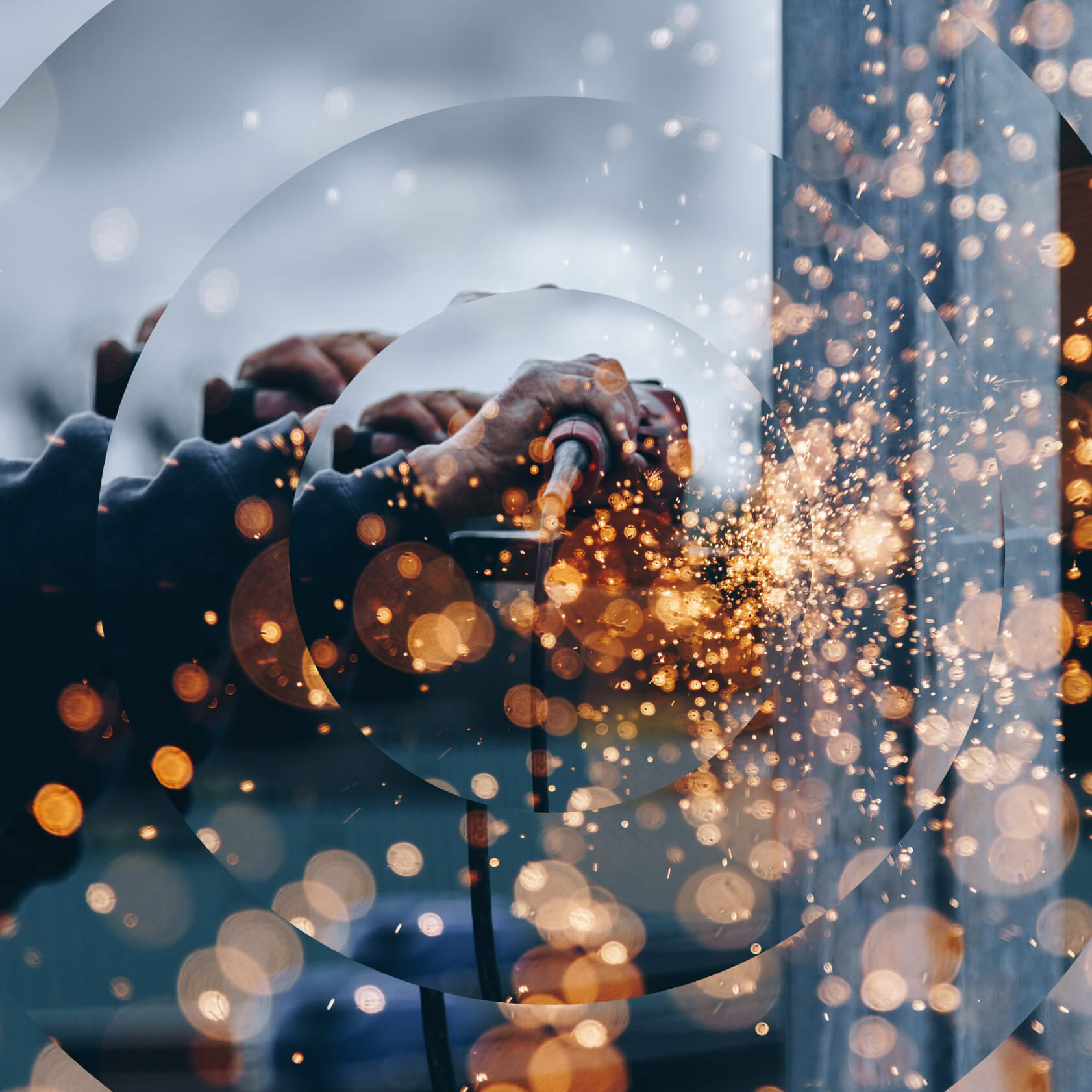
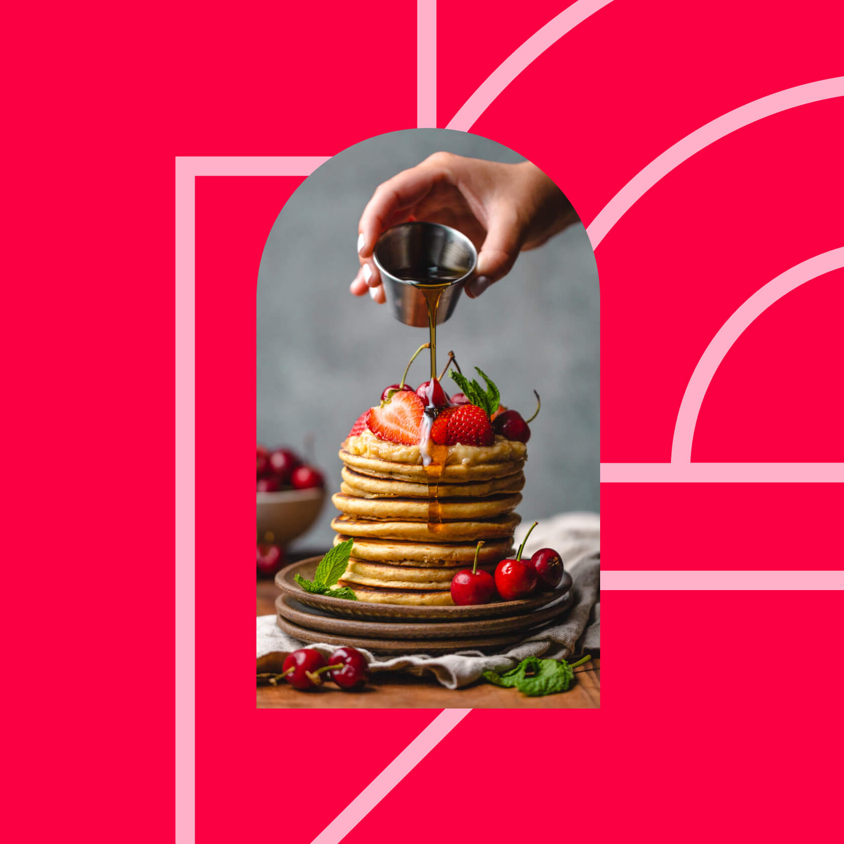
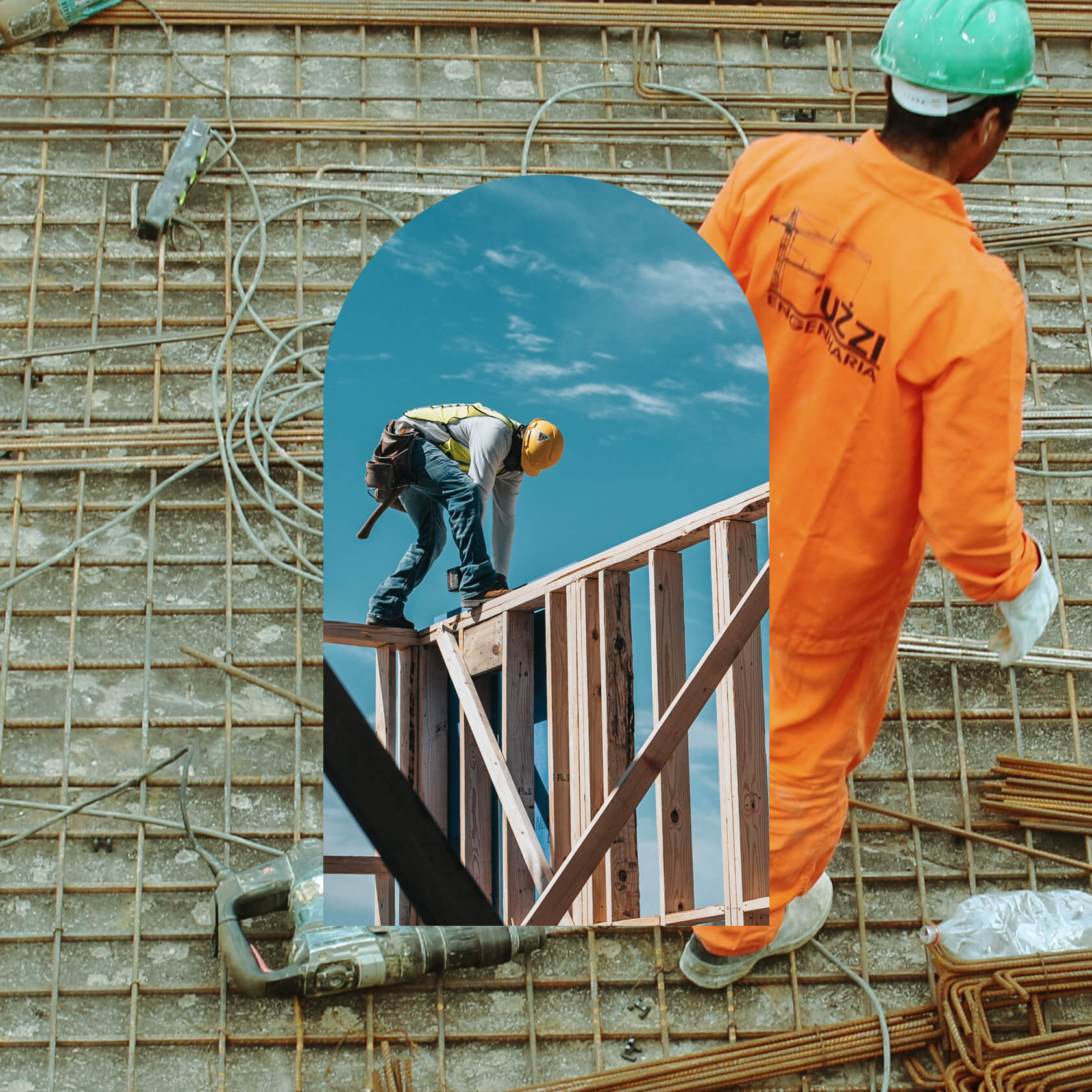
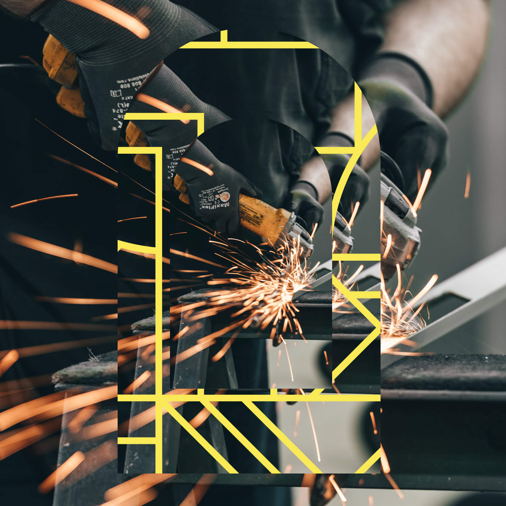
The uniqueness of a precise gesture, of a craft whose know-how cannot be acquired through the pages of a book, the strength emanating from a posture, the perceptible dynamics at work. L'Outil en Main adopts a creative and inquisitive perspective on the precise movements that characterize a job well done. These movements infuse their energy into manual trades, just as they do into life itself. By juxtaposing them with architectural elements and unusual environments, these movements take on a new force, or reveal a new poetry, giving our images their singularity.
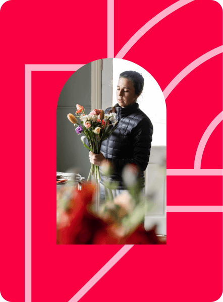
Merger
Geometry as a background graphic tool.
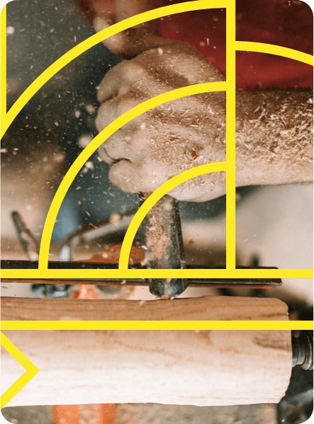
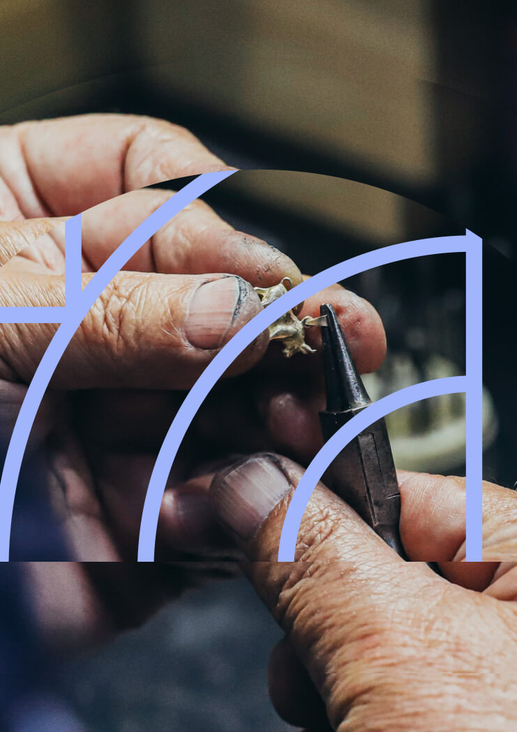
Overlay
Geometry takes possession of the visual.
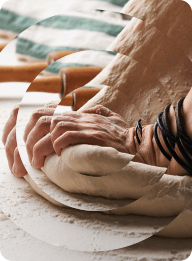
Wave
Geometry accompanies movement.
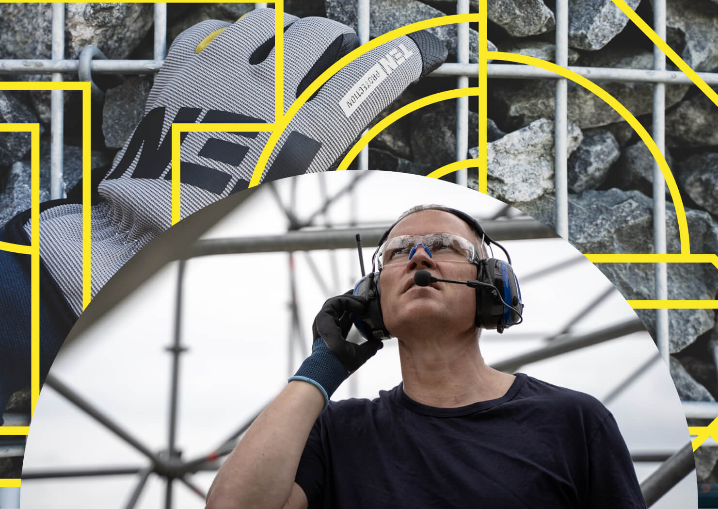
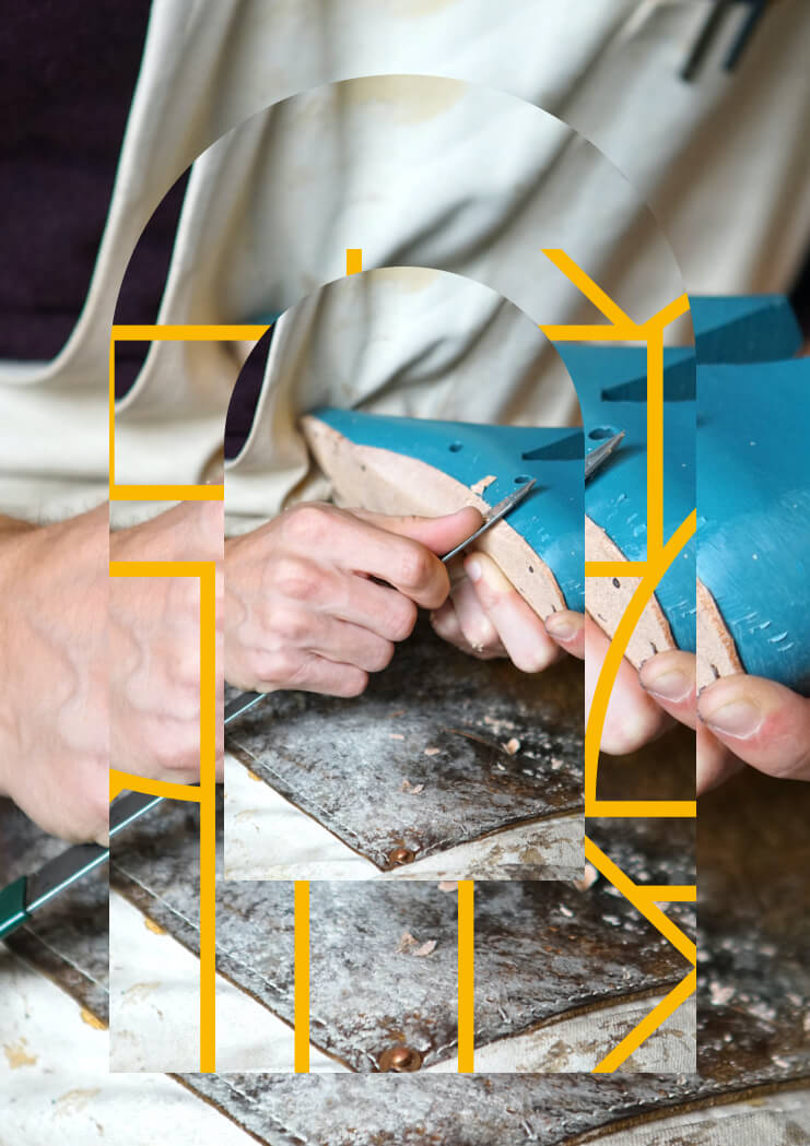
Architectural environment
"Geometry enriches visuals and introduces us to a diverse range of visual styles: dynamic, poetic, architectural and modernist. It's a rhythmic vibration that follows movement, the gesture of a craft, the know-how of a job well done.
Webdesign
Impactful design to give the network the website it deserves
A website that stands out for its efficiency, inspiration and professionalism, while perfectly revealing the core values of Outil en Main.
DESIGN AND VISUAL IDENTITY
The welcoming colorimetry of the tool in hand combined with a clean, precise design
Inspired by the characteristic blue of L'Outil en Main, the site was designed to engage visitors in the association's actions and facilitate access to the necessary information. The only color used in addition to blue, associated with the different trades, supports navigation and gives rhythm to the different pages.
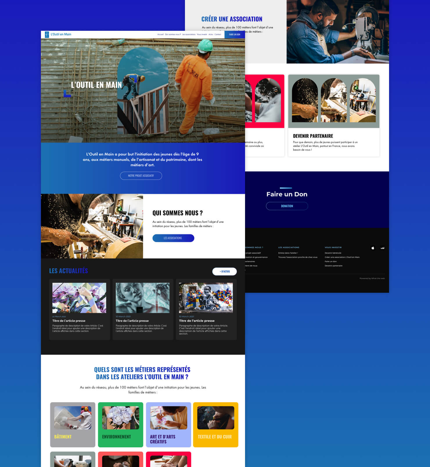
DESIGN AND VISUAL IDENTITY
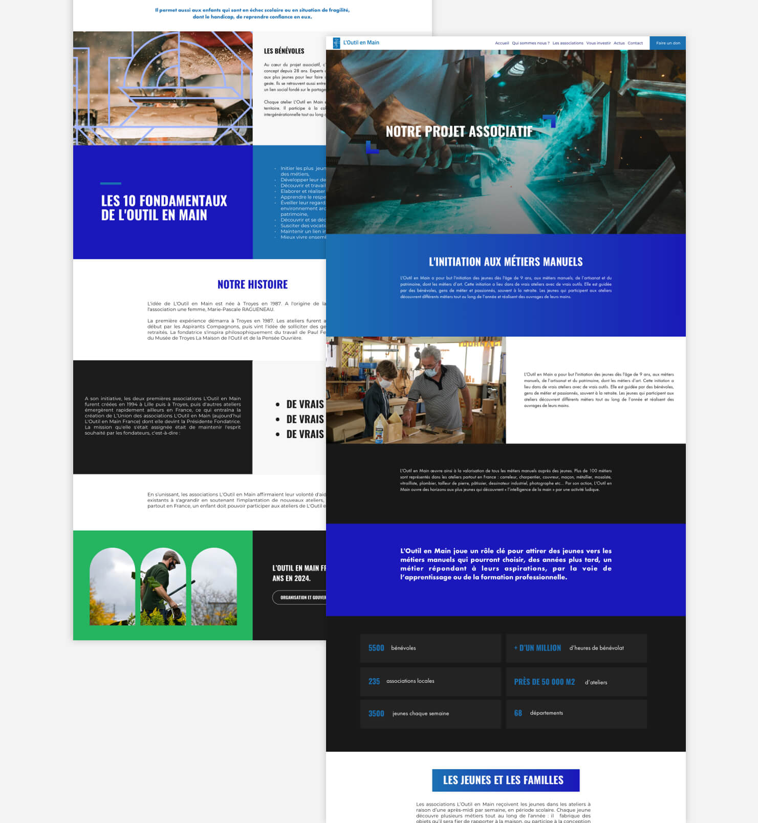
Design sets the pace for site content
The site's design shapes and evolves around the textual content, guiding the visitor's path and adding depth through shades of blue, accentuated by the contrast of black and white, a colorimetric choice that is both timeless and elegant.
Colors
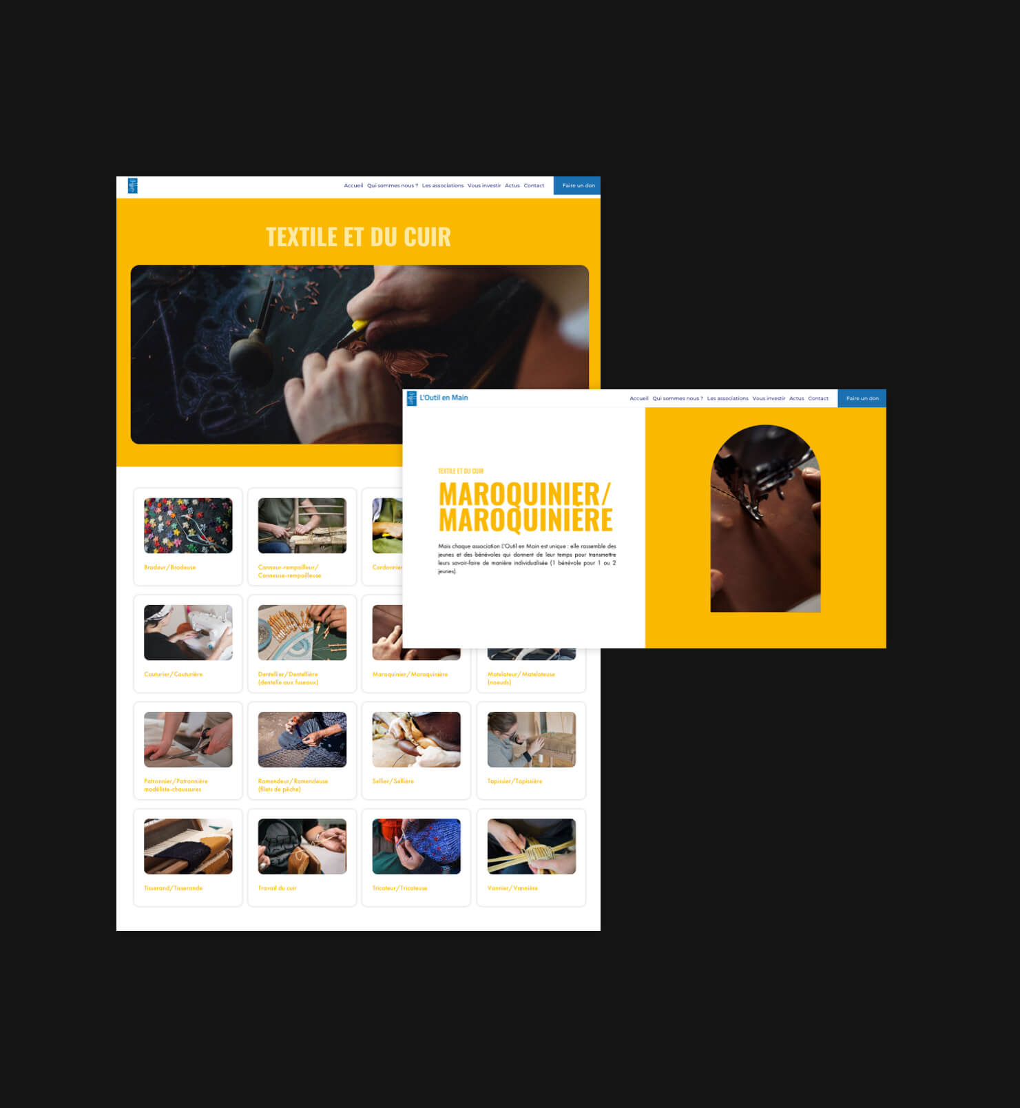
A choice of color for every trade
Each profession is associated with a specific color, highlighting its know-how and guiding visitors through a simple, fluid navigation.
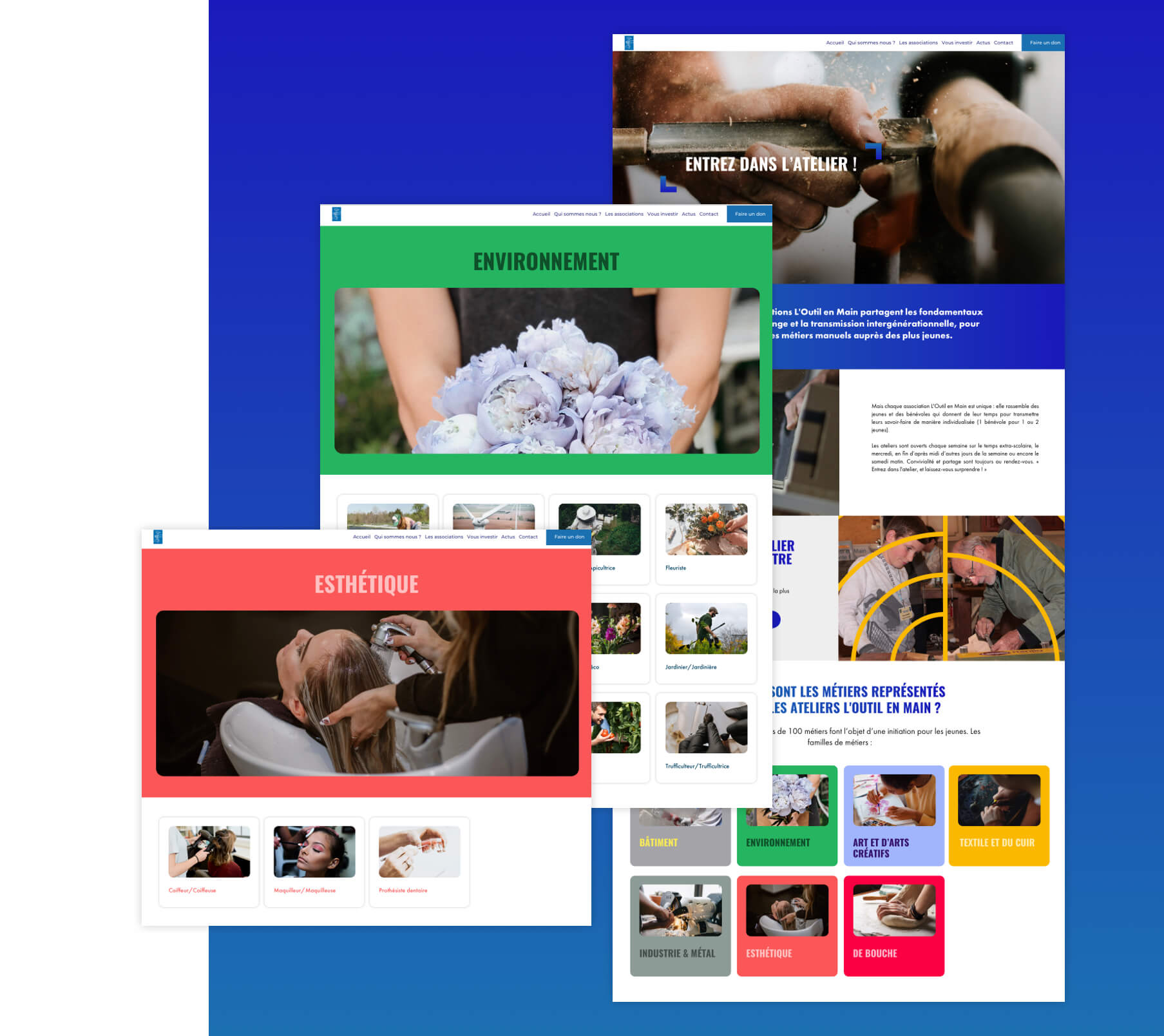
Colors
Giving know-how a voice
An explanatory page is dedicated to each craft, using elements from the art direction to highlight the craftsmanship and facilitate understanding of each skill.
ADAPTIVE DESIGNS
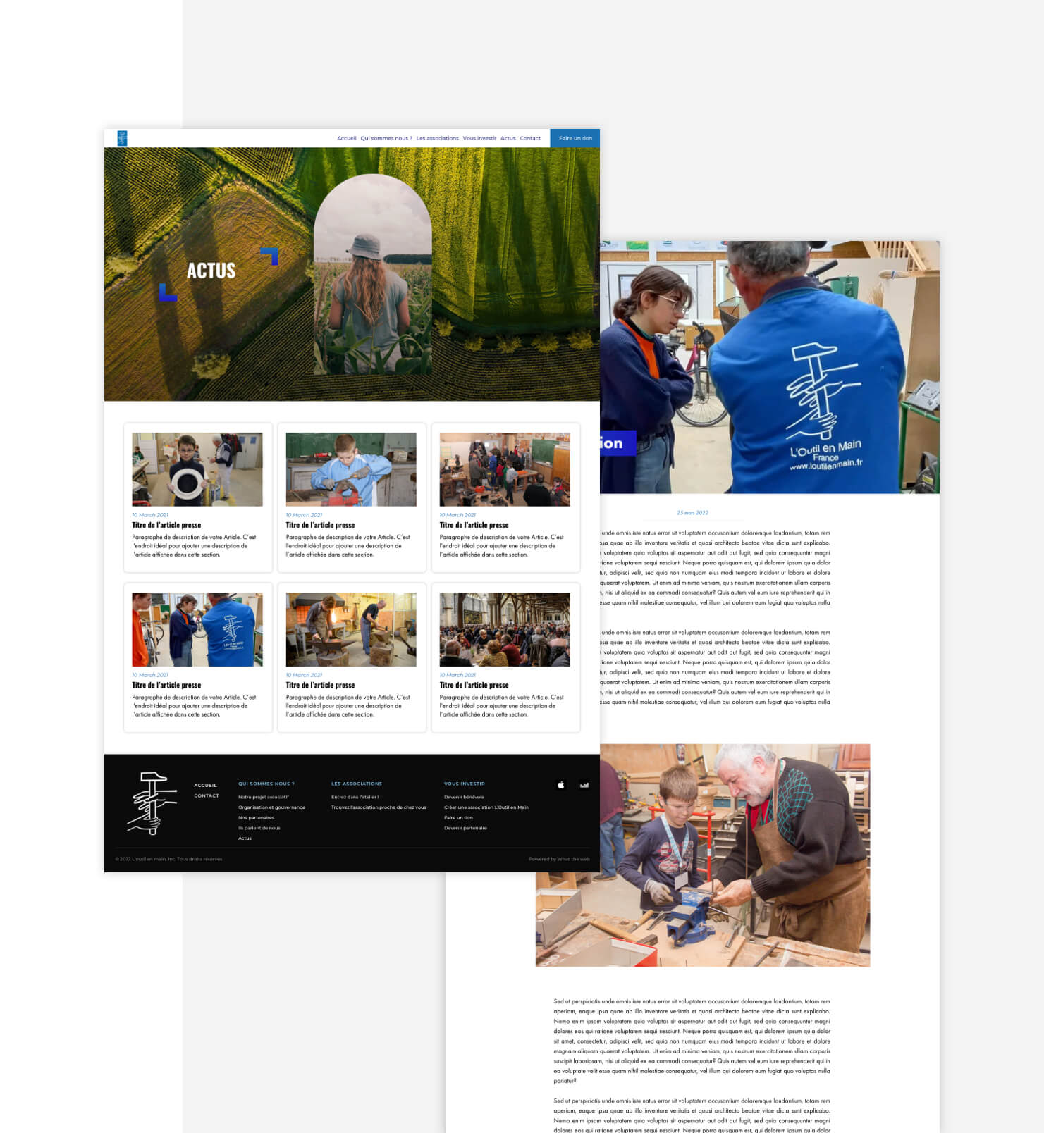
A variety of striking presentations for news and content
For each article and new page, the What The Web tool offers a selection of varied design templates. These user-friendly templates make it easy to integrate video, text, images and audio files.
RESPONSIVE SITE
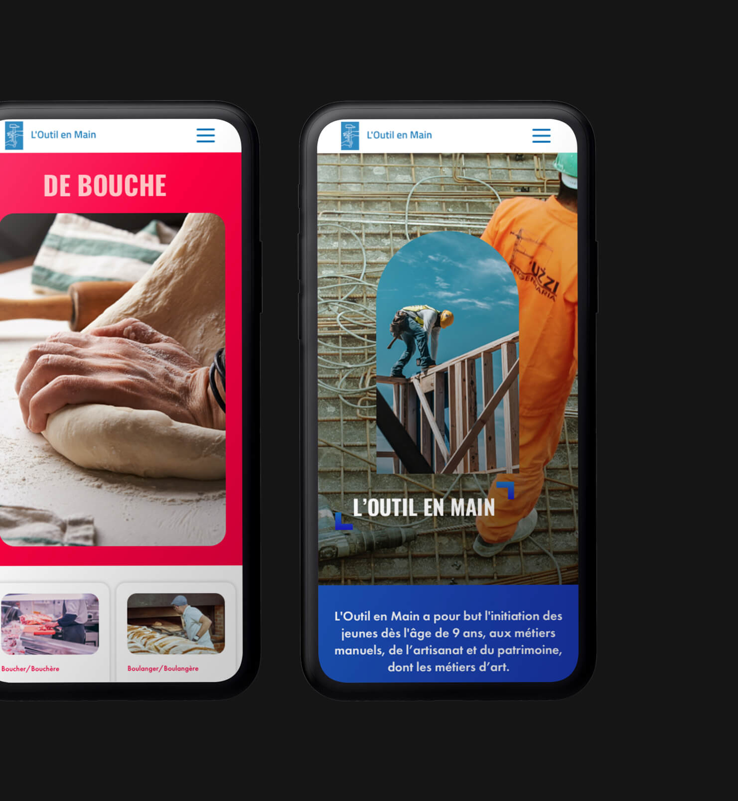
A responsive site designed for web, mobile and tablet use
The site's graphics have been designed to maintain a consistent impact across all formats.
A new dynamic for L'Outil en Main communications
Contemporary communication that blossoms over time, making full use of visual identity to create an impactful and powerful visual panel.

A casual menu that speaks for itself
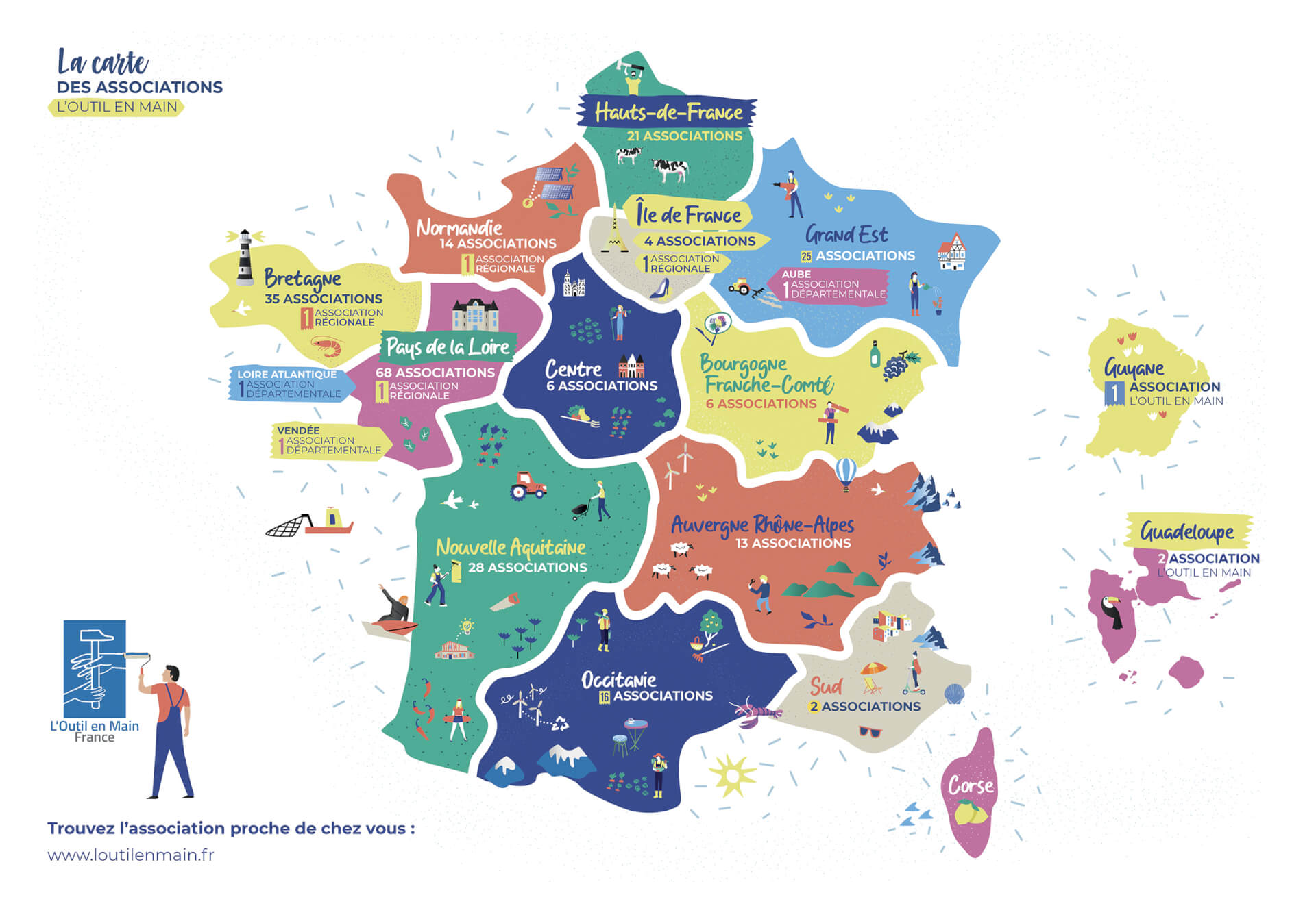
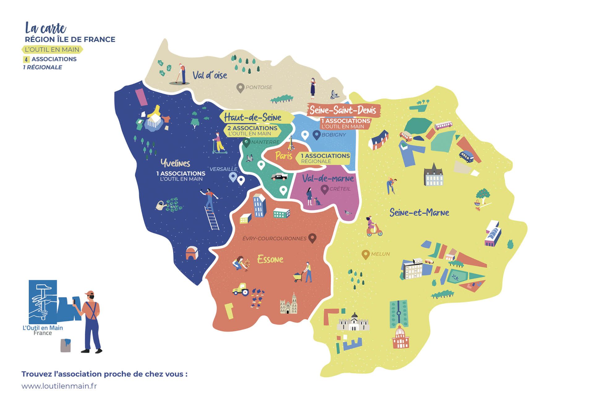
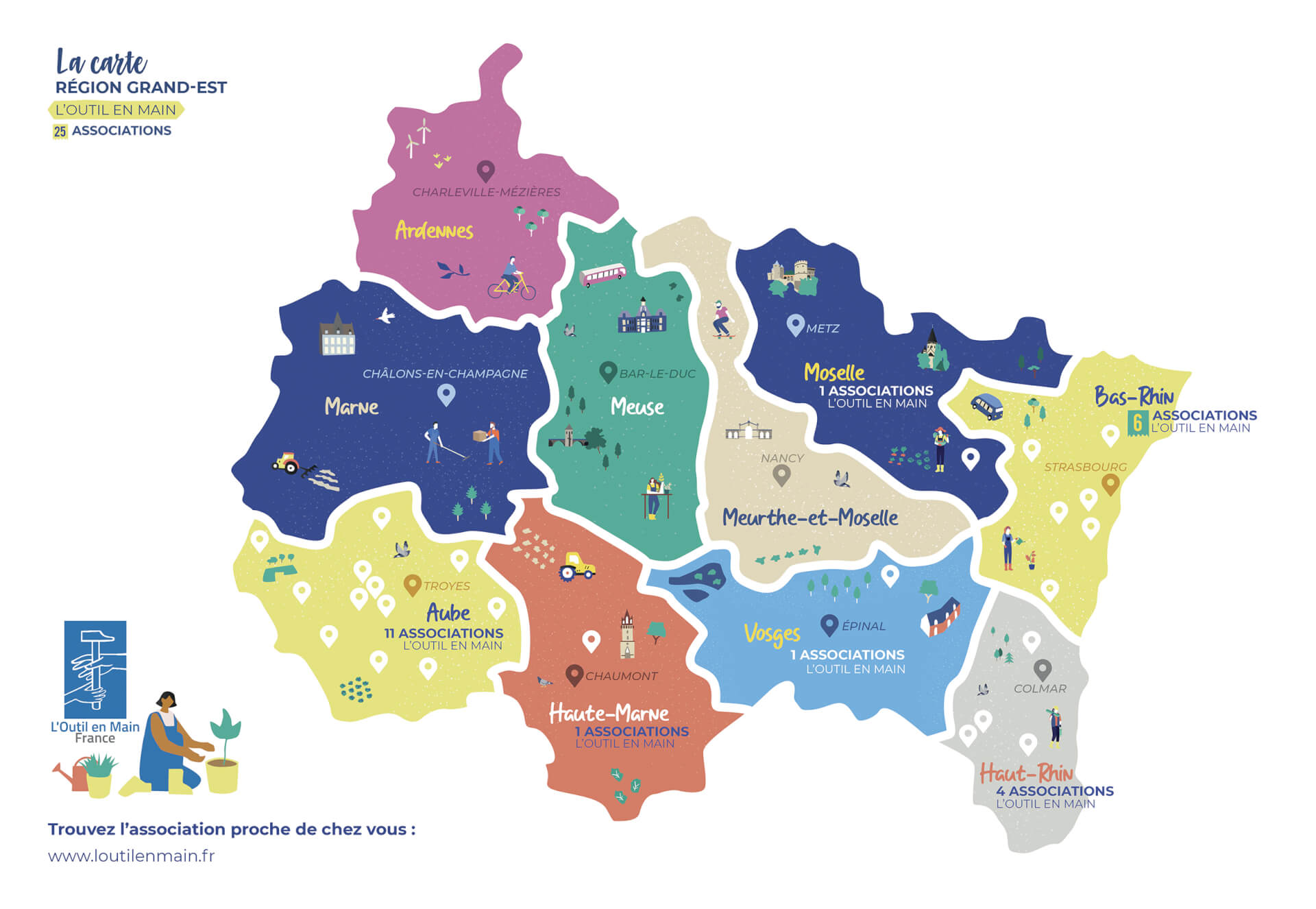
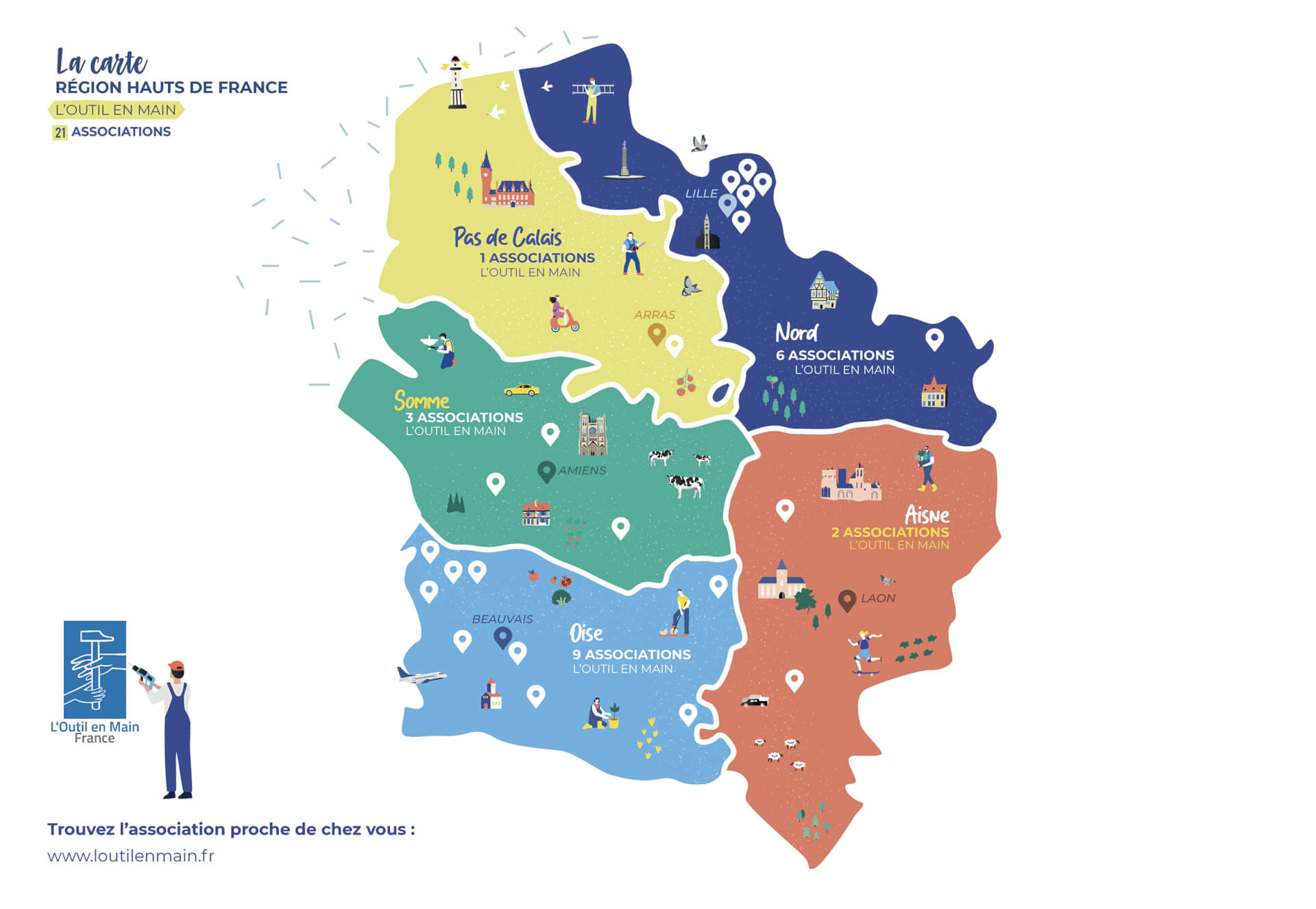
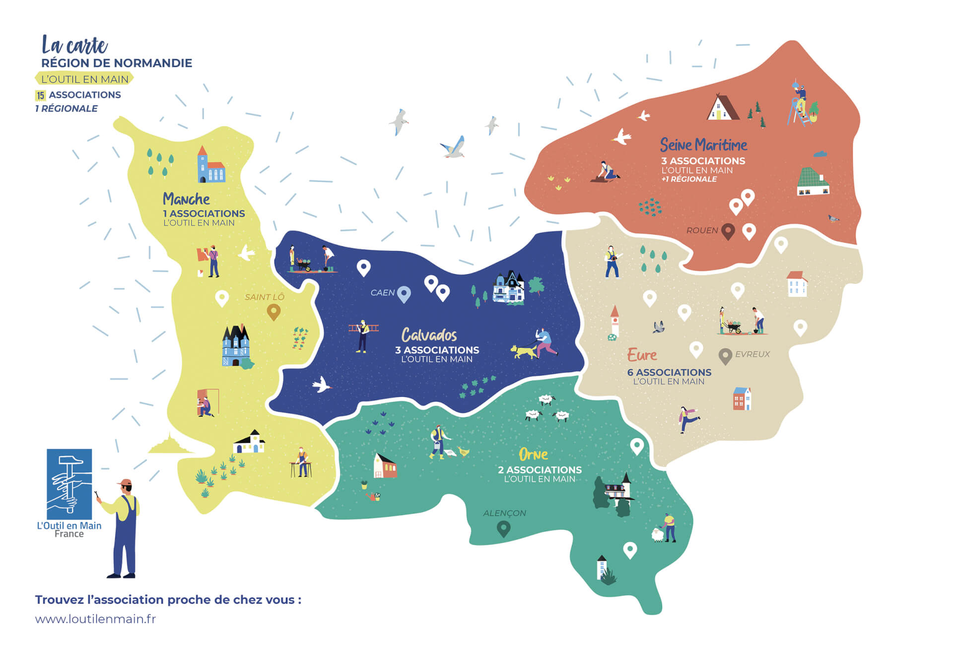
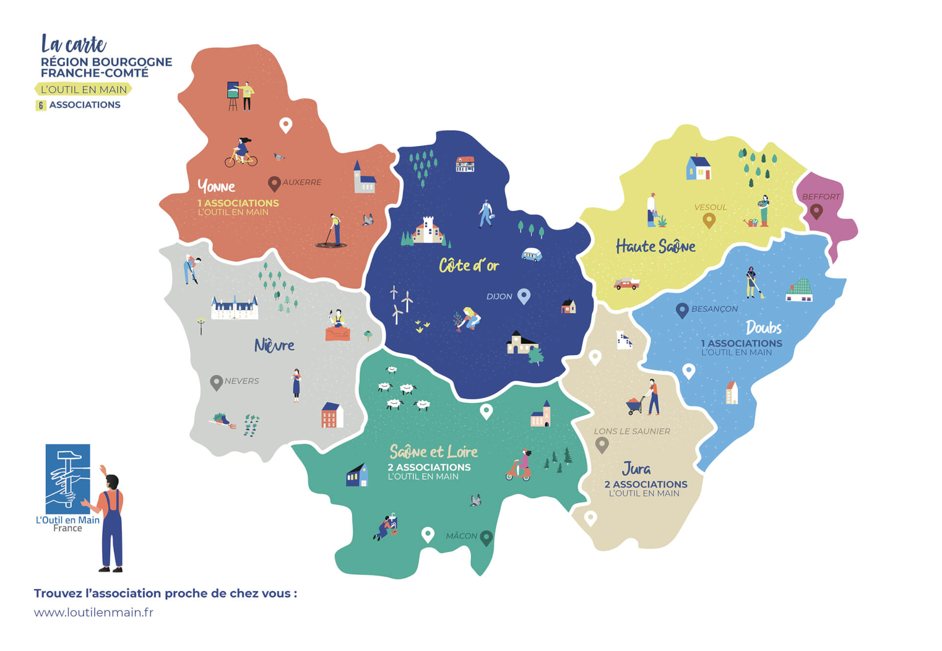
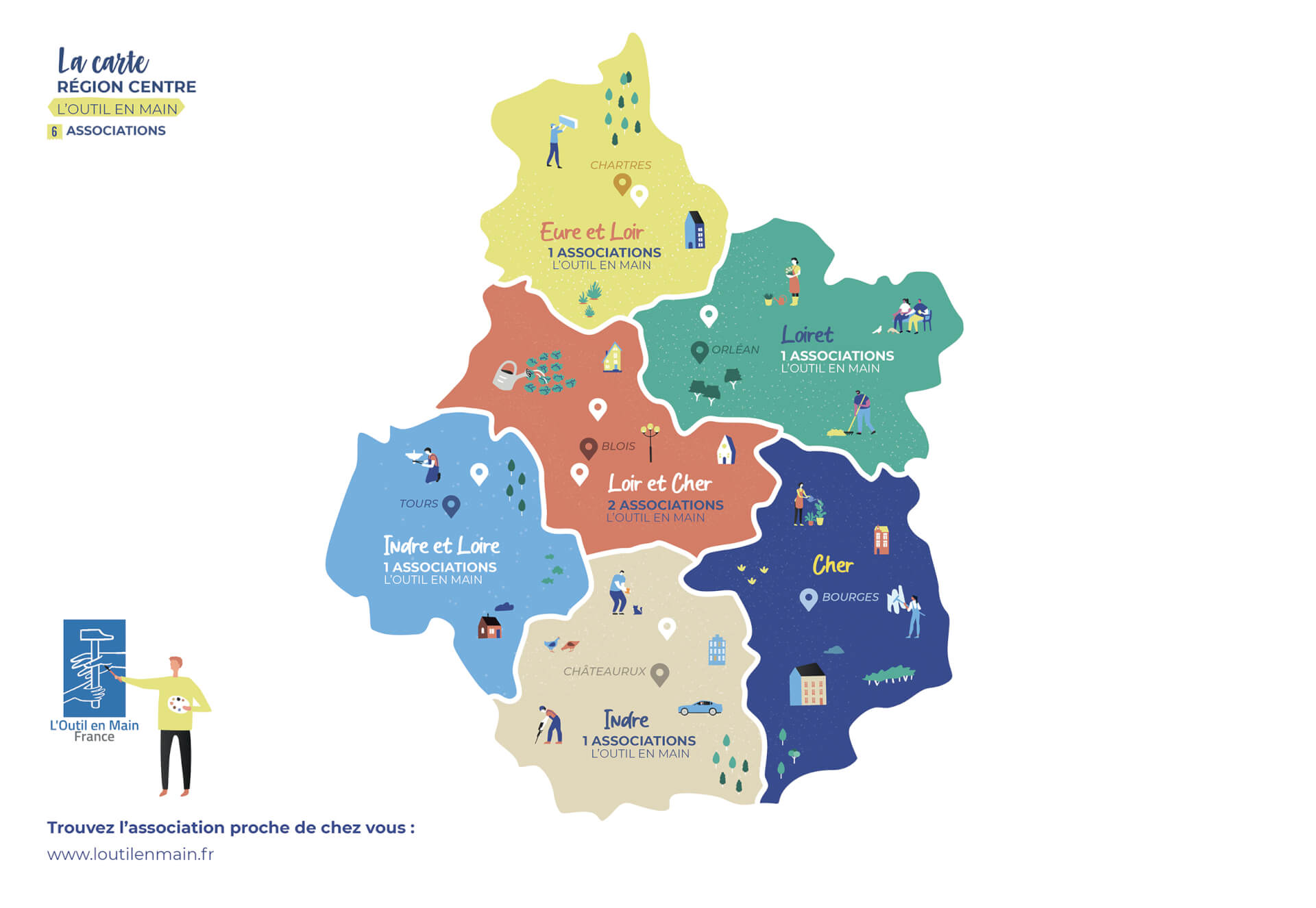
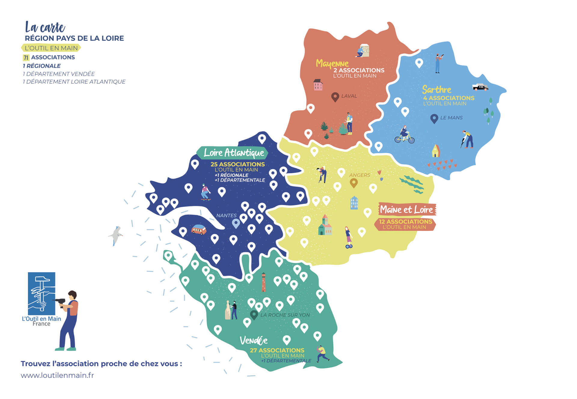
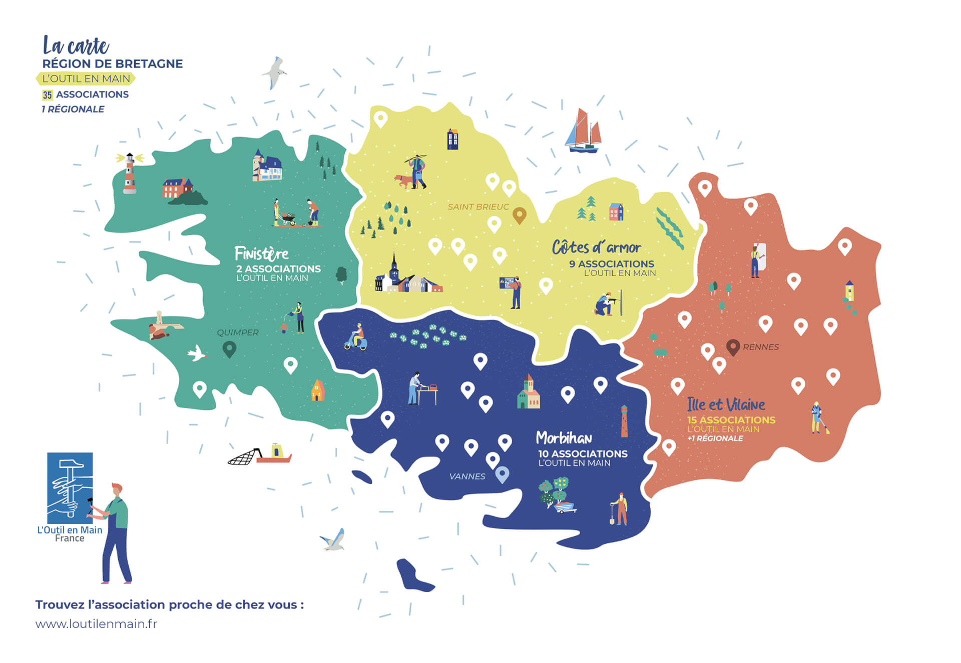
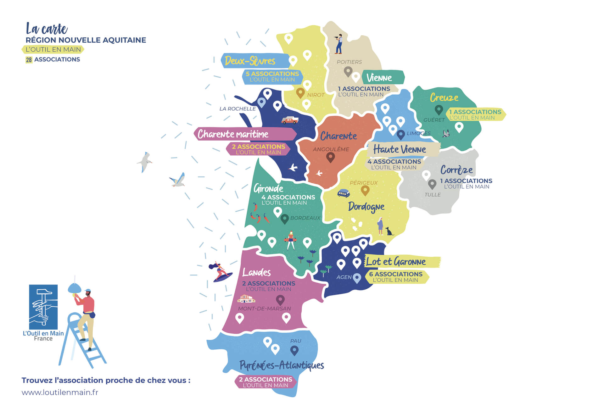
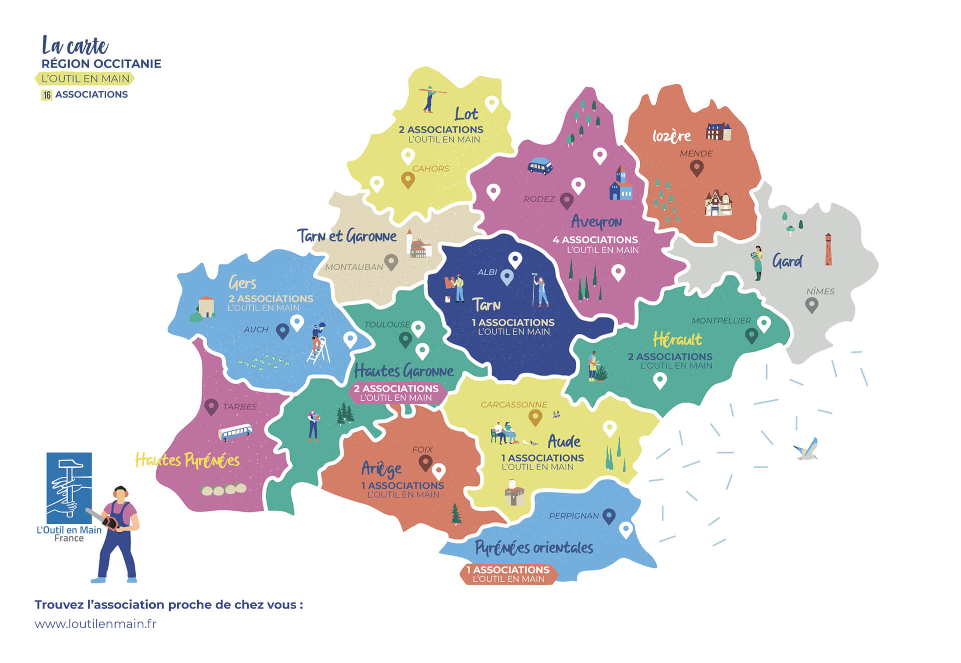
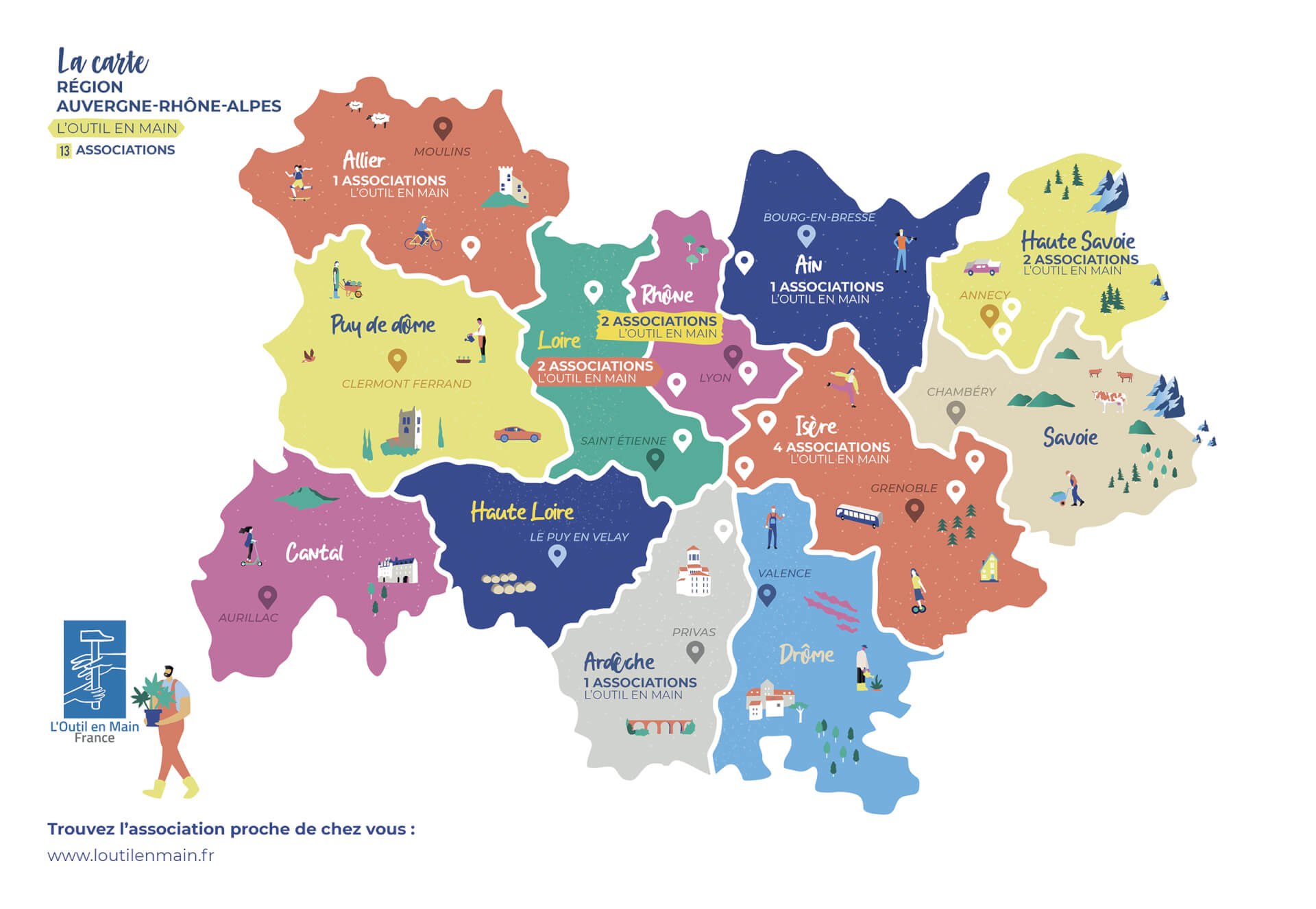
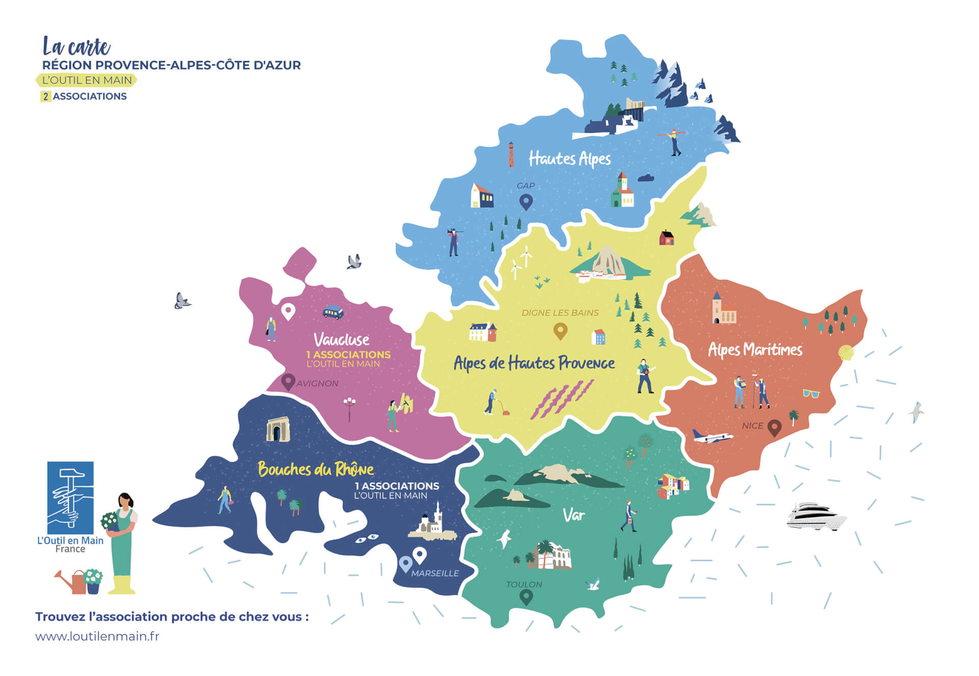
In response to Outil en Main's needs, a global map of France and customized regional maps were created to showcase the network. This simple map enables the network's players to identify themselves through a playful, relaxing graphic.
+ creations + projects + identities + stories + colors