EMMAÜS ÉPARGNE SOLIDAIRE
Art direction, webdesign, communication
SECTOR
savings
LOCATION
France
2024
The challenge? To breathe new life into Emmaüs Épargne Solidaire by completely redesigning their website. A fresher, more dynamic design that catches the eye and guides users in the blink of an eye. At the same time, a punchy digital campaign conveys a strong message: solidarity savings are impactful, inclusive and, above all, accessible to all. A project designed to make a lasting impression and reinforce the brand's social commitments, with a visual identity that leaves no one indifferent.

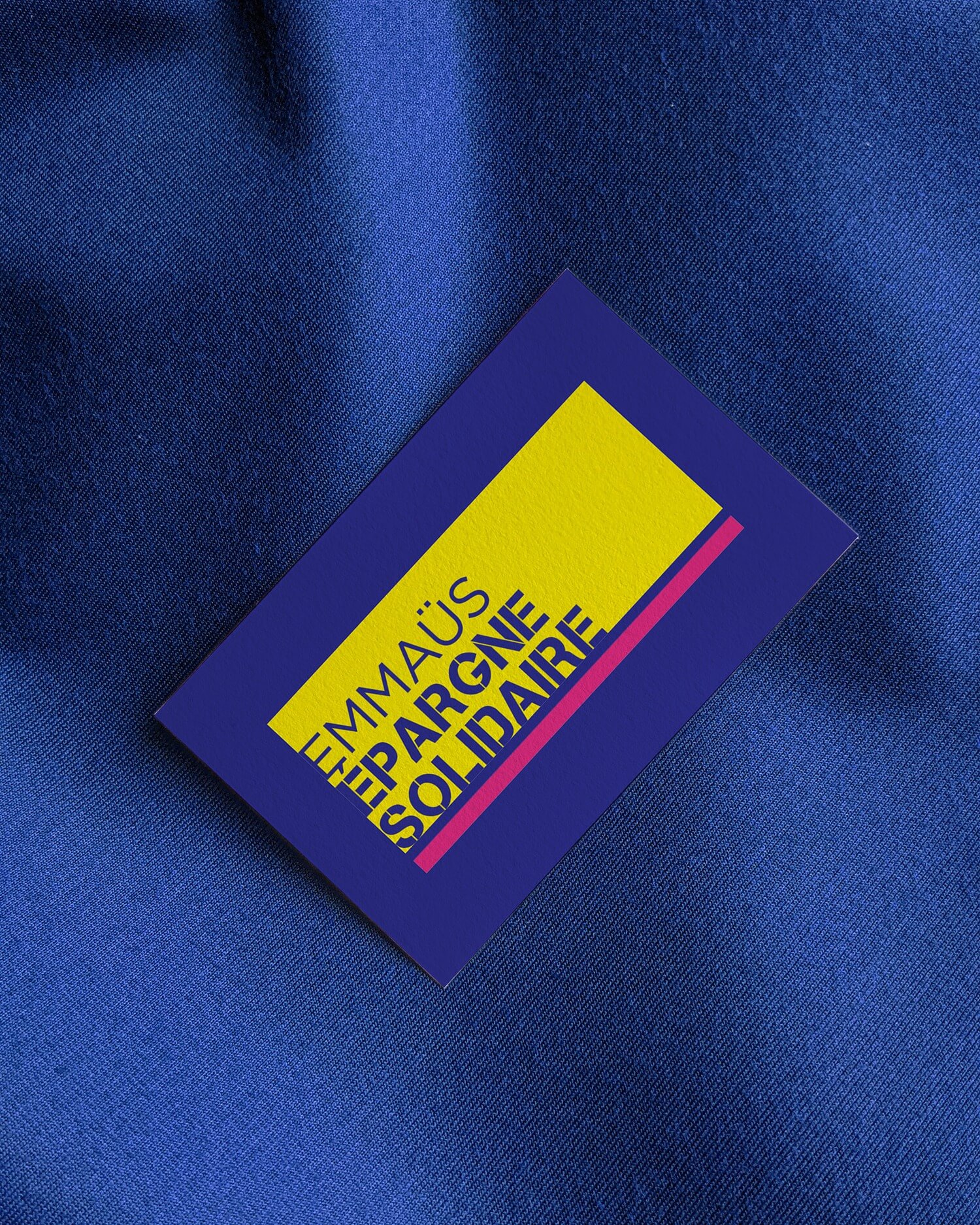
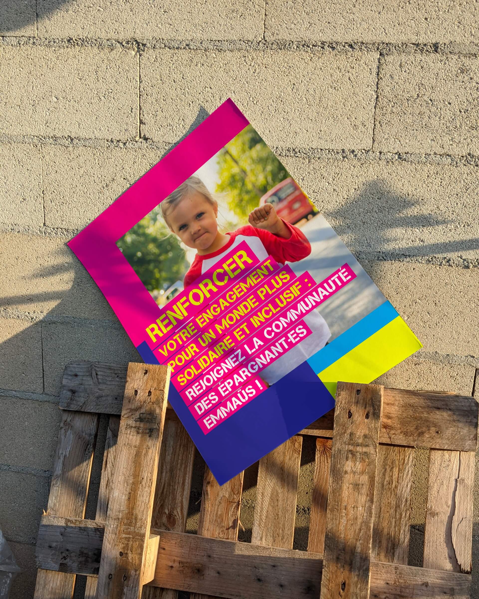
Revamped color code and striking typography
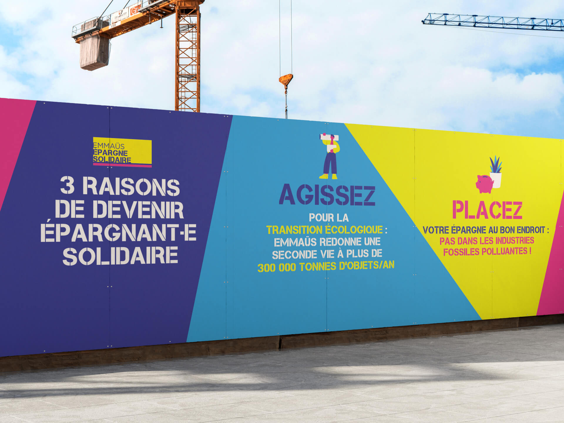
For this redesign, the choice was to remain faithful to Emmaüs Épargne Solidaire's emblematic color code. These flashy colors, already highly recognizable, have been pushed to the limit to reinforce their visual impact. The contrasting hues immediately attract attention, creating a universe that is both dynamic and inclusive. Cleanwork typography was used for the headlines, adding a modern yet striking touch. The play on large text sizes, combined with engaging messages, reinforces the immersive and captivating aspect of the campaign.

Impactful, visually coherent social networking communications
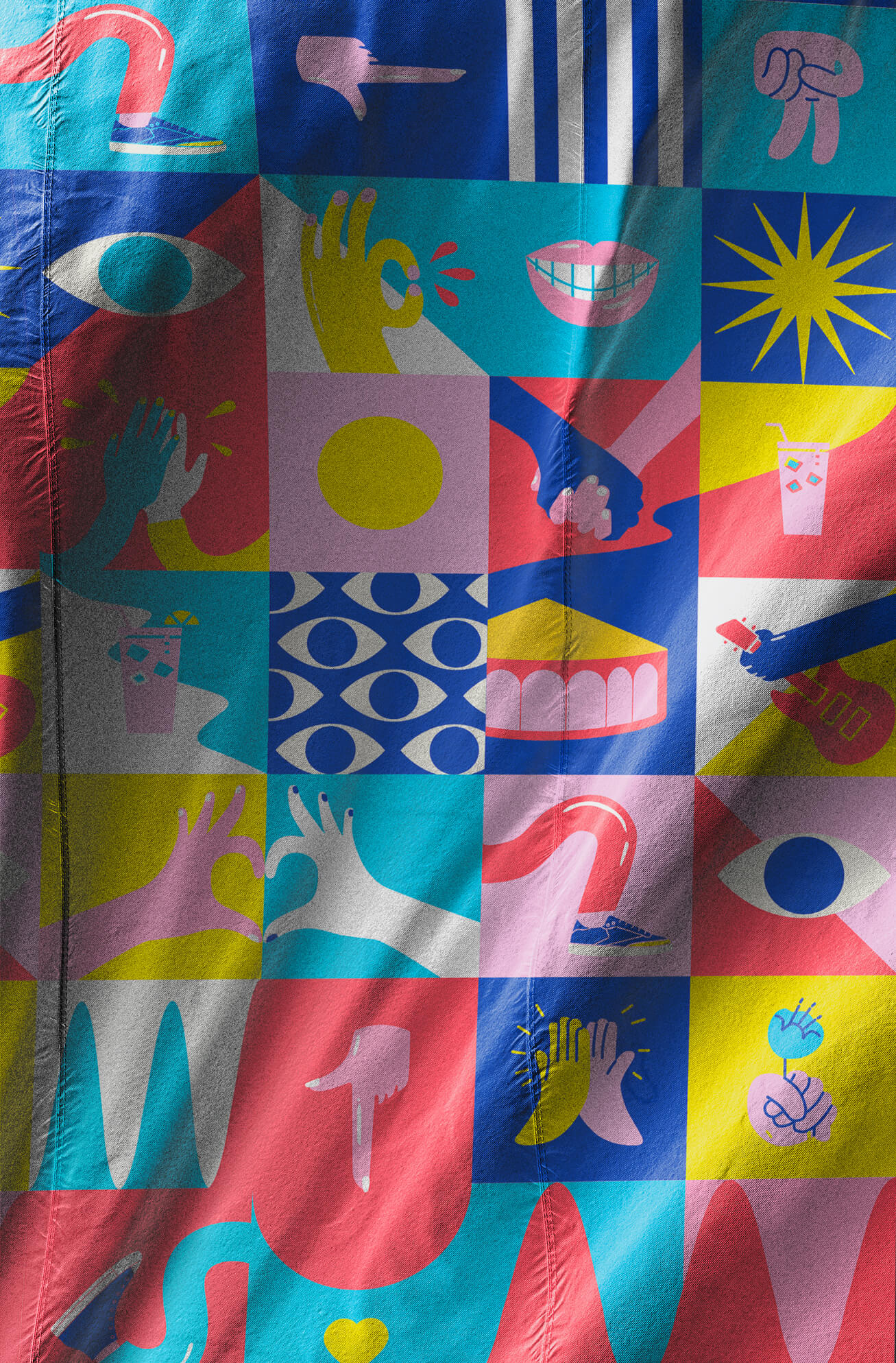
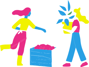
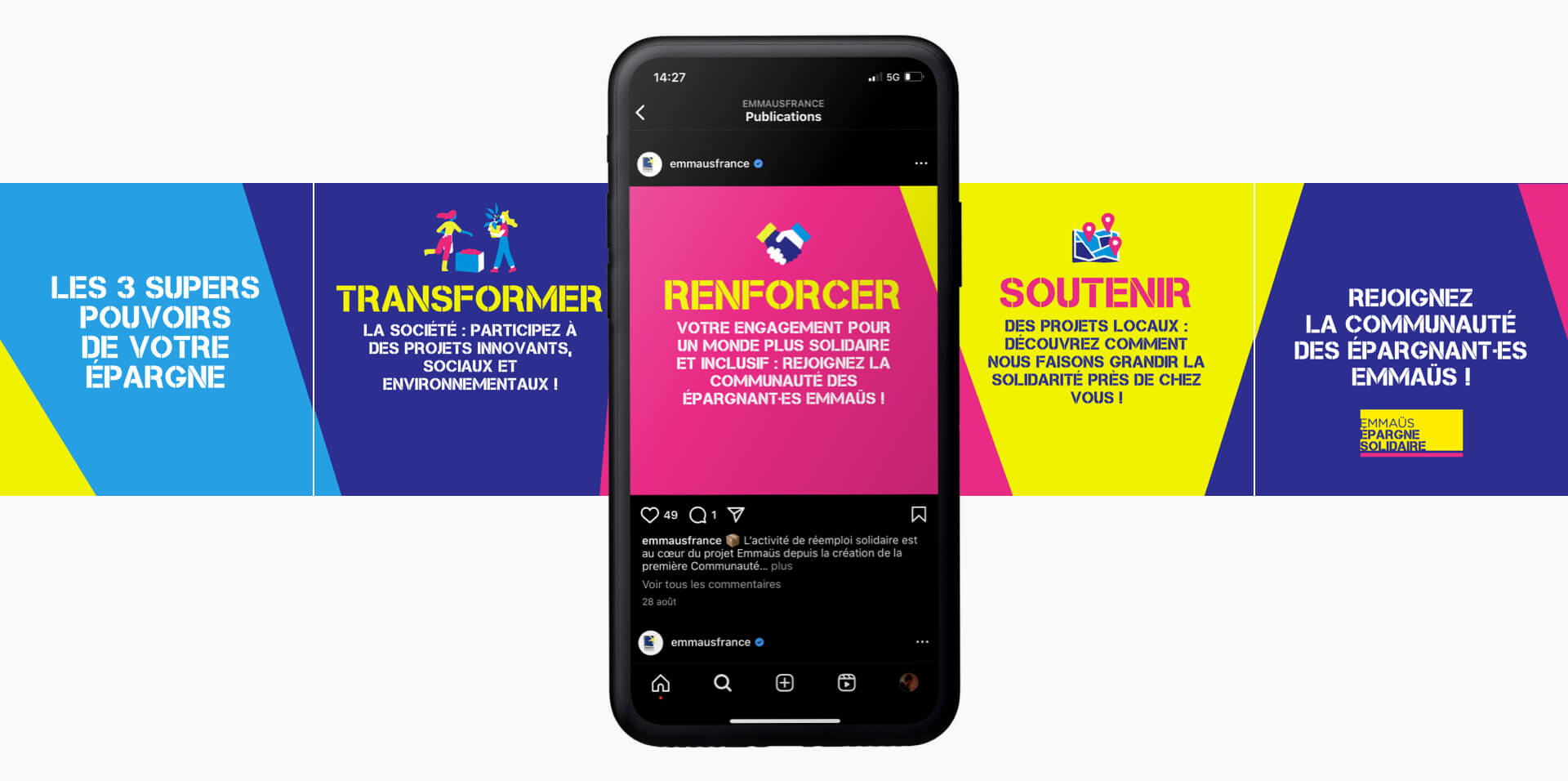
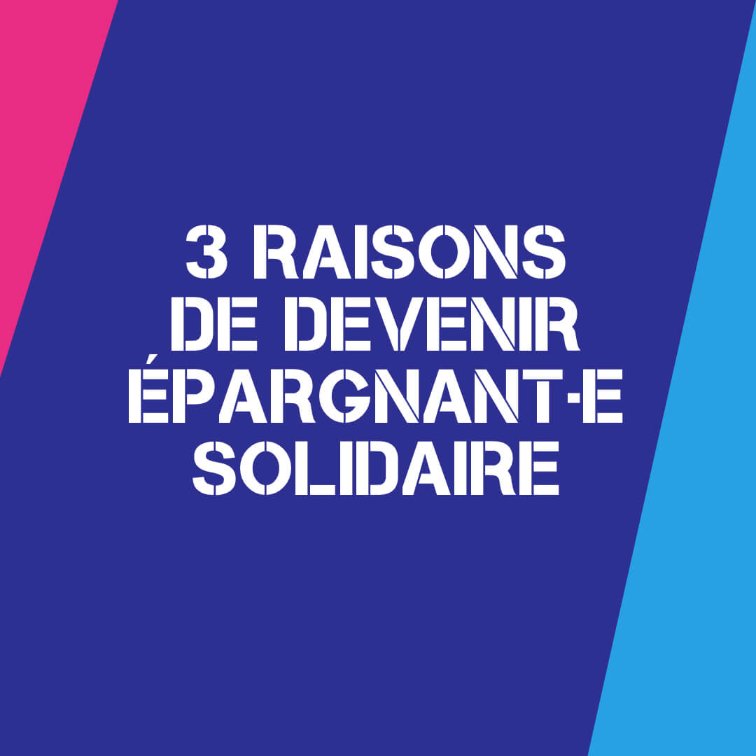
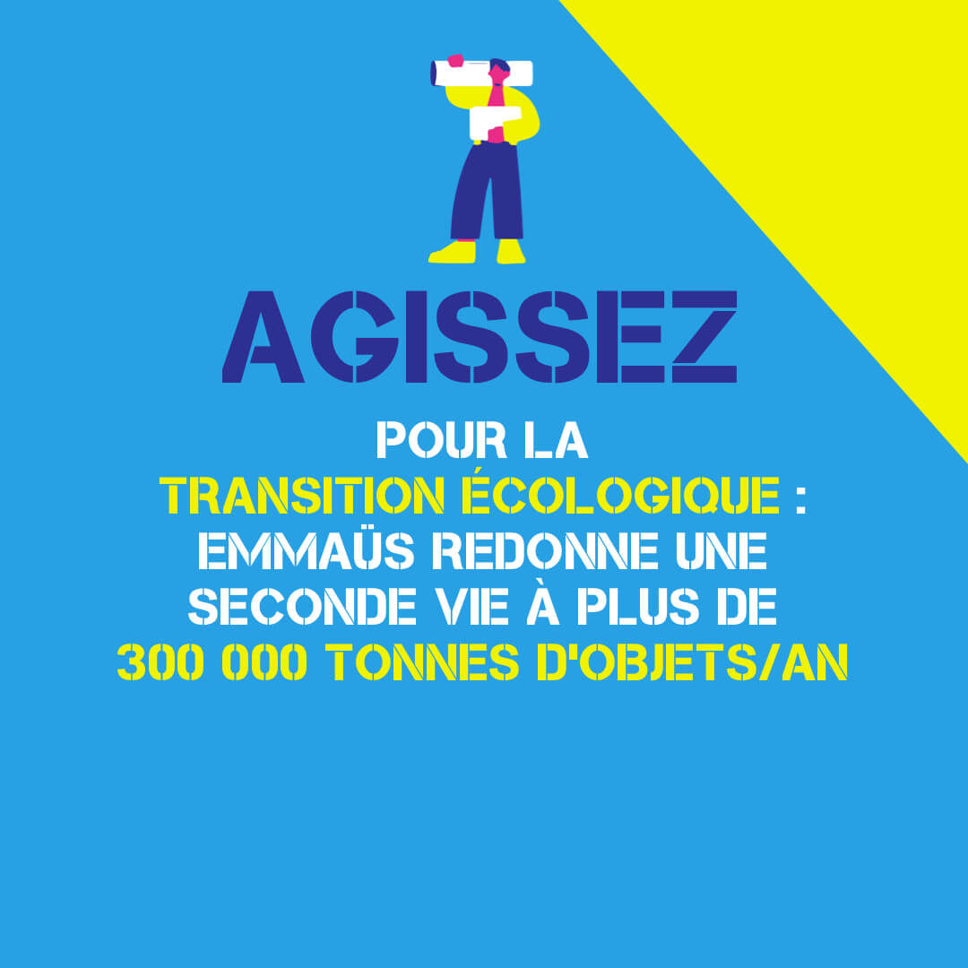
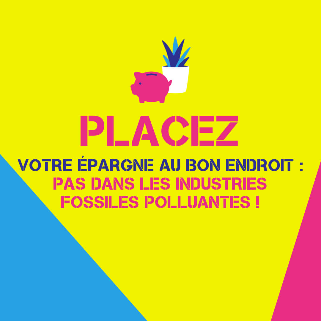
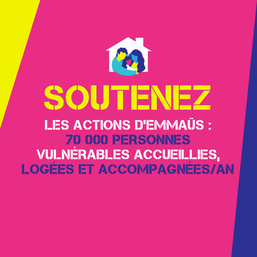
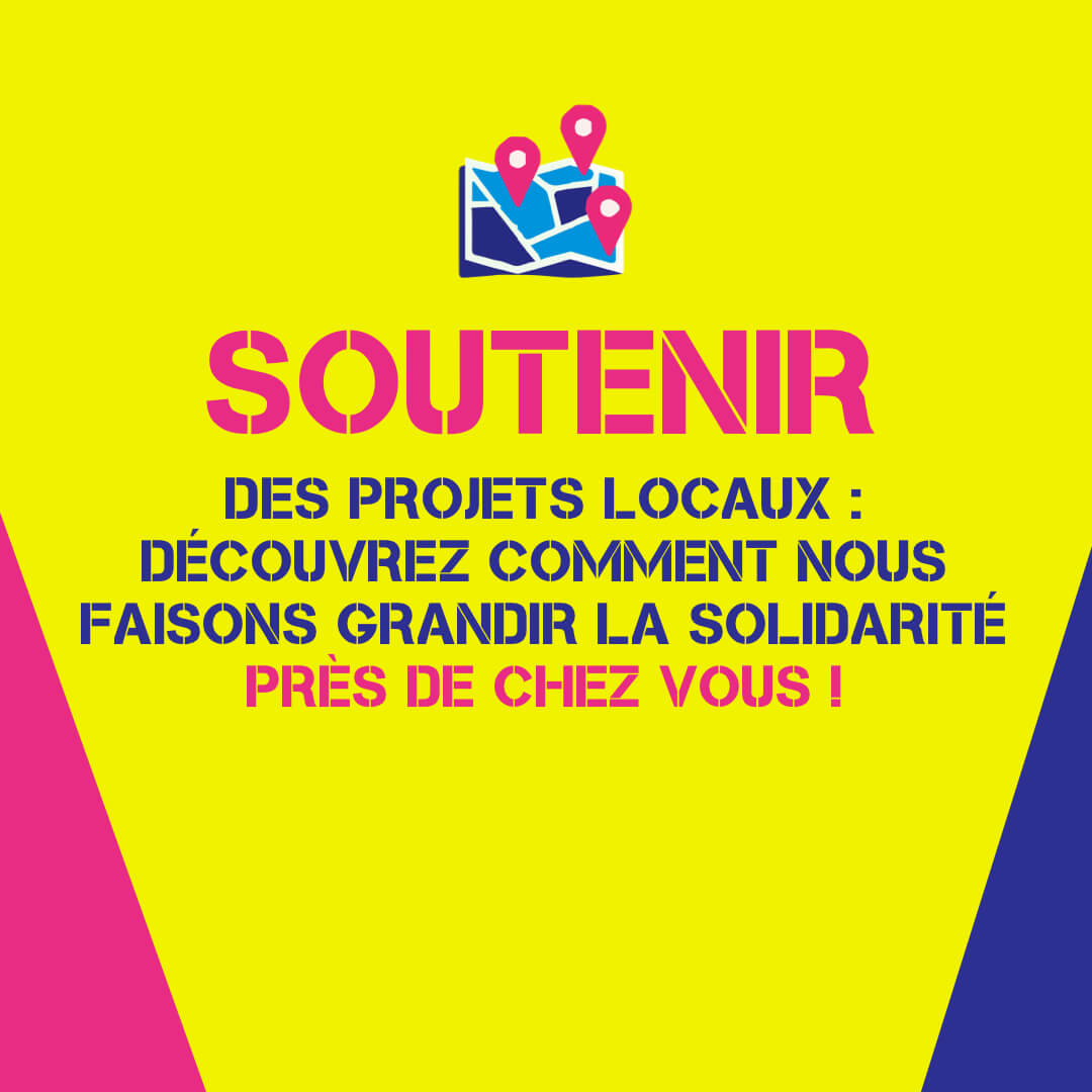
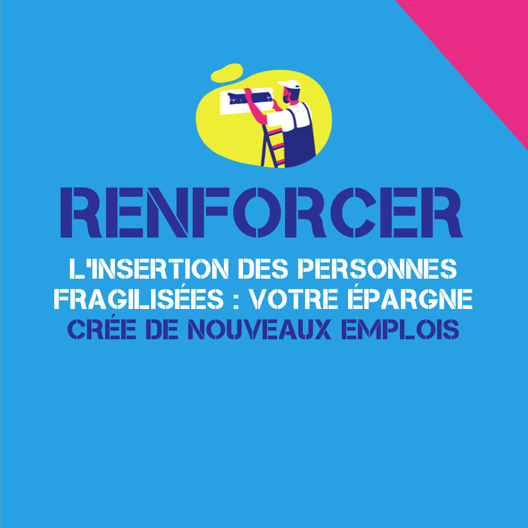
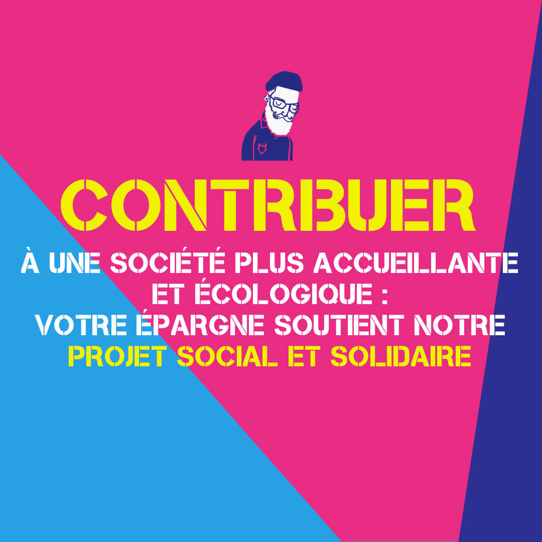
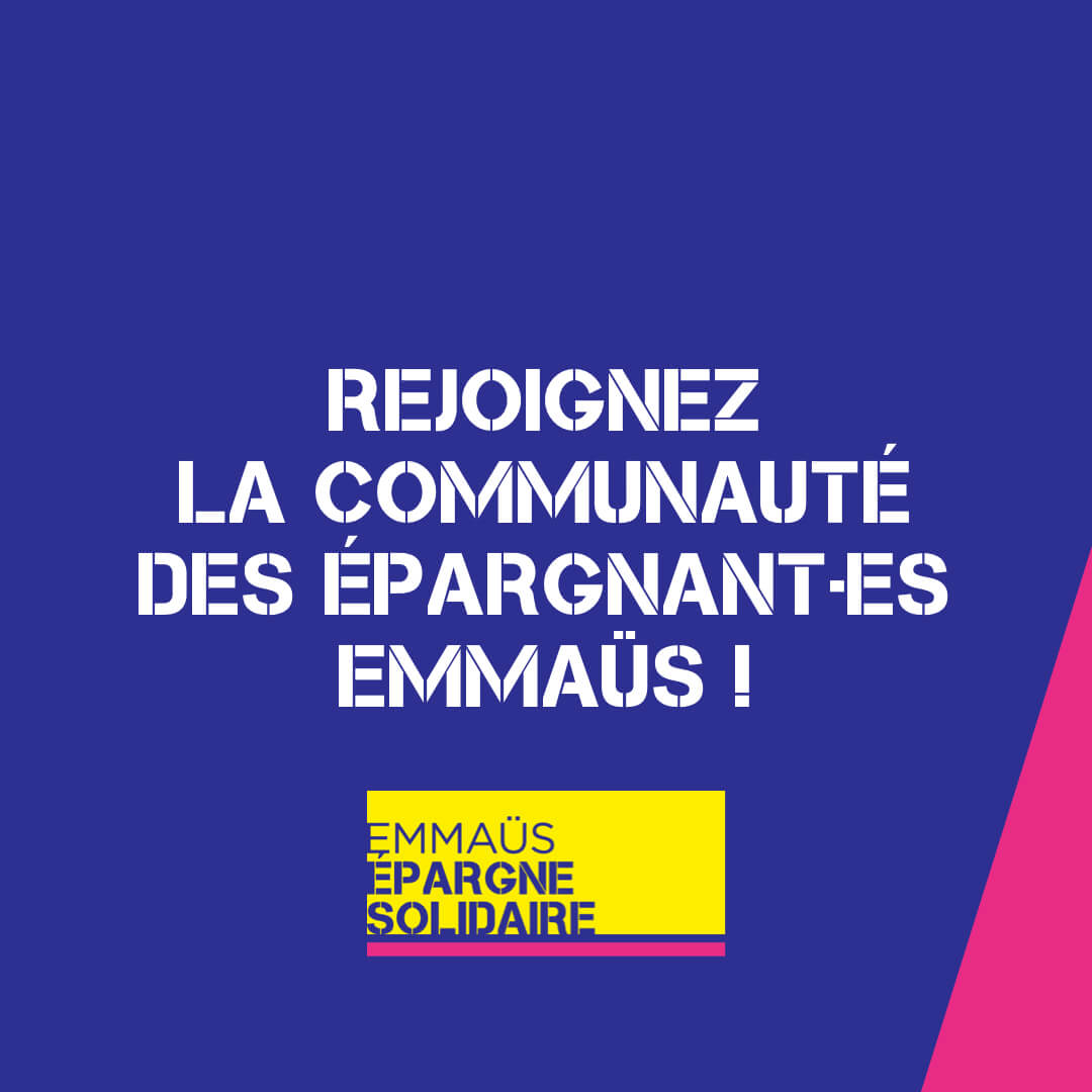
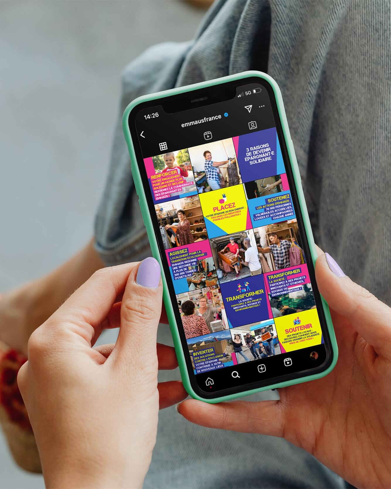
For the digital campaign on social networks, a strong message is combined with pictograms created especially for the occasion. Each visual is designed to reinforce user engagement while clarifying the superpowers of solidarity savings. The flashy color code, already emblematic of the brand, is used in the background in the form of geometric patterns. These shapes flow together to create a continuous visual strip, linking each publication in the carousel into a single, coherent and striking image. This choice reinforces the legibility and impact of the message on the different platforms.
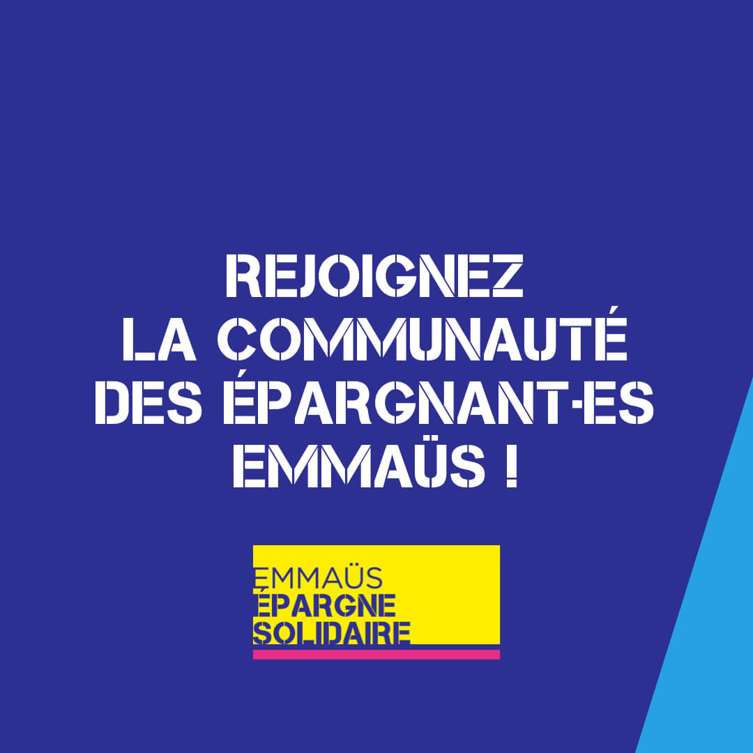
Powerful, uncompromising design
The carousel was designed to be striking and clear throughout. The graphic layout is fluid and harmonious, with geometric shapes that respond to each other and create a strong visual continuity. This design engages the user by delivering a legible, structured message, while capturing attention from the very first glance.
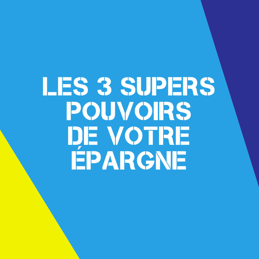
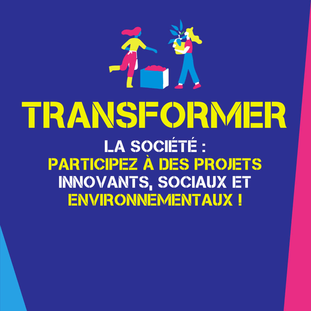
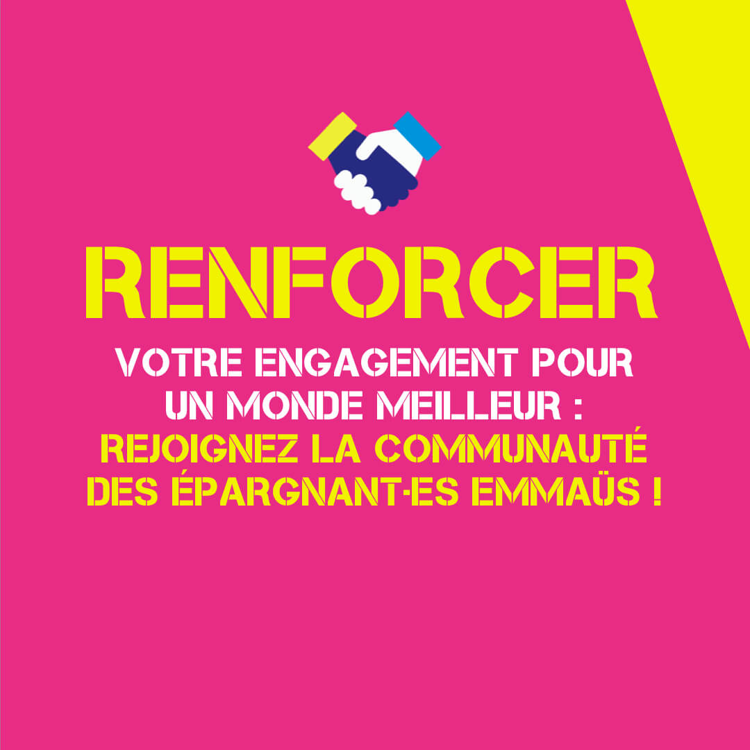
Colors and pictograms to convey your message
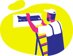
The four emblematic colors come together to create striking, dynamic visuals. The pictograms, specially designed for this campaign, add a playful dimension while reinforcing understanding of the message. Each background color blends harmoniously with the pictograms to give relief and a strong visual identity to each point on the carousel.
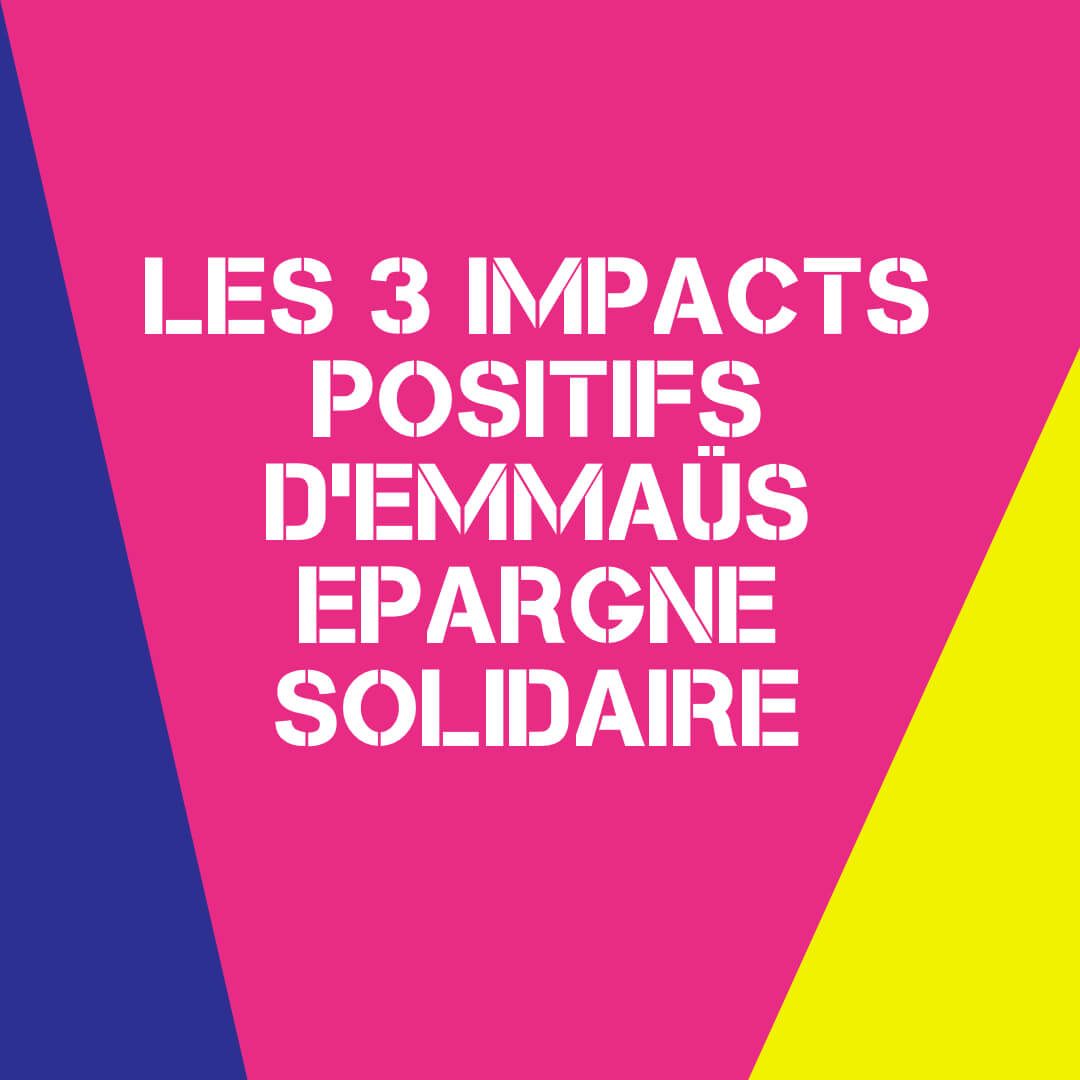
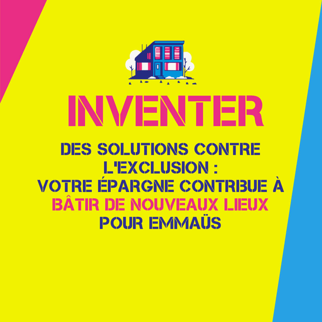
Engaging, impactful typography
The typographic choice was a bold, clear and modern font. It asserts itself in the visual space without detour, making an immediate impact. The large size of the headings, combined with optimal legibility, highlights key messages in a fluid and striking way, while adding a graphic rhythm to the carousel.
Impactful visuals in story format
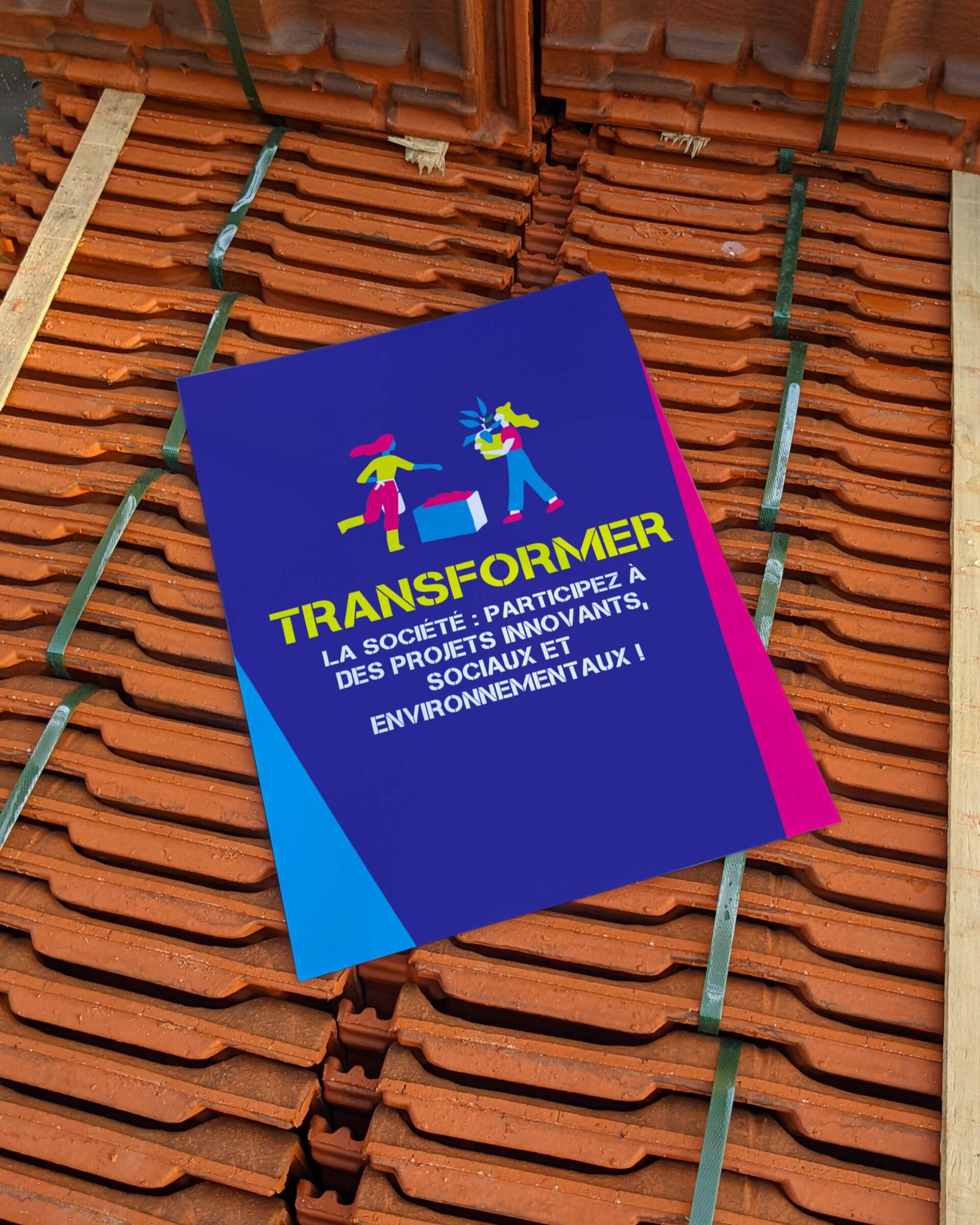
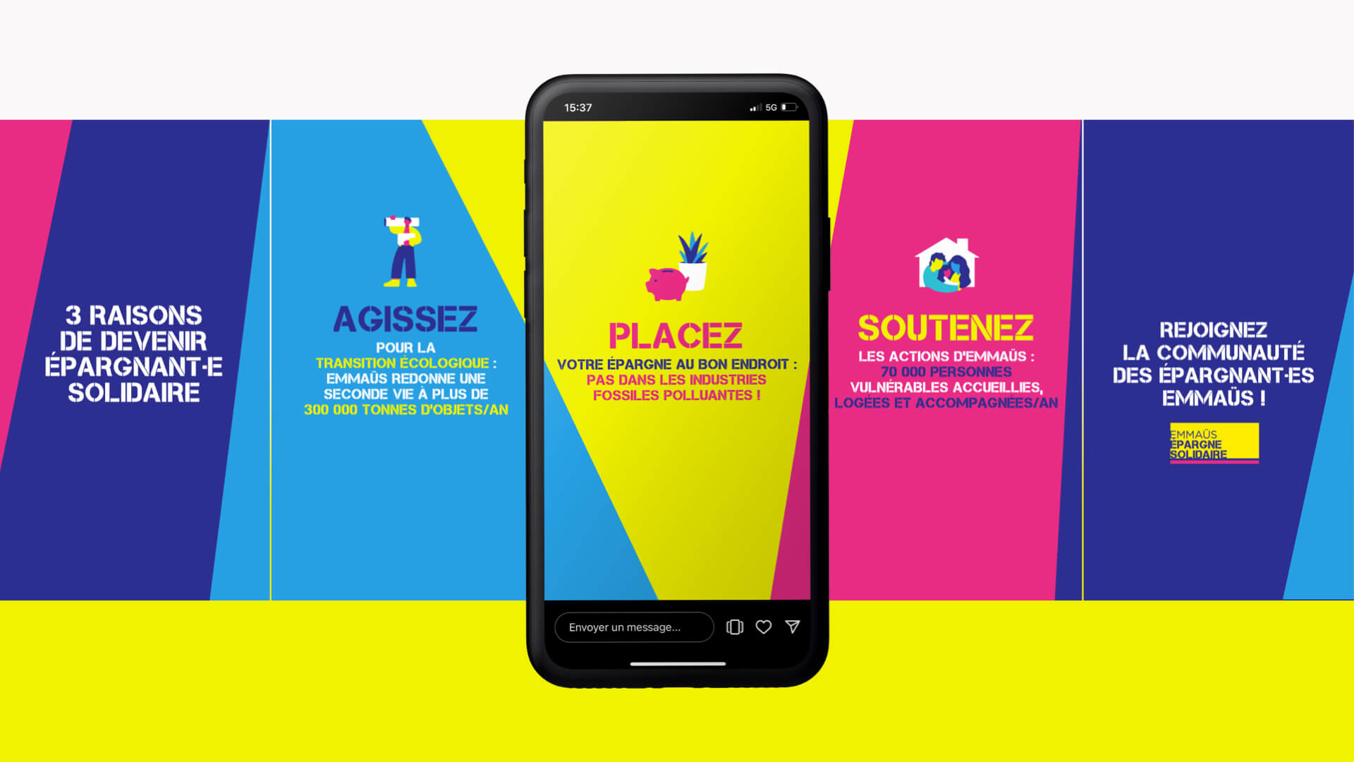
The visuals have been adapted for the stories format, ensuring visual continuity while adapting to the codes of social networks. Each story uses the campaign's strong colors and emblematic pictograms, to guarantee maximum visibility on mobile. Messages remain clear and impactful, while offering an immersive experience consistent with the rest of the communication.

The website, central pillar of the project
The Emmaüs Épargne Solidaire website is the centerpiece of the entire project. Everything has been designed to offer a fluid, intuitive and engaging user experience. This portal centralizes all key information and highlights the actions of solidarity savings. Thanks to a clear structure, striking visuals and dynamic colors, the site becomes a veritable hub for raising awareness and encouraging action. The entire campaign revolves around this platform, which effectively connects the public to the issues and solutions proposed by Emmaus.
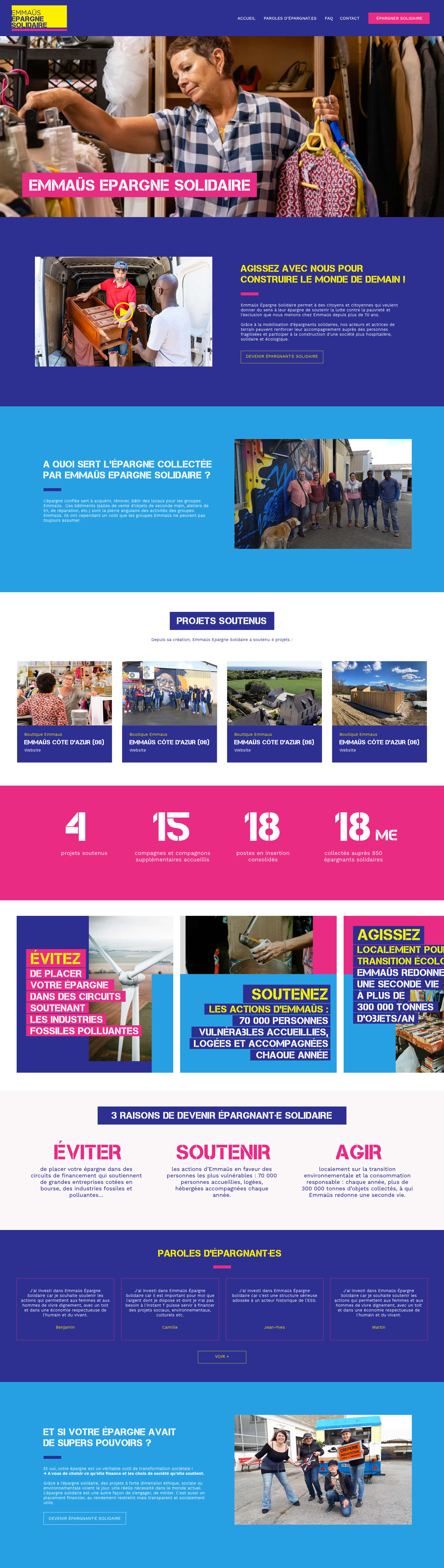
A site designed for a fluid, colorful rhythm
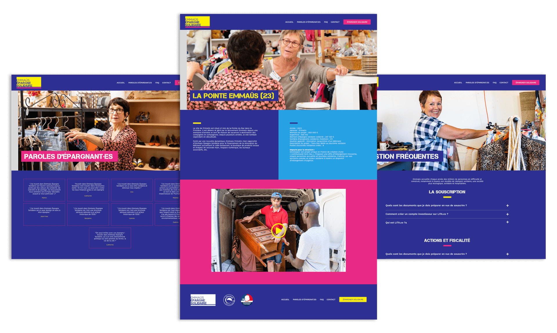
The Emmaüs Épargne Solidaire site was designed to create a fluid visual rhythm between the different pages. Colored backgrounds, used strategically, provide a dynamic that guides the user through the content. Breathing" zones are integrated at certain points to ensure comfortable, airy reading. This subtle interplay of color and space ensures a pleasant and engaging user experience, while highlighting key messages in a powerful way.
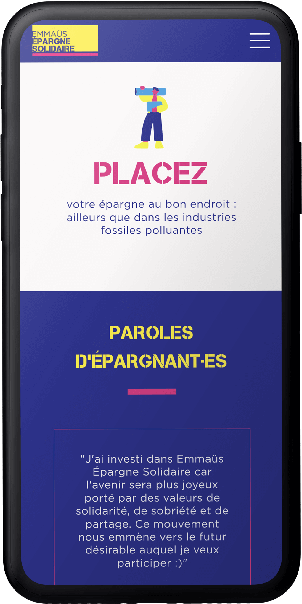
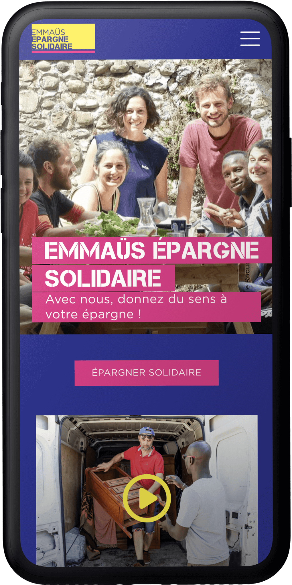
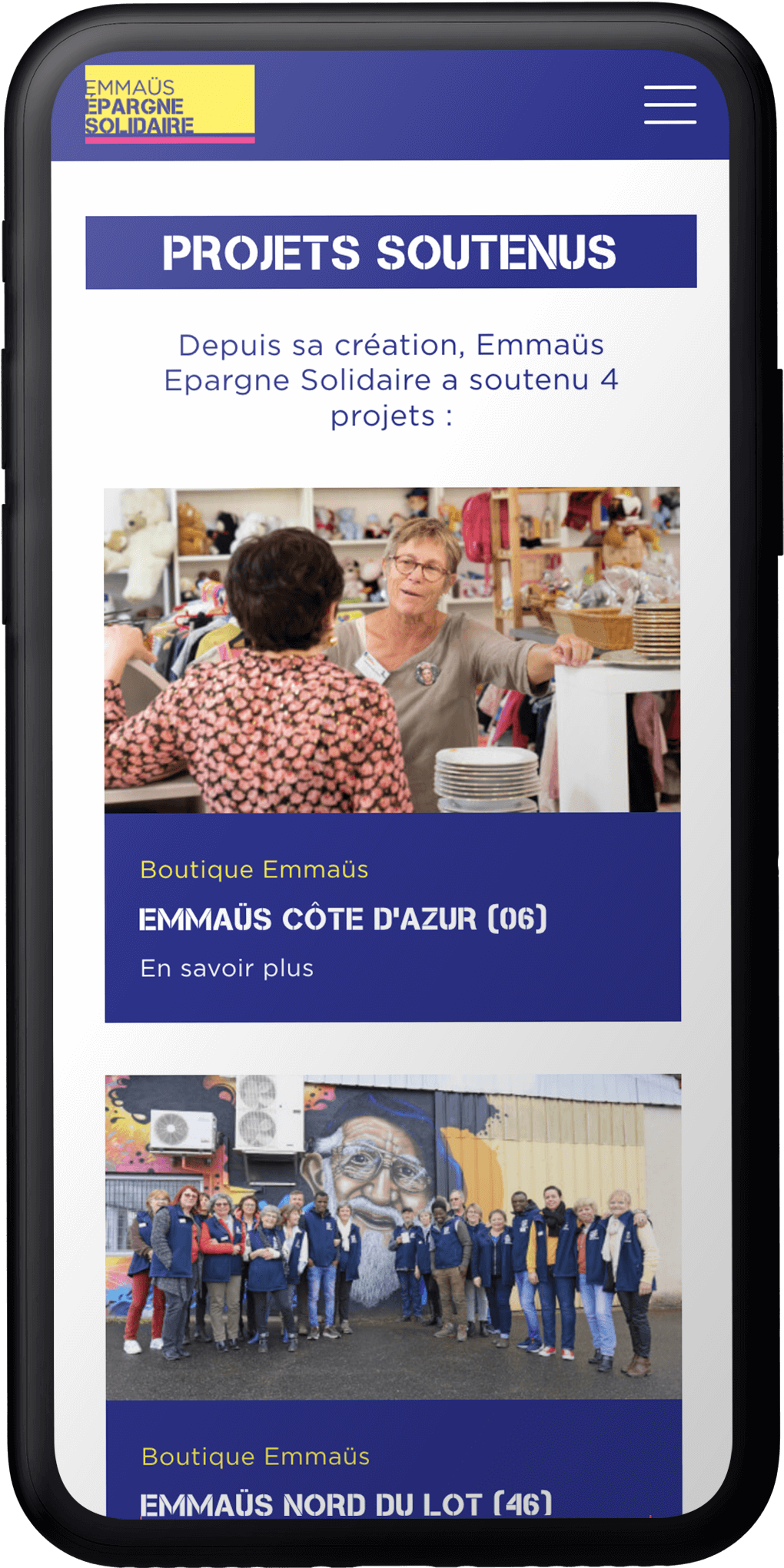
A perfectly optimized mobile experience
The site has been designed to offer a fluid, fully responsive mobile experience. Every element adapts perfectly to mobile formats, guaranteeing fast, intuitive navigation on all devices. Visuals and content remain impactful, even on smaller screens, while maintaining optimal readability. The responsive approach ensures visual and functional consistency across all media, offering seamless accessibility.
+ creations + projects + identities + stories + colors