Tips
Wed 23 Jul 2025
5 mistakes we see all the time on SSE sites (and how to avoid them)
You don't need a perfect site. But avoiding these pitfalls can help you gain clarity, efficiency and credibility.

A clear site is one that serves
You may not be selling a product, but you need people to understand you, to support you, to join you. And for that, your site needs to do the job. At What The Web, we work with dozens of SSE structures every month: associations, cooperatives, foundations, third places, social enterprises... And we notice that the same mistakes are made very (very) often. Here are the 5 most common, and above all: how to avoid them.
1. Too much information everywhere
If you want to say everything, you end up saying nothing. We still see too many overloaded sites, with :
-
unreadable blocks of text,
-
lengthy menus,
-
entire pages repeating the same thing.
Our advice: start simple.
Prioritize your information. Think about what an unfamiliar visitor is looking for. And structure it all with clear headings, short paragraphs and a few well-chosen visuals.
2. No visible action button
You want people to commit? to donate? to join?
Then make it clear. Too many sites don't have a "call to action" button visible on arrival.
Our advice: place your important buttons (donation, membership, contact, registration...) in the header or just after your intro pitch. And repeat them. Once is never enough.
3. A site that's not mobile-friendly
By 2025, over 70% of visits will be made from a telephone.
And yet, we still come across too many sites poorly designed for small screens: illegible text, buttons too small, inaccessible menus...
Our advice: systematically test your site on mobile. This is the version that will count the most. A responsive site means more accessibility, more confidence, more impact.
4. A vague "About" page
People don't read your whole mission statement, or your listed values. They want to understand who you are and why it speaks to them.
Our advice: tell a story.
Explain how you got started, what motivates you, and who's behind it. Add a team photo, it instantly humanizes them.
5. A static site, never updated
We still see sites where the last news item dates back to... 2021. Or empty calendars.
The result: visitors think you're inactive, or worse, that you no longer exist.
Our advice: keep at least one part alive:
-
a "news" section (easy to maintain),
-
a synchronized calendar,
-
or even just a "last update" banner.
In short: a good site is a lively, readable site.
You don't need a corporate website. But you deserve better than an empty shell or a confusing mess. Your site is a strategic tool. It can be simple, but it needs to be thoughtful. That's what we're here for.

Continue exploring
Tue 26 Mar 2024
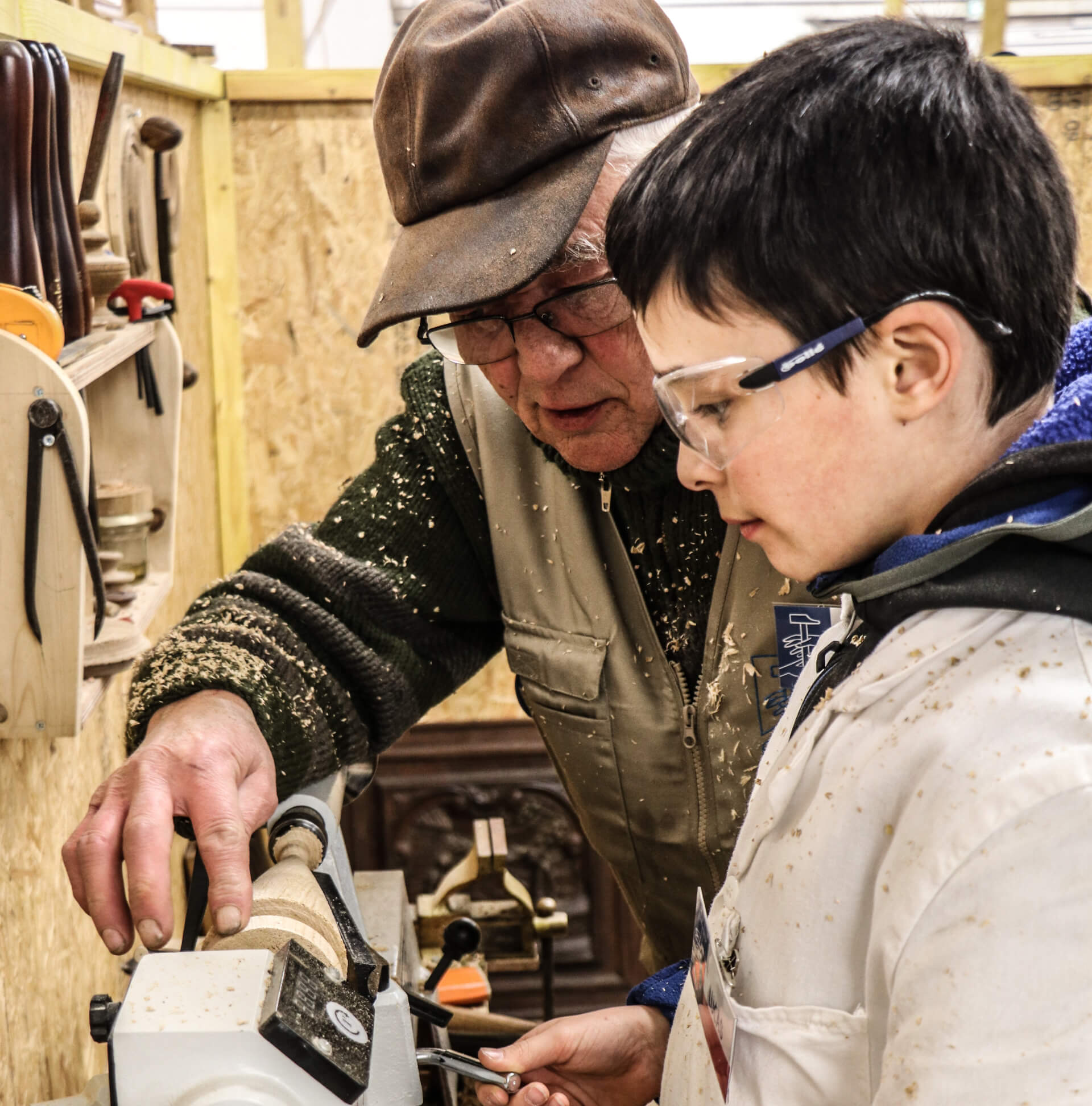
Enter the inspiring world of L'Outil en Main, an association dedicated to introducing young people to manual trades. Explore its action and mission to promote practical education and the personal development of children.
Sun 10 Mar 2024
In our series of presentations of committed associations, today we highlight Les Enfants de la Méditerranée (LEM), an organization dedicated to the development and protection of children through education and culture.
Fri 5 Jan 2024
In this special edition of our webzine, we are pleased to introduce you to an extraordinary association with which we have had the privilege of collaborating: ALFA