YO! FEST
Art direction, architecture design, logotype, webdesign, communication, goodies
SECTOR
Festival
LOCATION
Brussels
2018
Yo! Fest brings together 10,000 young people around music and political activities, to discuss and shape the future of Europe. For its 2018 edition, the request was to create a global and adaptive multi-media communication that connects them to a European audience aged 16 to 30.
Visual vibrations
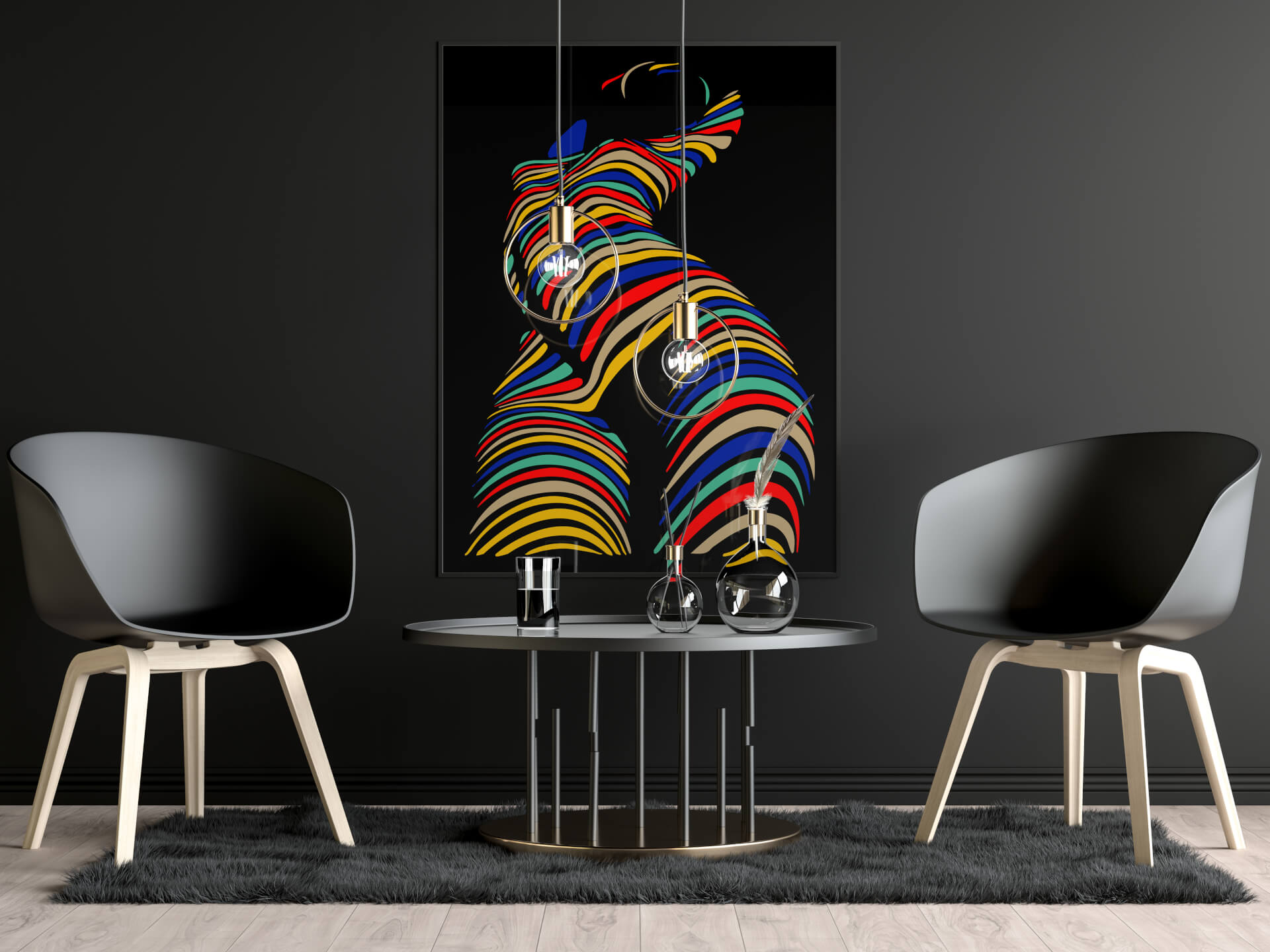
The ambition is to embody a lively, streamlined identity, inspired by the sound of the onomatopoeia Yo! A vibrant, unifying expression, Yo! conveys a collective, emotional energy. The graphic design is based on a bold palette sublimated by deep black, a symbol of elegance and unity. The imagery, both contemporary and timeless, evokes the vibration of sound through an abstract motif. The result is a versatile, evolving and hypnotic identity, suitable for all media.
A wave of sound takes over Yo! Fest
Creation of an art direction that embraces the viral and sensitive nature of today's music and communication channels, complementing them with elegance.
Yo!Fest Trailer
Play video
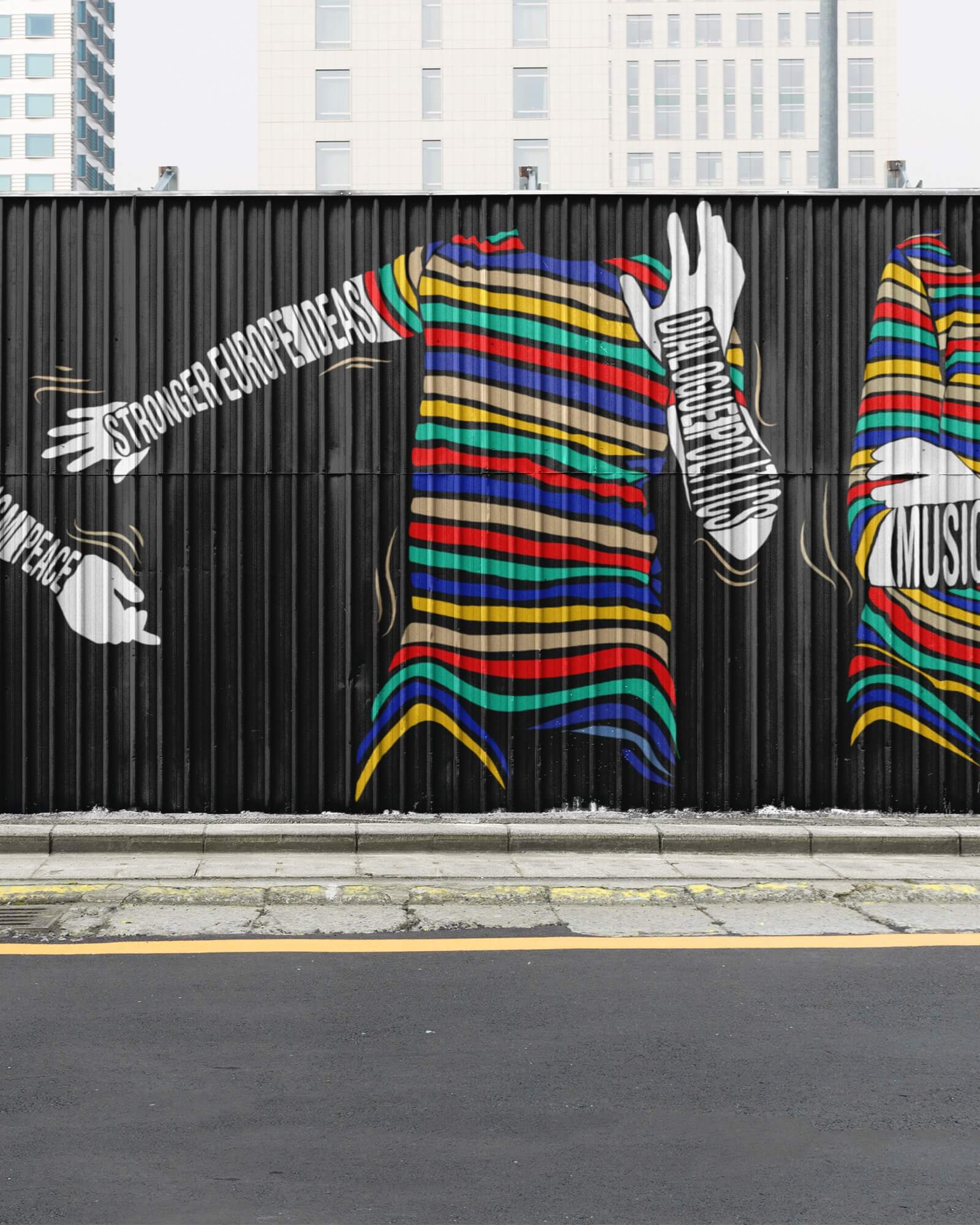
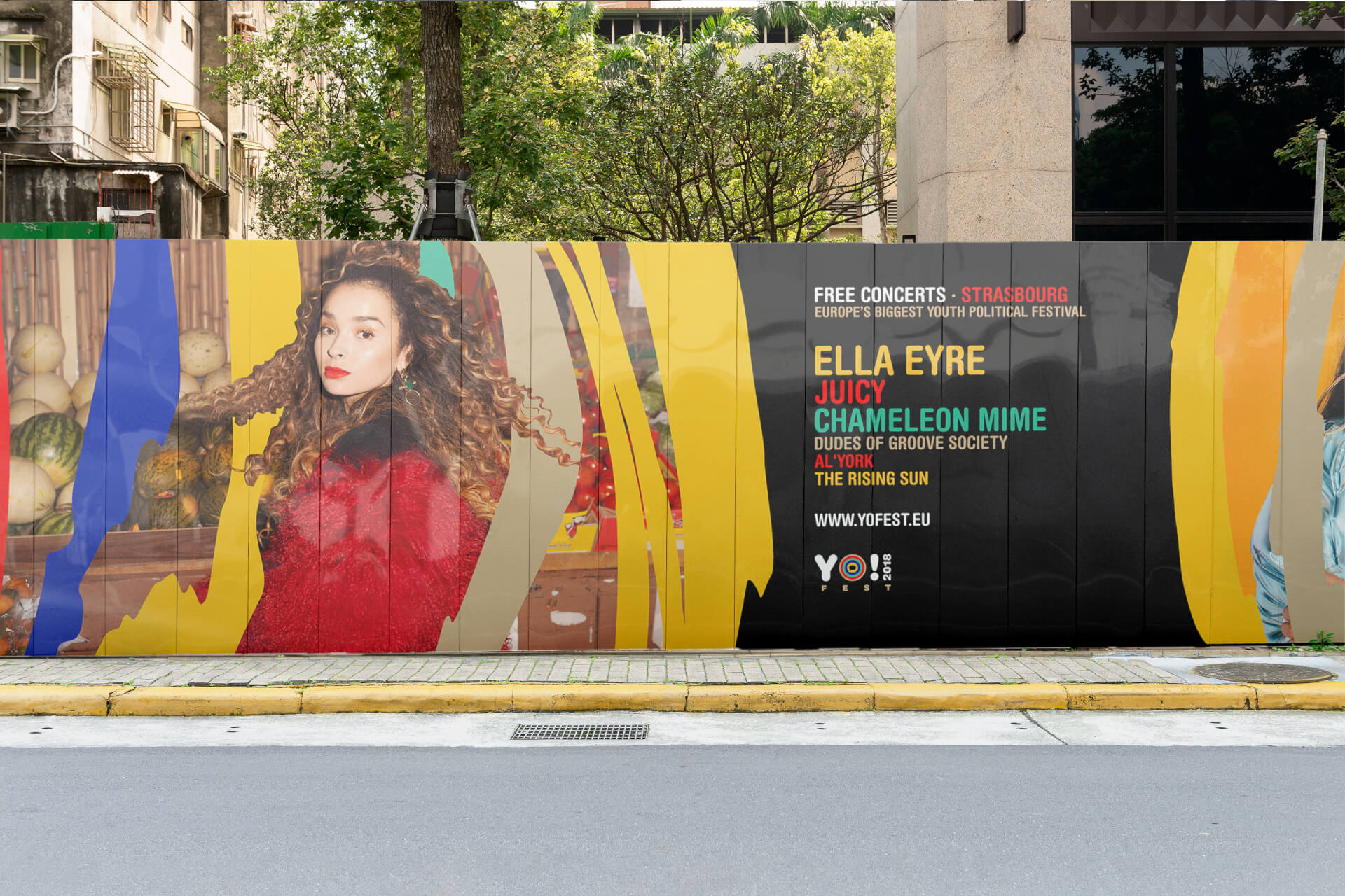
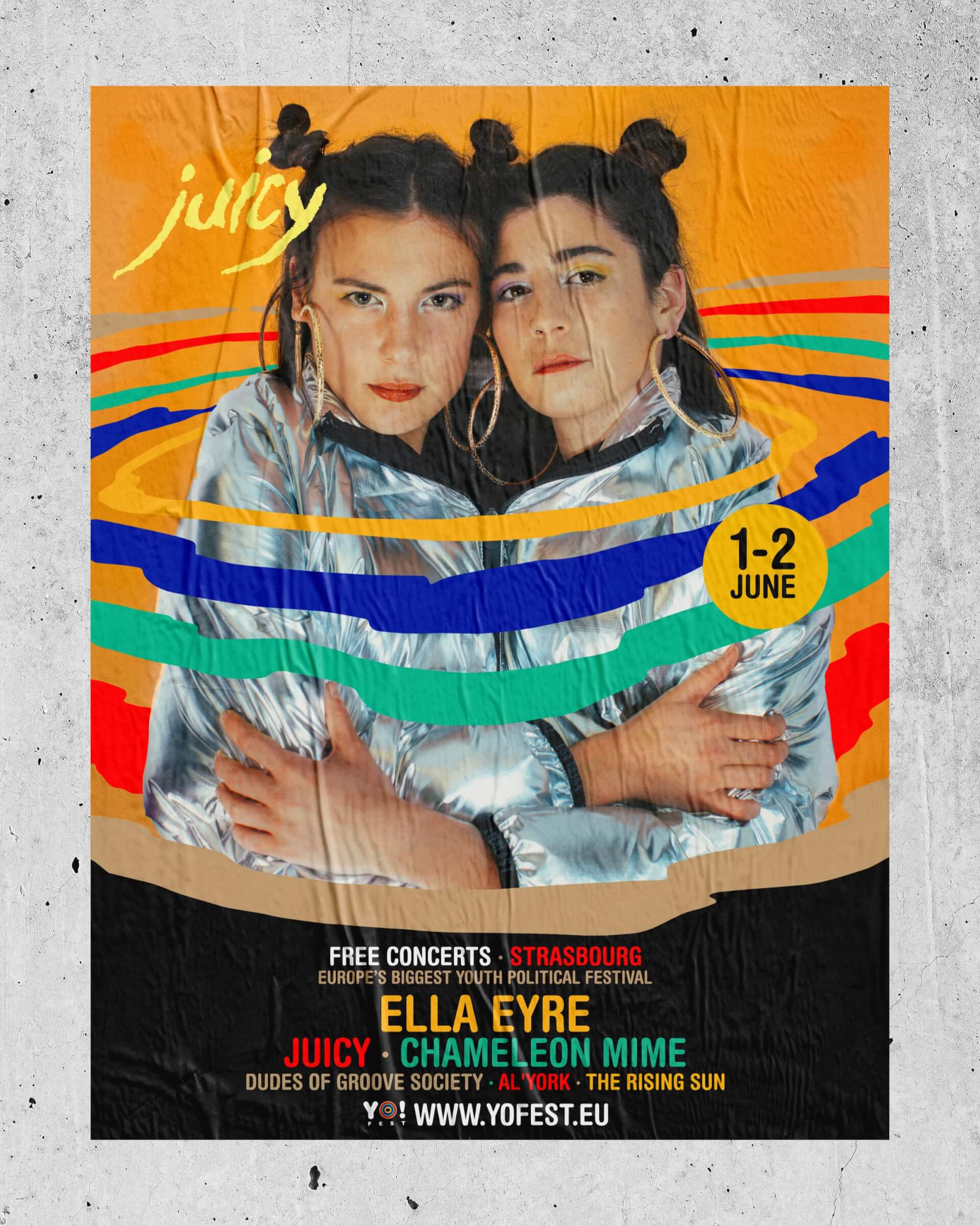
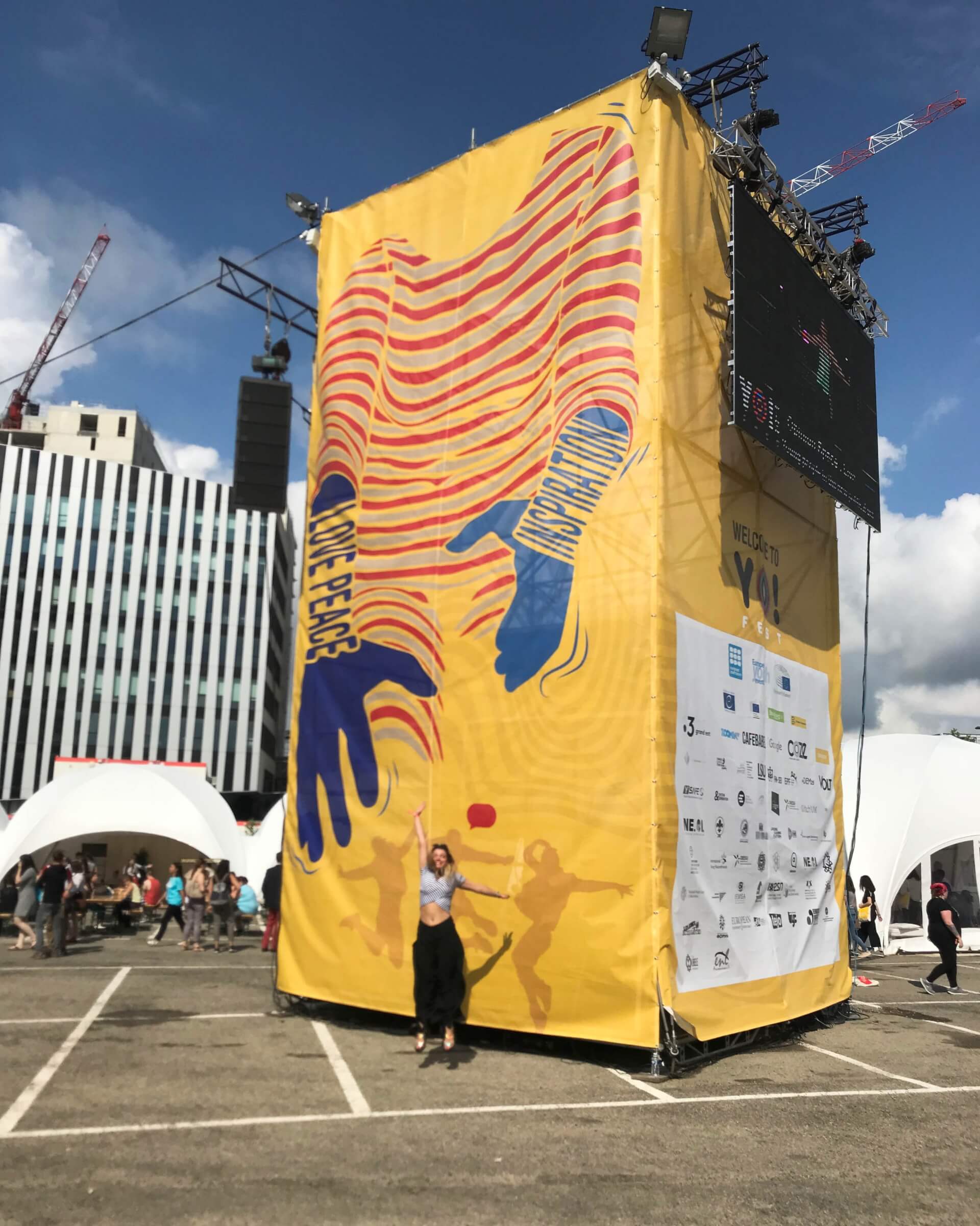
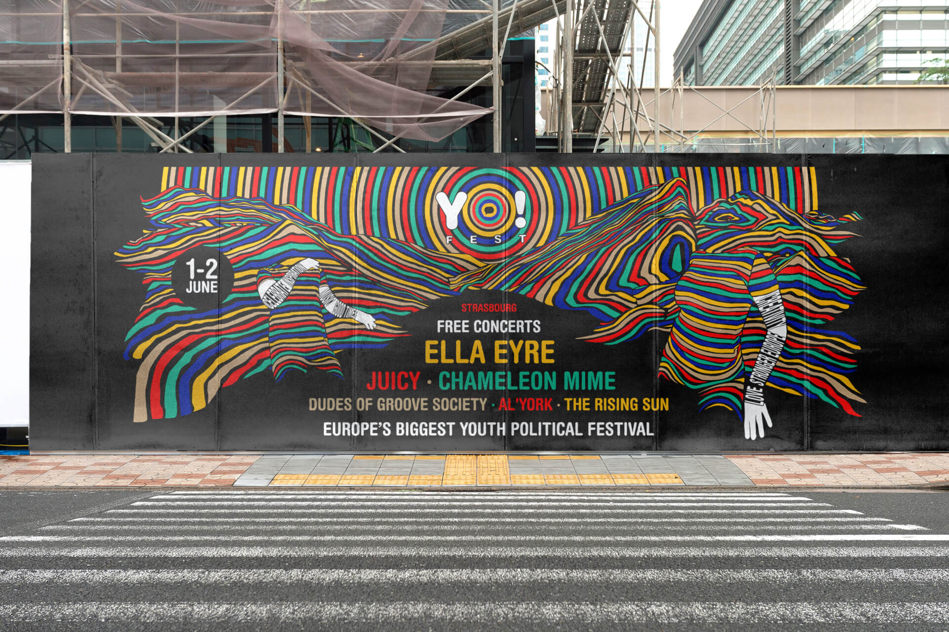
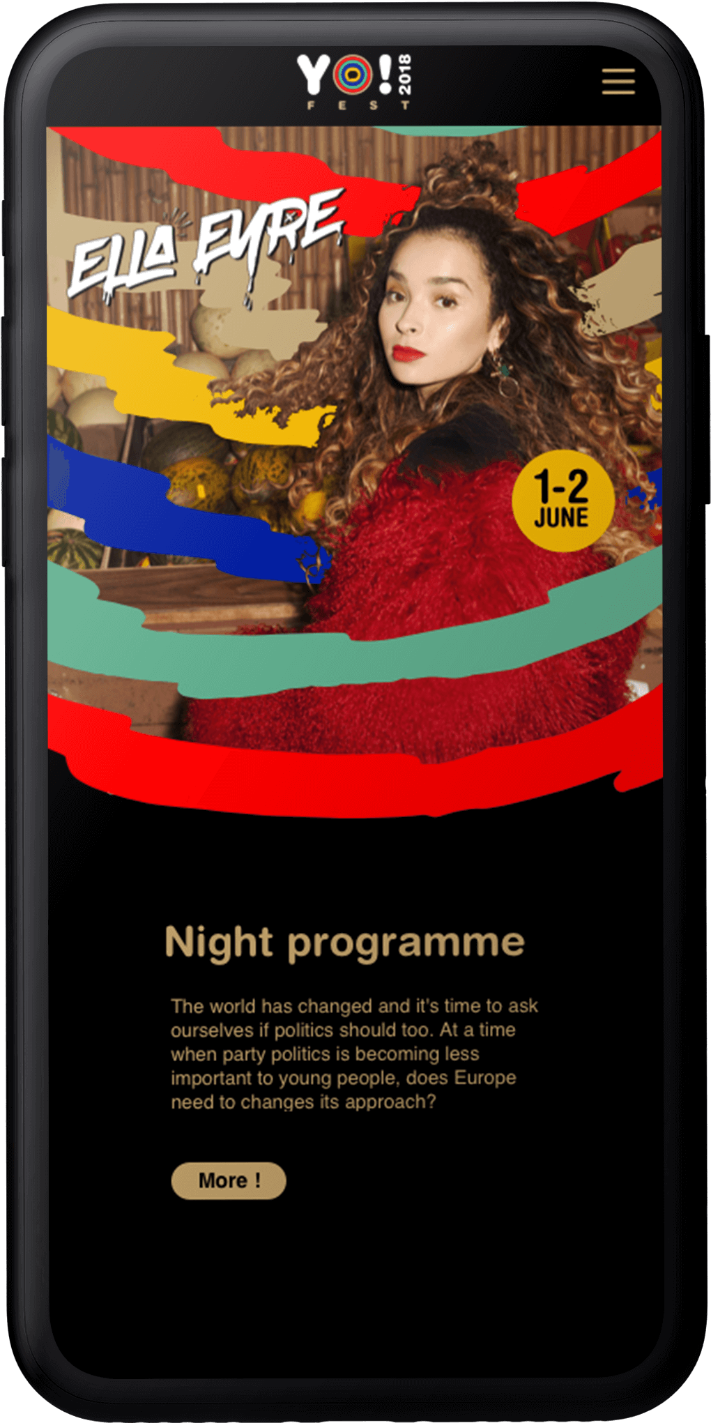
The graphics adapt and evolve according to the media, their size and architecture, for a powerful, rhythmic design.
YO!
FEST
YO!
FEST
YO!
FEST
YO!
FEST
YO!
FEST
YO!
FEST
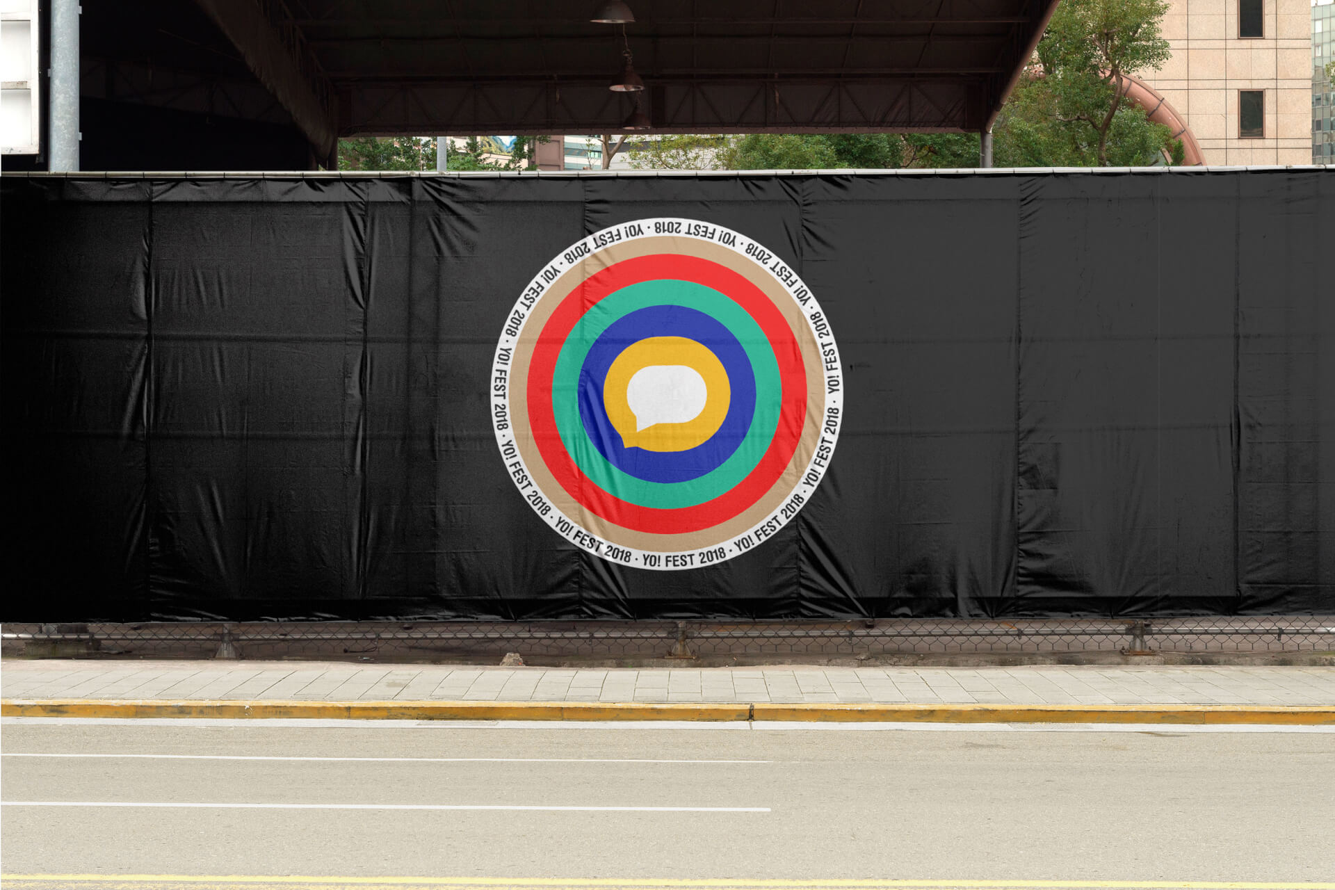
The logo aims to illustrate the idea of the reverberation of a sound wave, a rallying call.
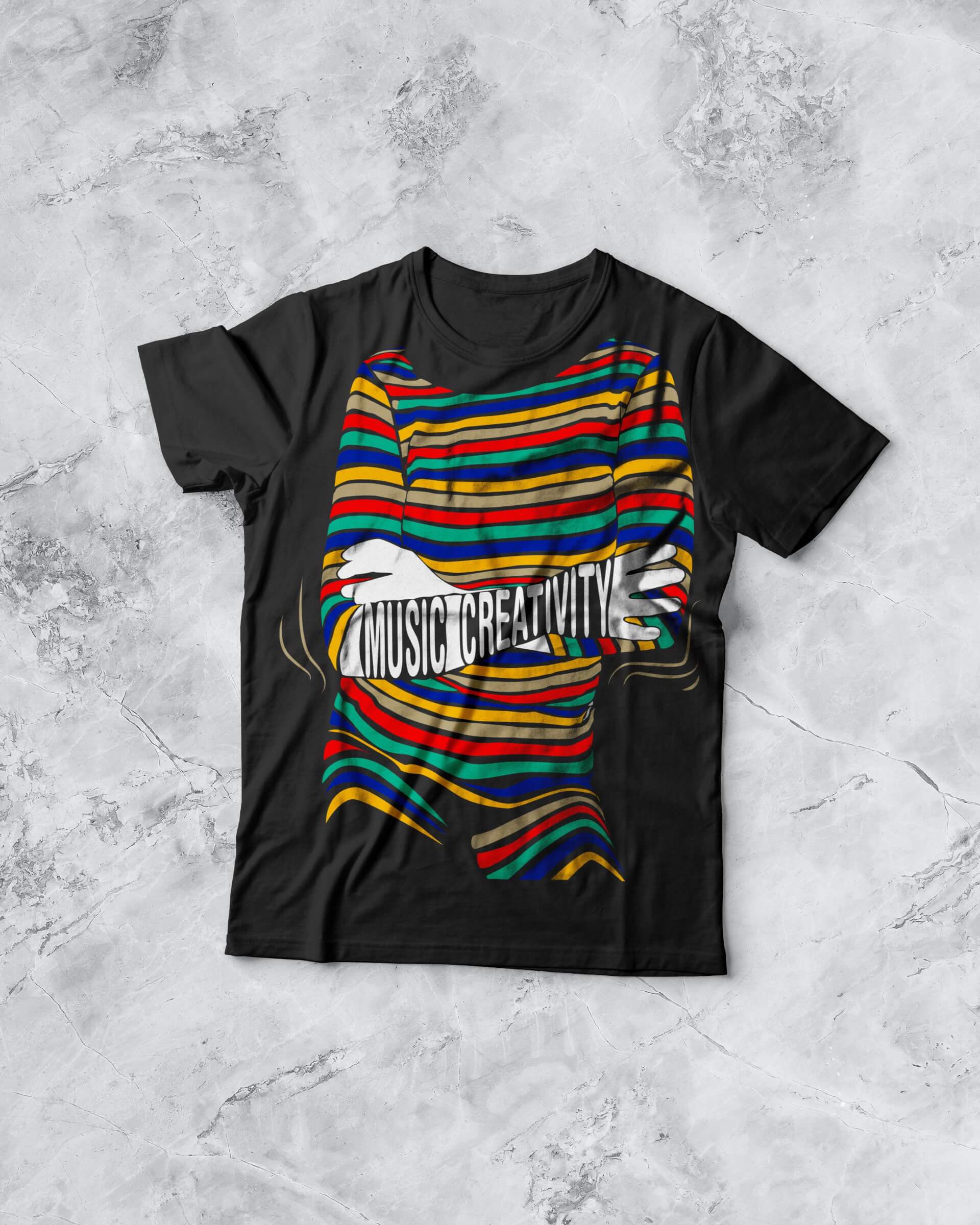
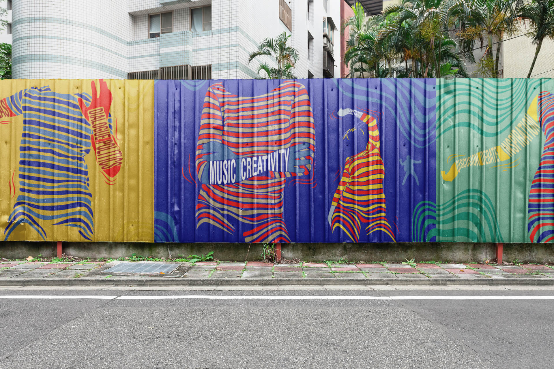
A fashionable pattern at the frontier of textile design and street culture
Highlighted by a powerful, contemporary chromatic scale.
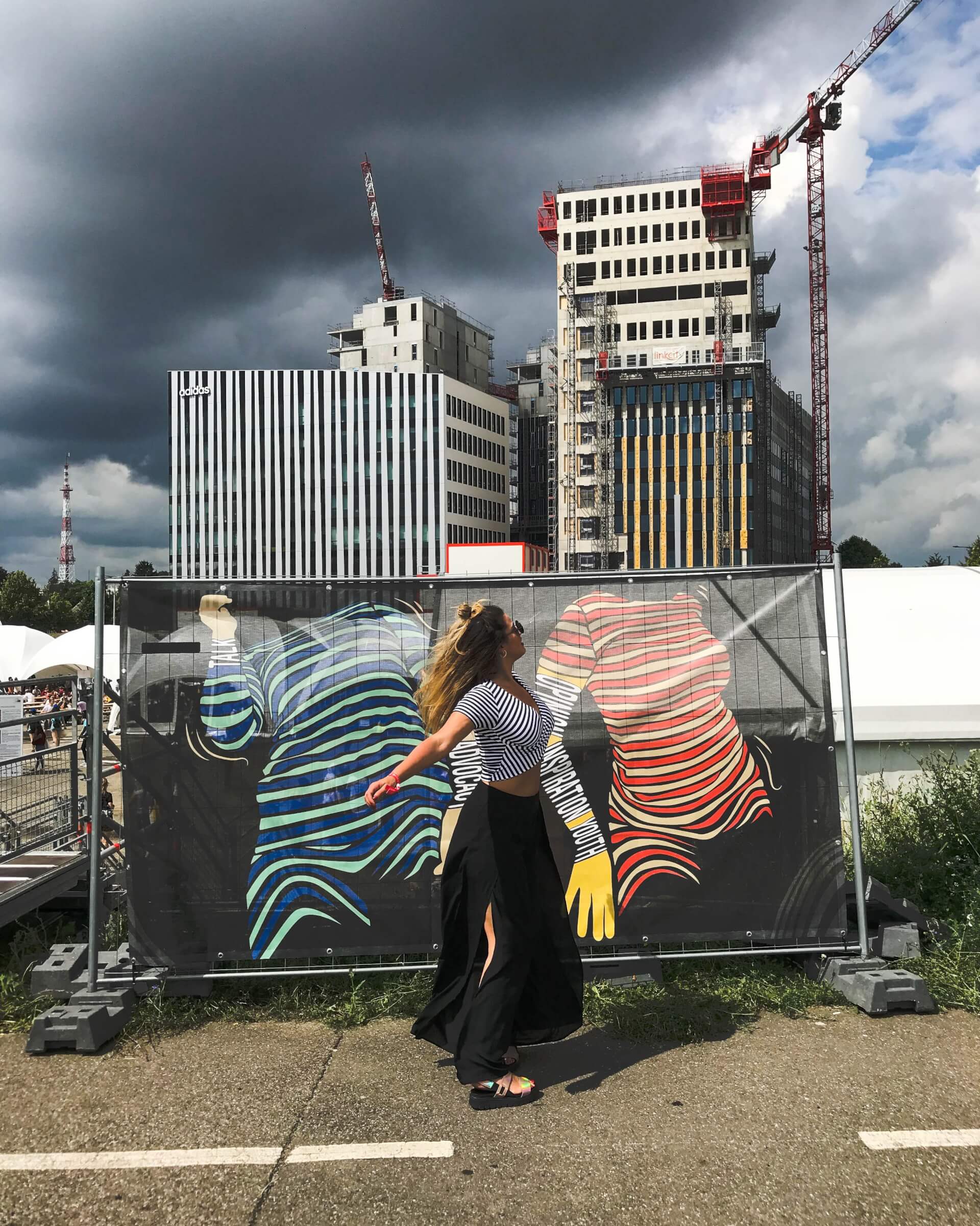
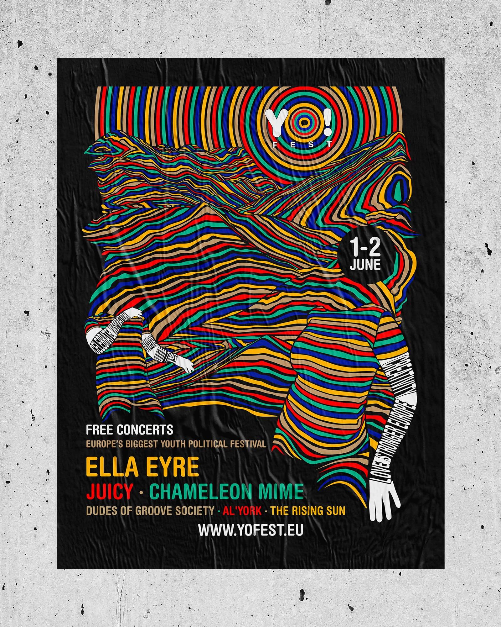
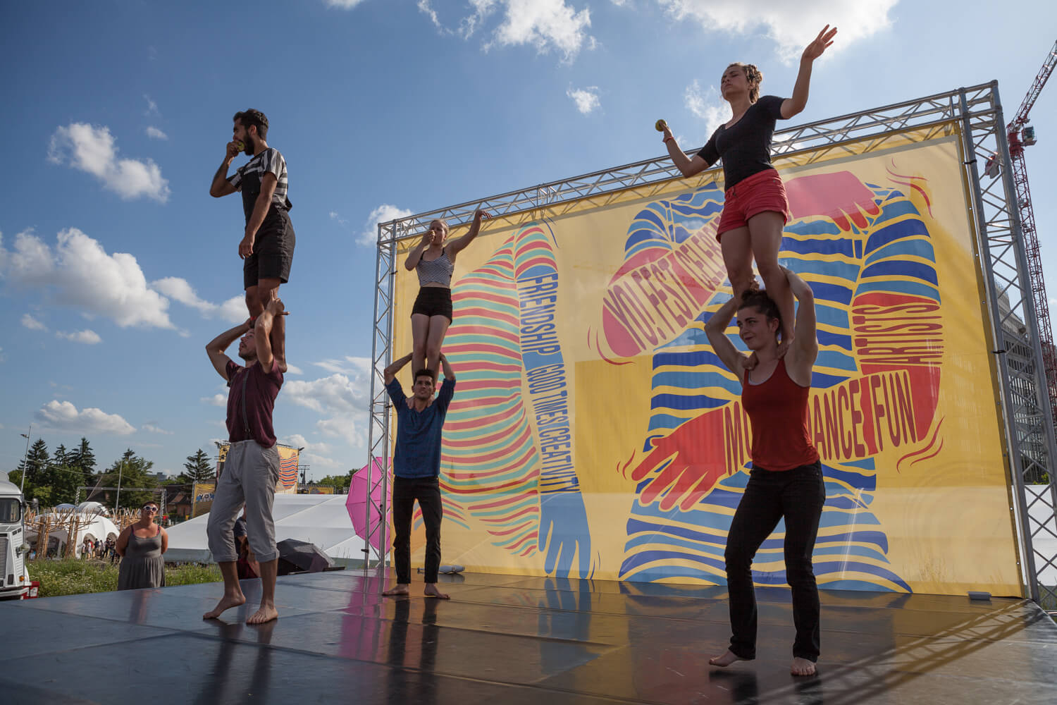
From the smallest to the largest, the graphics fit perfectly.
The strength of a communication campaign lies in the singularity and precision with which each variant adapts to the specific formats and distribution channels of each communication medium.

A gif version made for digital
They enable us to communicate by increasing our power.
The website as a communication tool
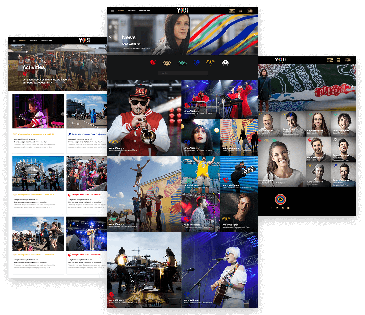
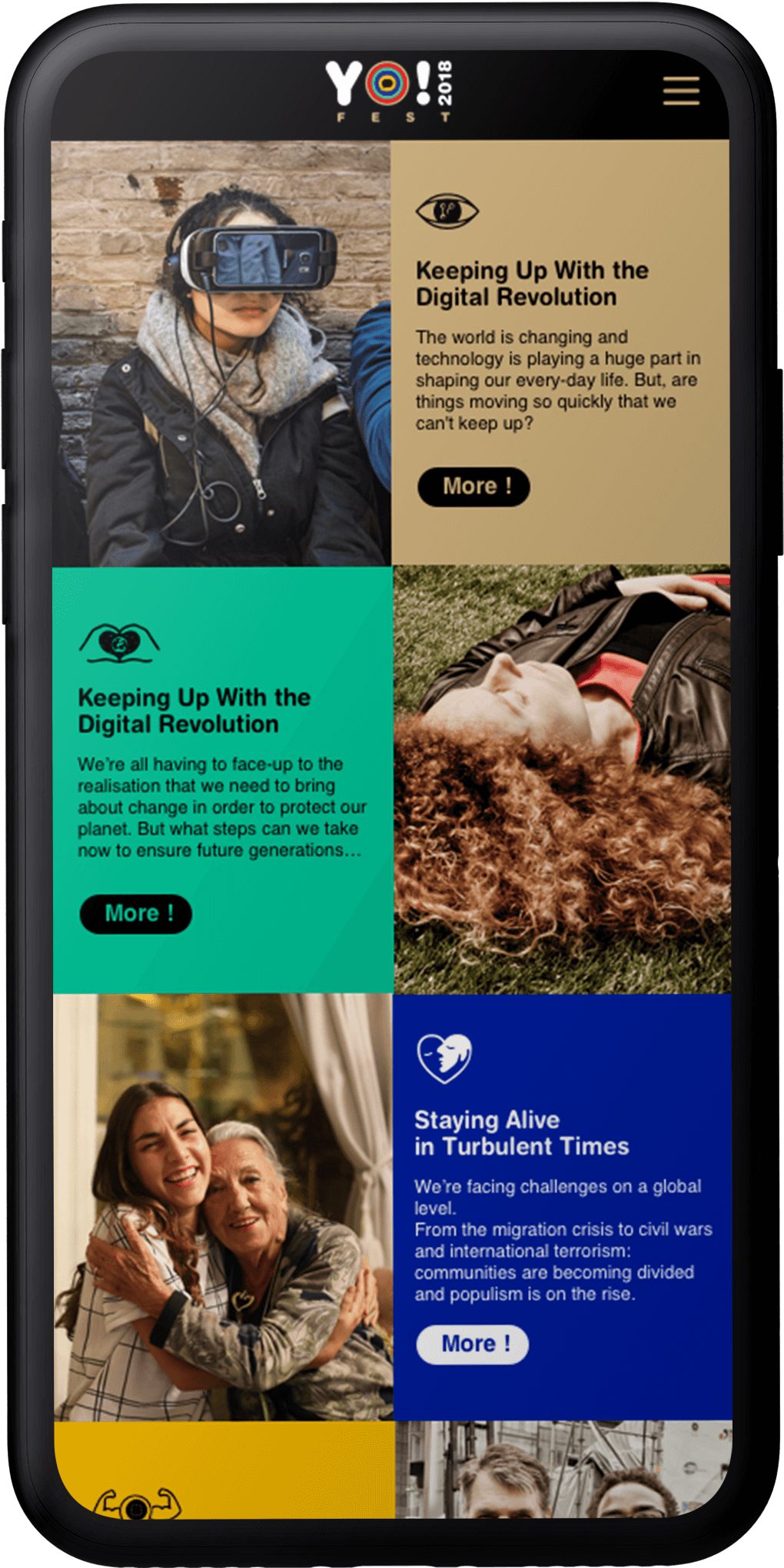
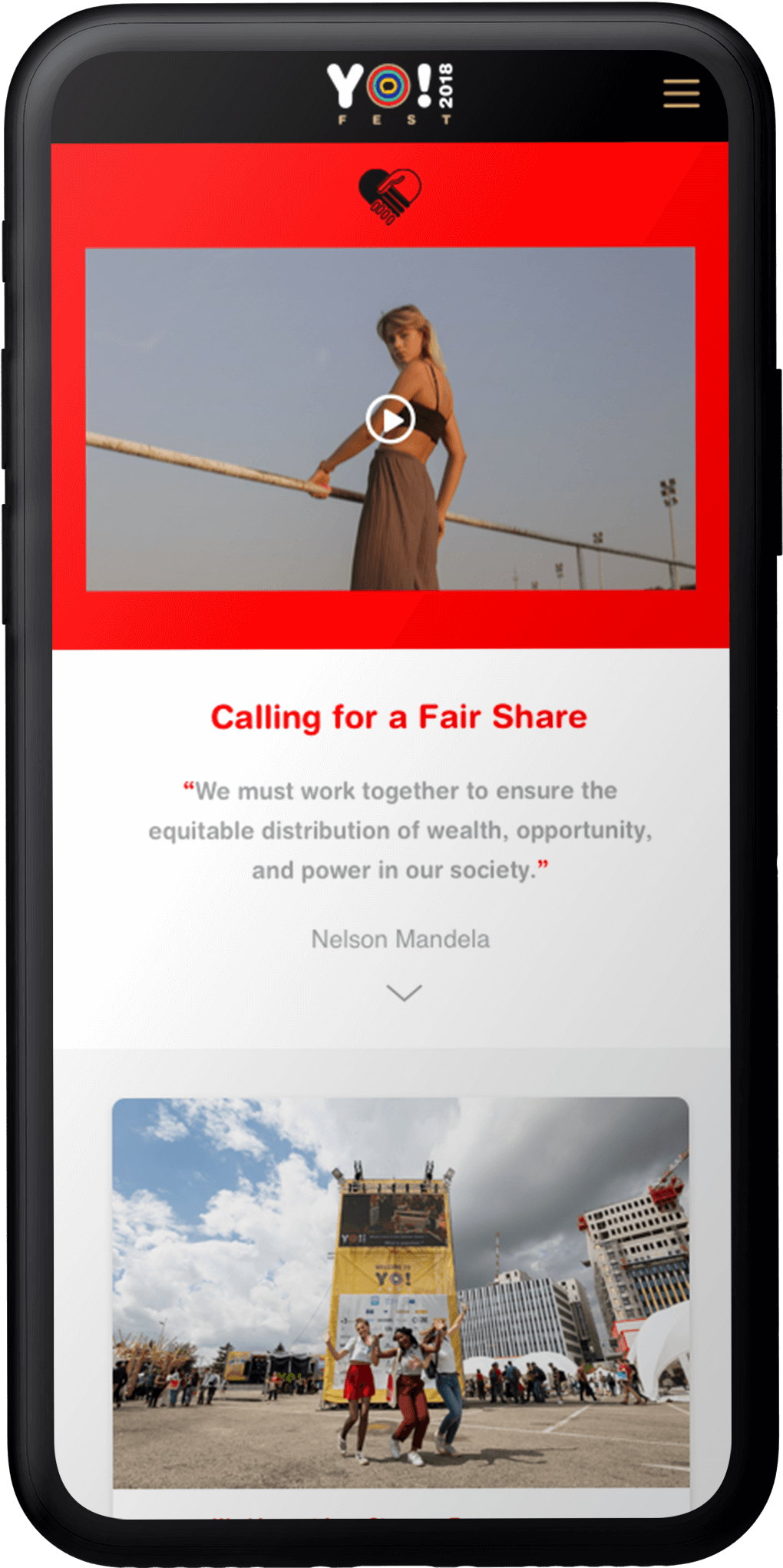
The Yo! Fest website was completely redesigned. The graphics were designed to match the different sections of the site, with each theme having its own color code to make navigation more dynamic.

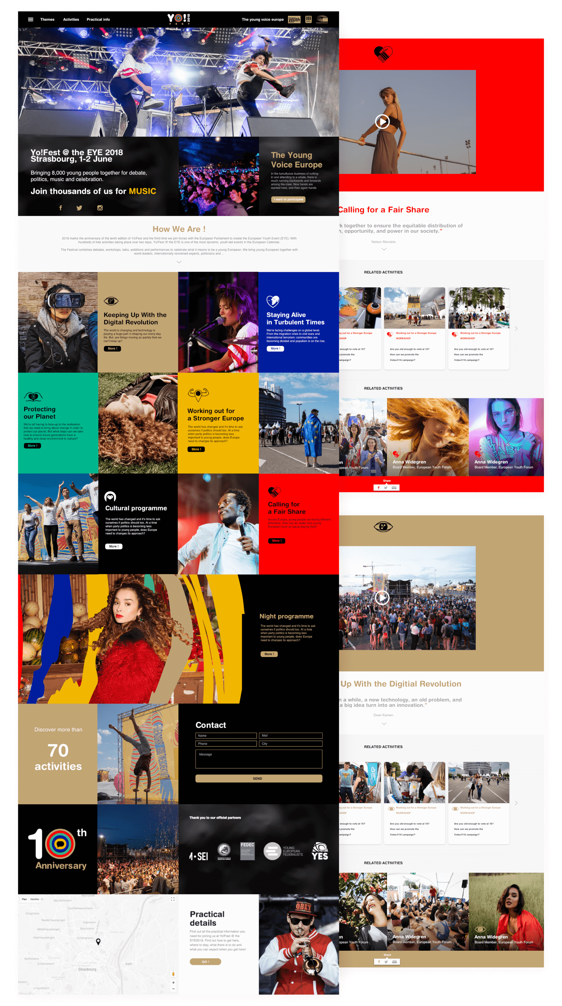
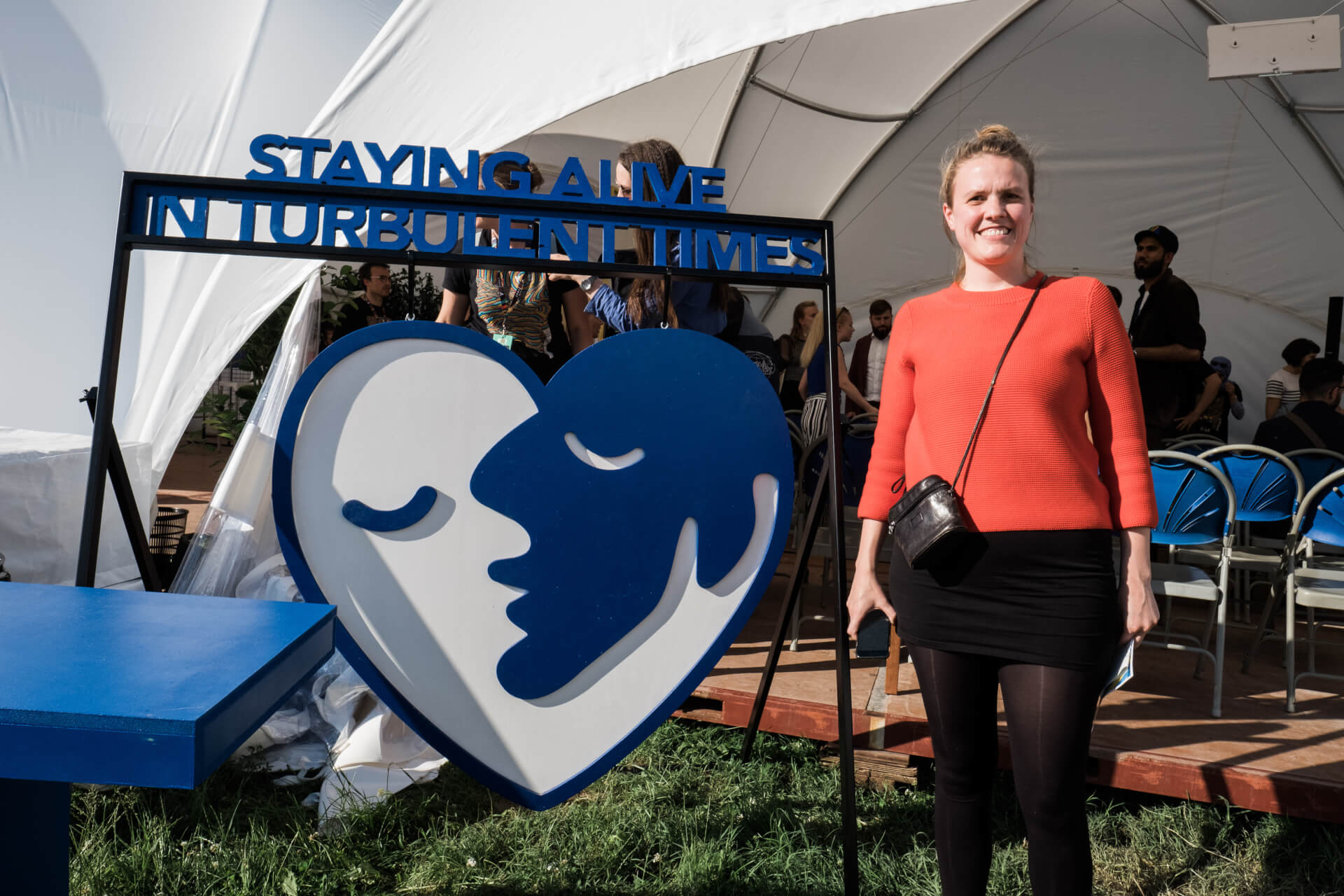
A pictogram and a color for each theme. These colors are repeated on all the festival's communication materials.
Visual vibrations
The ambition is to embody a lively, streamlined identity, inspired by the sound of the onomatopoeia Yo! A vibrant, unifying expression, Yo! conveys a collective, emotional energy. The graphic design is based on a bold palette sublimated by deep black, a symbol of elegance and unity. The imagery, both contemporary and timeless, evokes the vibration of sound through an abstract motif. The result is a versatile, evolving and hypnotic identity, suitable for all media.
A series of goodies
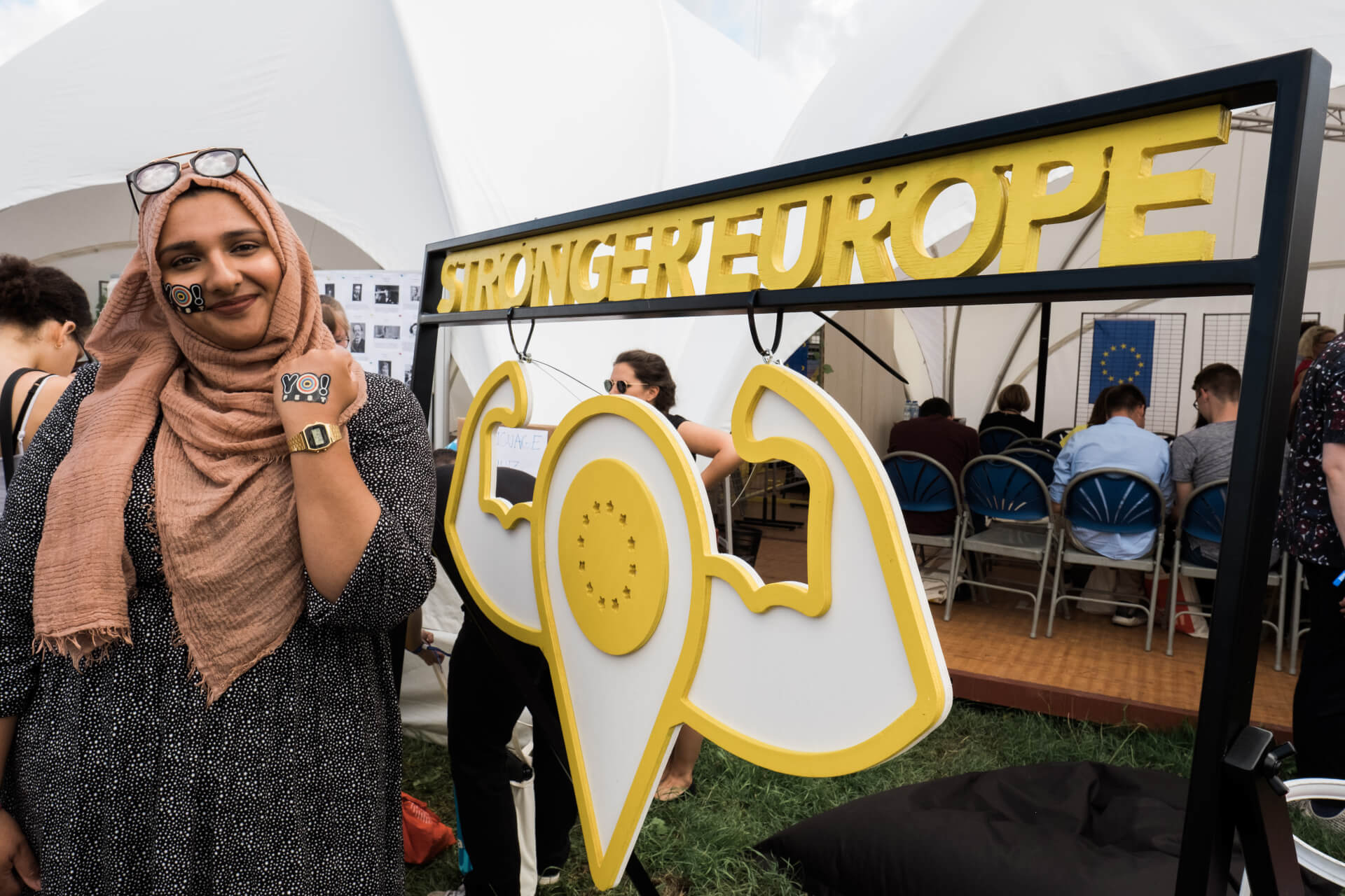
The introduction of a series of goodies surprises the public and gives them the opportunity to collect the various media.
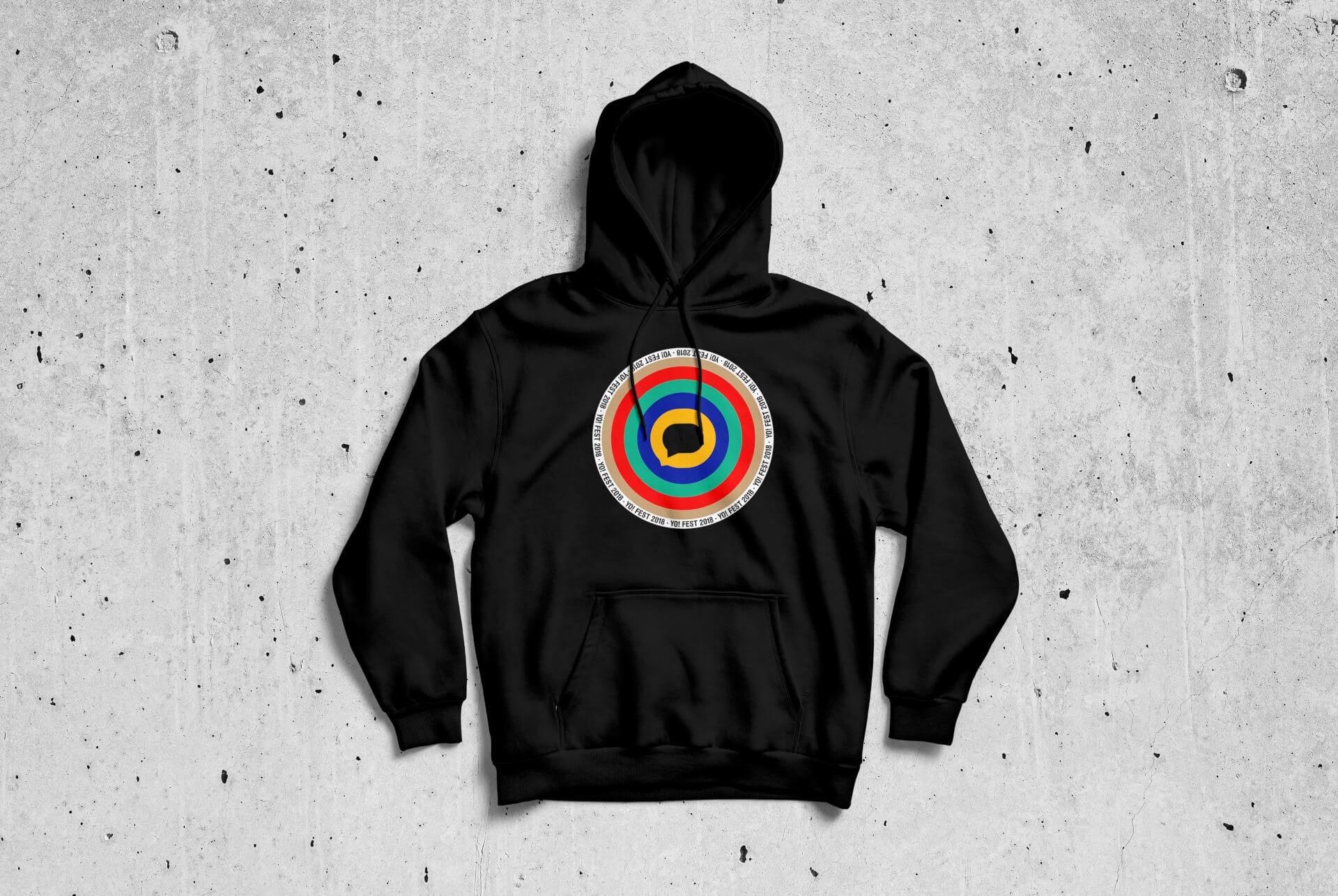
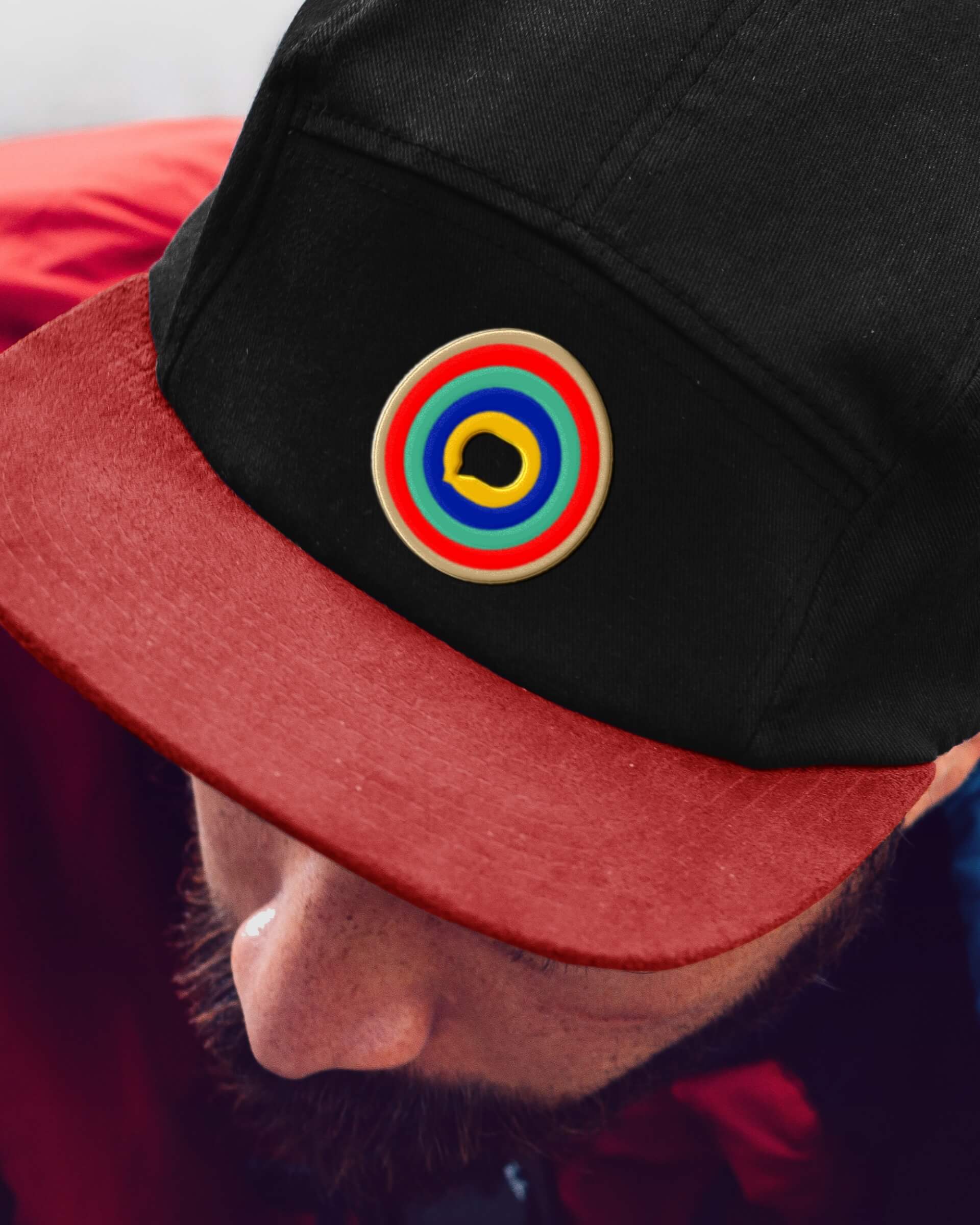
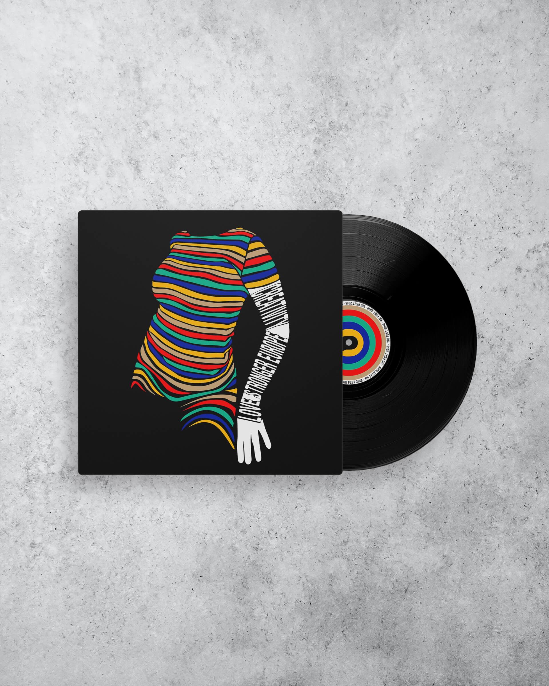
From streetwise to elegant, the art direction reflects its graphic breadth across the various take-home media.
10,000 young people around music
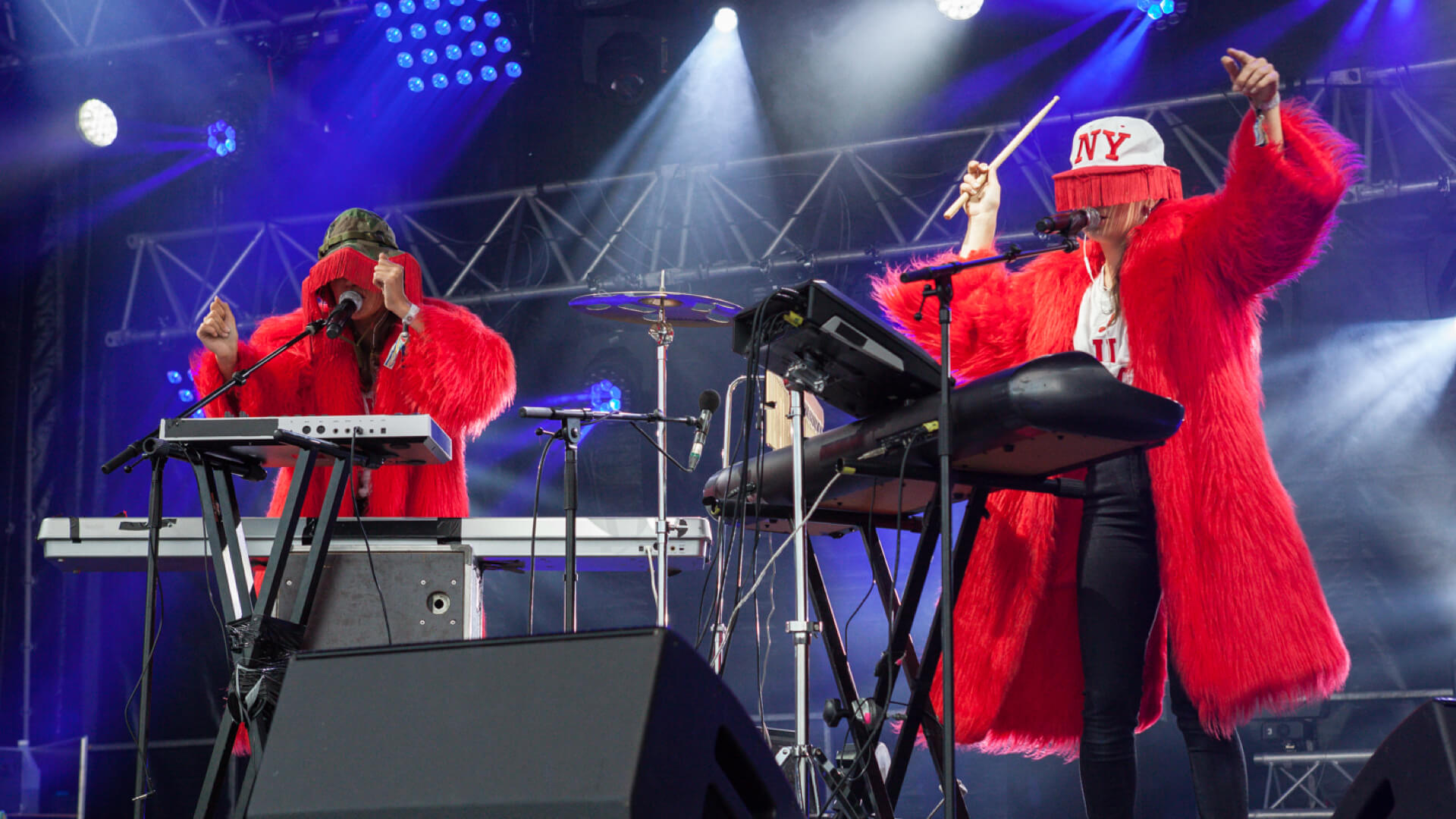
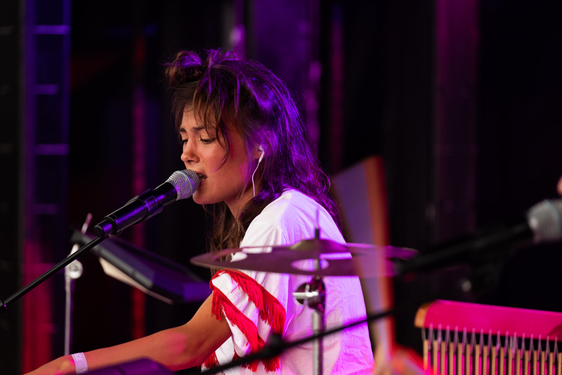
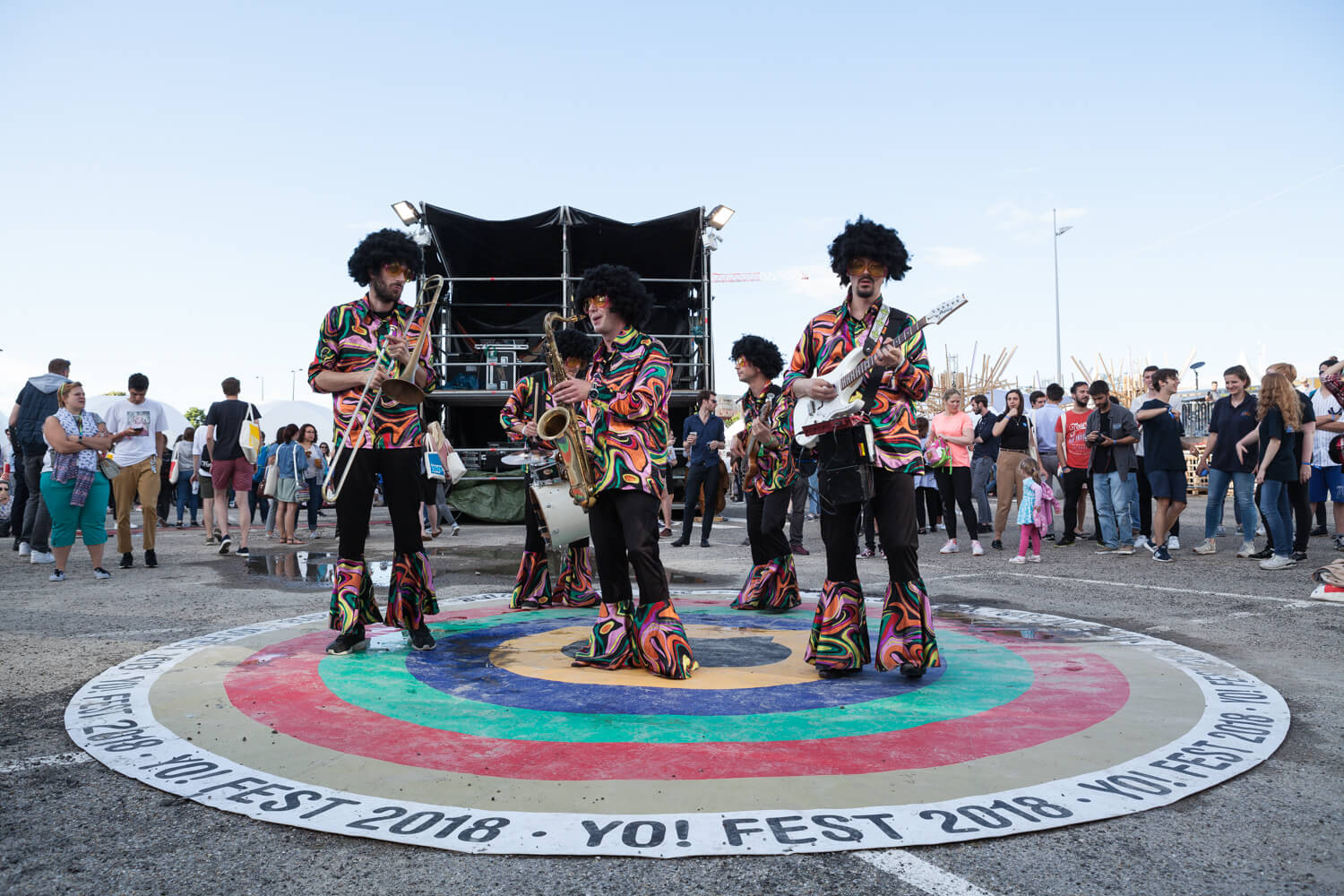
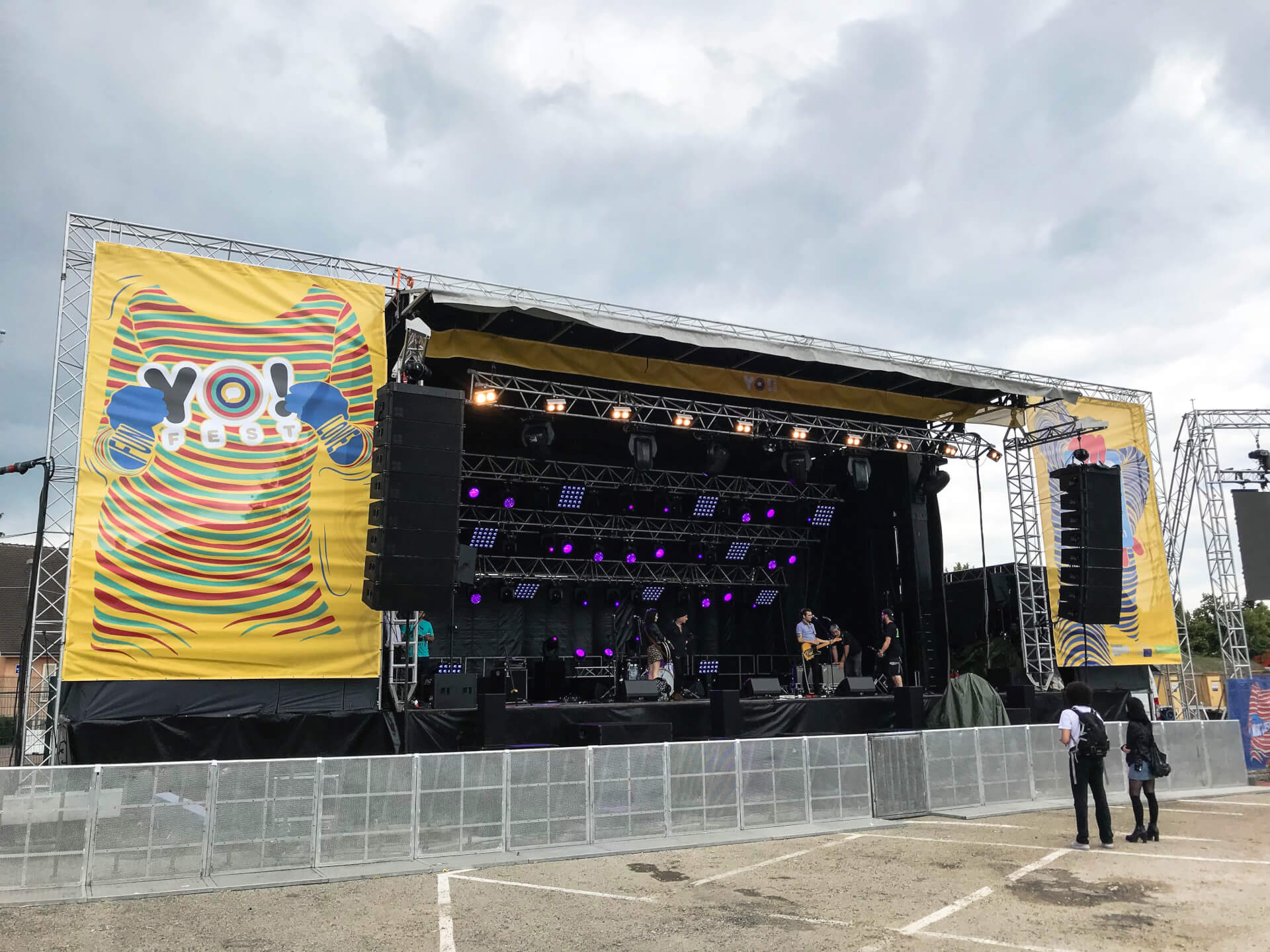
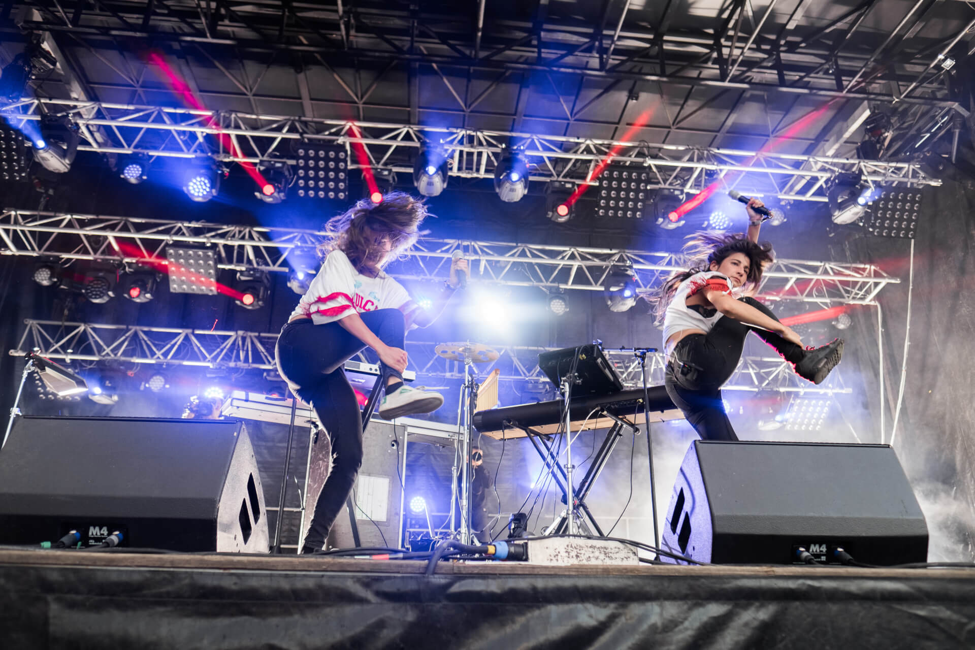
On-the-spot photos that reflect the energy of Yo! Fest by Alban Grosdidier and Sidney Léa.
+ creations + projects + identities + stories + colors

Crafts & Heritage
L'Outil en main
European elections 2019
Change is Coming
Festival
YO! Fest 2019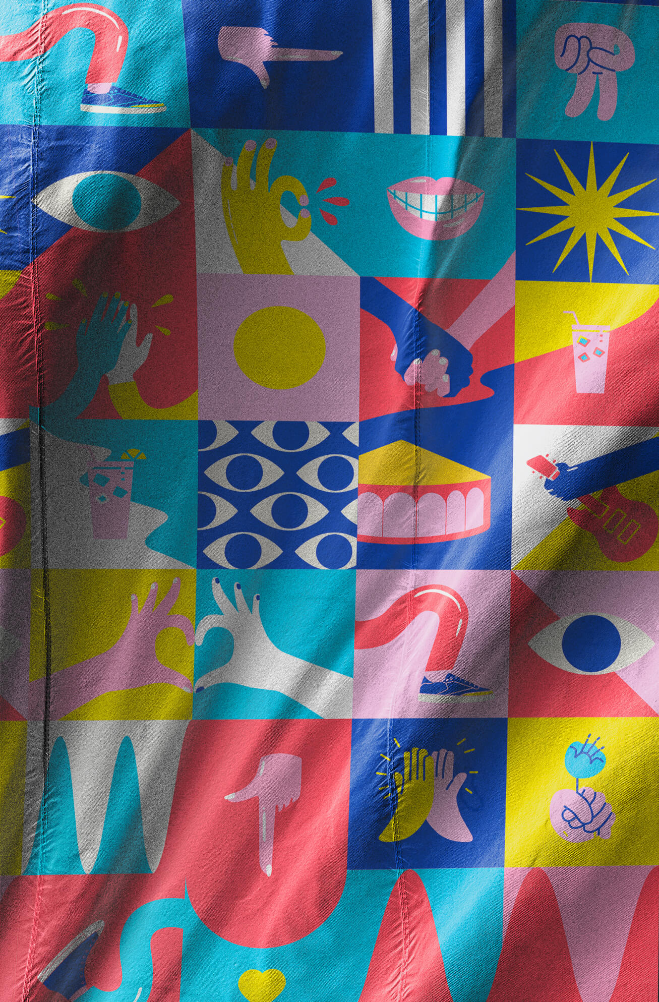
Festival
Emmaus Solidarity Festival 2023